3
$\begingroup$

For 7 different discharge energies, I have two gases (1. pure helium, 2. a helium oxygen mixture) being heated up. Those 14 settings then enter a tube, in which the system cools off. In the list below, the first "HePure" pair {152,72} says the gas enters the tube at 152 kelvins and comes out at 72 kelvins. At the same discharge energy input, the oxygen mixture generally takes more energy, so the first "HeO2Mix" pair is hotter (186 vs. 151 kelvins), but the temperature drop is again about 80 kelvins (152-72=80 vs. 168-82=86 kelvins).

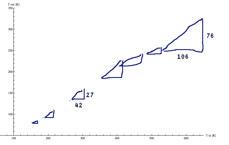
I draw a nice picture. The two curves overlap, which shows that even if the heating is different for the two systems, the temperature drop in the tube only depends on the temperature when the gases enter, not on the chemical composition.

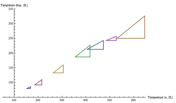
However, to simultaneously show the initial heating for the 7 respective input energies, I'd like for the 7 corresponding pairs to be connected. So there should be a line between {152, 72} and {168, 82}, and then between {185, 93} and {215, 105} and so on up to {530, 280} and {646, 320}. At best, I'd like to see all information like in the picture below, with triangles and labels. How is this possible to do?

HePure  = {{152, 72}, {185, 93   }, {263, 130}, {355, 168}, {405, 192}, {485, 242}, {530, 280}};
HeO2Mix = {{168, 82}, {215, 105}, {305, 145}, {417, 190}, {473, 230}, {527, 270}, {646, 320}};

tempDrop = {#[[1]], #[[1]] - #[[2]]} &;

ListPlot[ {tempDrop /@ HePure, tempDrop /@ HeO2Mix}, PlotRange -> {{50, 650}, {50, 350}}, AxesLabel -> {"Temperature in, [K]", "Temperature drop, [K]"}]
enter image description here

$\endgroup$

2 Answers 2

3
$\begingroup$

You can pre-process the input data to ListPlot

dt = Transpose[{tempDrop /@ HePure, tempDrop /@ HeO2Mix}];
dt2 = Join[#, {Through@{Max, Min}@#, #[[1]]}] & /@ dt;
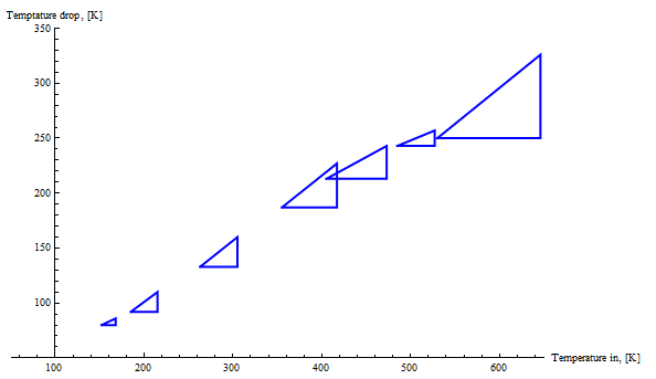
ListPlot[dt2, Joined -> True, BaseStyle -> Thick]

enter image description here

ListPlot[dt2, Joined -> True, PlotStyle -> Directive[Thick, Blue]]

enter image description here

Or, less conveniently, post-process the plot output

lplt1 = ListPlot[dt, PlotRange -> {{50, 650}, {50, 350}}, Joined -> True, 
   AxesLabel -> {"Temperature in, [K]", "Temptature drop, [K]"}, PlotStyle -> Thick] ;
Normal[lplt1] /. Line[x_] :> (Line[Join[x, {Through@{Max, Min}@x, x[[1]]}]])

or

Normal[lplt1] /. Line[x_] :> {Thick, Blue, Line[Join[x, {Through@{Max, Min}@x, x[[1]]}]]}

to get the first and second pictures above.

Update:

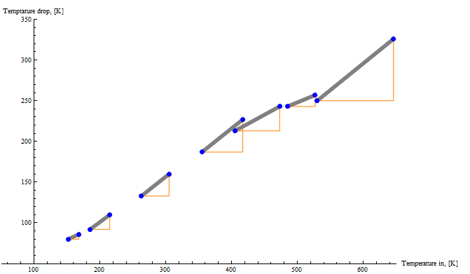
make the artificially added vertical and horizontal part of the triangle ... not thick
(or) to put the dots back on

Normal[lplt1] /. Line[x_] :> {Thickness[.01], Gray, Line[x],
    Orange, Thin, Line[{x[[1]], Through@{Max, Min}@x, x[[2]]}], 
    PointSize[Large], Blue, Point[x]}

enter image description here

$\endgroup$
4
  • $\begingroup$ Looks cool, thanks. I have a hard time understanding the Join construction. What if I want to make the artificially added vertical and horizontal part of the triangle (the ones I've labeled with numbers in my drawing) not thick? The point being that to emphasize that the lower left points of the triangles don't correspond to measurements. (Another option to make this point would be to put the dots back on.) $\endgroup$
    – Nikolaj-K
    Commented Mar 12, 2015 at 10:53
  • $\begingroup$ @NikolajK, please see the update on how to use post-processing to get the requirement(s) in your comment. $\endgroup$
    – kglr
    Commented Mar 12, 2015 at 11:22
  • $\begingroup$ Thanks again. I ended up with this now: pastebin.com/c0hTaATx One last thing, how can I put the gray lines in the background, so that they aren't drawn over the dots, but the other way around? $\endgroup$
    – Nikolaj-K
    Commented Mar 12, 2015 at 13:05
  • $\begingroup$ @NikolajK, my pleasure. To avoid the line covering the dots, you put the Point primitives last in the list on the right-hand-side of :>, e.g., Line[x_]:>{Thick, Gray, Line[x], Thin, Line[{x[[1]], Through@{Max, Min}@x, x[[2]]}], PointSize[Large], Blue, Point[x]} $\endgroup$
    – kglr
    Commented Mar 12, 2015 at 13:11
2
$\begingroup$

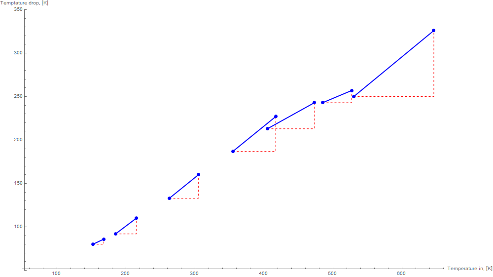
Riffle+Partition to combine starts and ends. InterpolationOrder-> 0 or 1 to produce triangles:

ListPlot[ Riffle[tempDrop /@ HePure, tempDrop /@ HeO2Mix] ~ Partition ~ 2, 
 PlotStyle -> Directive[##3], Mesh -> #2, 
 BaseStyle -> AbsolutePointSize@7,
 PlotRange -> {{50, 660}, {50, 350}}, ImageSize -> 1000, 
 AxesLabel -> {"Temperature in, [K]", "Temptature drop, [K]"}, 
 Joined -> True, InterpolationOrder -> #

] & @@@ {{0, None, Thin, Red, Dashed}, {1, All, Thick, Blue}} // Show

enter image description here

$\endgroup$
1
  • 1
    $\begingroup$ +1 but Riffle[. . .] ~Partition~ 2 would be nicer. :^) $\endgroup$
    – Mr.Wizard
    Commented Mar 12, 2015 at 11:31

Your Answer

By clicking “Post Your Answer”, you agree to our terms of service and acknowledge you have read our privacy policy.

Not the answer you're looking for? Browse other questions tagged or ask your own question.