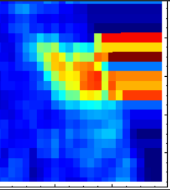
I'm working with ListDensityPlot on a set of triples, $\{\{x_1, y_1, z_1\}, \dots\}$. The data is on a semi-regular grid and looks just as it should through most of the plot. However, at the boundary of the dataset, the function continues on with the bordering hue.

Is there a simple way to fix this? I think it should work to append 'above' the data set a 'dummy' region with zero's or the like, but I feel that there must be something more elegant. Anyone have any thoughts? The top of the function is not neatly described by an analytic function, or this would be rather simple.
