I am a novice user, so please bear with me! I have a set of random points which are color-coded by some function. The point distribution is fairly dense so I should be able to see a smooth color distribution, but I see "choppy" discrete points. I use the following for processing:
g0 = Graphics[{PointSize @ .003, Opacity[0.075], Point[pts, VertexColors -> vc]}];
where pts is an array of 2D points (with (x,y) coordinates) and vc is some functional distribution of colors. The choice of PointSize essentially allows me to cover up the spaces that separate the points -- when PointSize is too small, one sees dots on a blank background, but when PointSize is too large, one sees an ugly, choppy color distribution, although the space separating the points is now covered.
I use Opacity to smooth out the choppiness, and for the most part it works. However, I would like to have a more elegant/exact control of this process. I would like to apply a radially symmetric filter function of sorts to these data points such that the color value at the center of each element of pts is vc and drops to some value (say, zero) at the edge of the radius of size PointSize. For the sake of argument let's just say the filter function at each point is vc * Max[0 , 1 - Abs[r/0.003 ]], where 0 <= r <= 0.003. This filter function should interpolate the colors in between points smoothly and provide a nicer looking field (it will look as if the points were first projected onto a uniform grid and then displayed smoothly).
Note that processing speed is somewhat important because I'm visualizing unsteady field of hundreds of thousands of points per timestep
Hopefully I'm clear enough with my request.
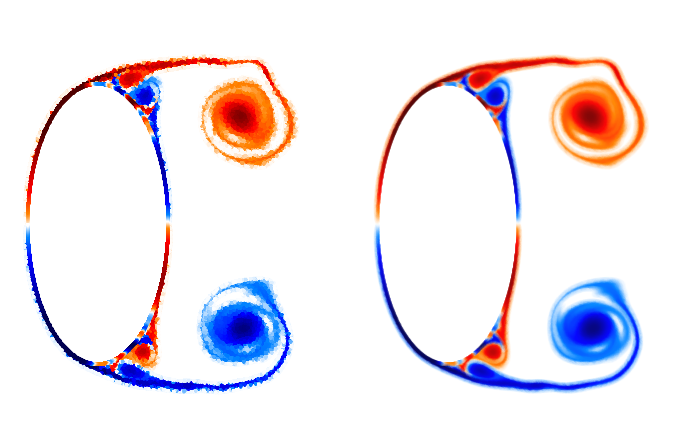
I'm including a side-by-side image: Left uses PointSize @ .005 (exaggerated to make my point); Right uses PointSize @ .005 and Opacity[0.07]. The problem with Opacity is loss of sharpness.
The "data" is at https://drive.google.com/file/d/0BzCeMgfPKi0vd0dCT2lRWTEzd0E/view?usp=sharing
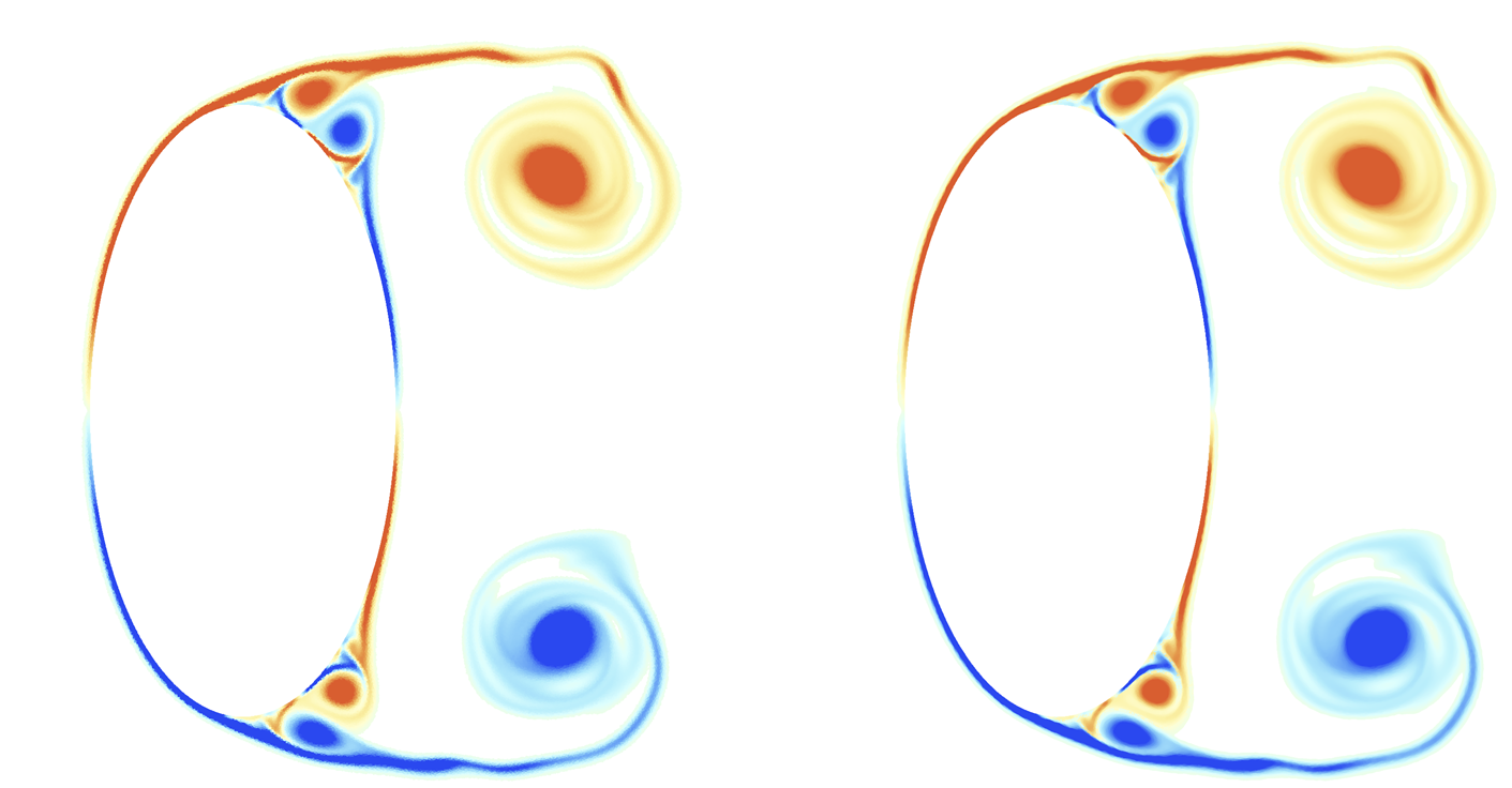
The code snippet to extract the correct "data" and plot it with a color scheme that's close enough to my own is given below (setting Opacity to 1 shows the choppy version):
cf = ColorData["LightTemperatureMap"];
dat = Transpose[Import["data", "Table", "HeaderLines" -> 1]];
pts = Transpose[{dat[[1]], dat[[2]]}];
vc = cf /@ Rescale[Clip[-dat[[4]], {-50, 50}]];
g0 = Graphics[{[email protected], Opacity[0.1], Point[pts, VertexColors -> vc]},
         Axes -> False, PlotRange -> {{-.35, 2.15}, {-.8, .8}}, ImageSize -> {1200}];
Show[g0]


