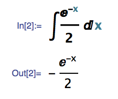
Trying out Mathematica 10 and I still get the Courier font, not the new font shown in all of the examples on Wolfram's website. Anybody have any ideas how to get the new font working? Running on Mac OS X if that helps. I also deleted my entire Library/Mathematica folder, but that did not help.
2 Answers
Mathematica still works with Courier by default. Nothing is broken about your copy of Mathematica. It is the case, however, that if you use any sans serif font (or at least any font that properly advertises itself as sans serif...many amateur font designers don't bother setting font metadata bits correctly), you'll see the new MathematicaSans font in use for the Mathematica characters. It was a lot of work and long overdue, and we're very proud of it.
So why are the examples different? The short answer is we're doing different things on the web and on the desktop. For now.
The long answer is that there's been a bit of a row within the company of which, I confess, I'm one of the chief instigators...but I won't say for which side. I think that most people would like to see us retire the tired old Courier for something a bit more modern, but the big question is whether that font should be proportionally or mono-spaced.
On the one hand, Mathematica has never offered a strictly monospaced environment. That would be impossible with true typesetting, but even without it we do things like putting little spacing hints around operators and such.
On the other hand, Mathematica is a full coding environment for the Wolfram Language, and it's pretty uncommon for a coding environment to use anything but a monospaced font. It can really play havoc with attempting to do proper indenting, and arguments can be made that code is just not as readable in proportional fonts, especially in regards to the treatment of punctuation and delimiters.
So we've split the difference between the web and desktop environments for now, which is probably not a permanent solution.
I'm curious what SEers think about the situation. Maybe those who care might look at the comments below and upvote what most closely represents your opinion
-
5$\begingroup$ Upvote if this describes you: Proportional is totally the future, and a brilliant break from stodgy tradition! I'm so tired of being kicked around by pseudo-modern coding environments that can't even figure out modern typesetting! $\endgroup$ Commented Jul 10, 2014 at 5:45
-
35$\begingroup$ Upvote if this describes you: Proportional for coding? Are you insane? Do the people who thought this stinker up actually ever write code? There are so many great coding fonts out there today...let's modernize on one of those! $\endgroup$ Commented Jul 10, 2014 at 5:46
-
11$\begingroup$ Upvote if this describes you: Wait...are you suggesting that you're going to take away my Courier font? You'll have to pry it from my lifeless limbs. It was an inspired choice when Wolfram did it in 1988, and it's no less inspired today. $\endgroup$ Commented Jul 10, 2014 at 5:48
-
5$\begingroup$ I think that proportional vs monospace is less important than clear distinguishability of characters. In the Wolfram Cloud input font,
Inandlnlooks much too similar, especially iflnhas a value assigned to make it black (not blue). When looking atInas part of an input (not cell label!), my brain wants to seeln(probably too used to natural logarithms). $\endgroup$– SzabolcsCommented Jul 10, 2014 at 16:49 -
3$\begingroup$ ... There's also the annoying bug where lines won't be auto-indented after an edit (e.g. adding a wrapper f[ ... ]) until I manually remove and re-add each newline in the input. $\endgroup$– SzabolcsCommented Jul 10, 2014 at 17:05
Nothing is wrong with your settings. Mathematica 10 is supposed to be using the old fonts. The old fonts are shown in the blog post introducing Mathematica 10.
Note: People report that the hack described below doesn't work on Windows or Linux. It works on OS X, where I tried it.
But you can play with the new fonts if you like. Go to Format -> Edit Stylesheet.... Create a new cell in the style definitions window. Show the cell expression by selecting the cell bracket and pressing Command-Shift-E. Then change the cell expression to
Cell[StyleData["StandardForm"], FontFamily -> "MathematicaSans", FontSize -> 12]
convert the cell back (Command-Shift-E), then close the style definitions window. Now the notebook will use Mathematica Sans for standard form expressions.

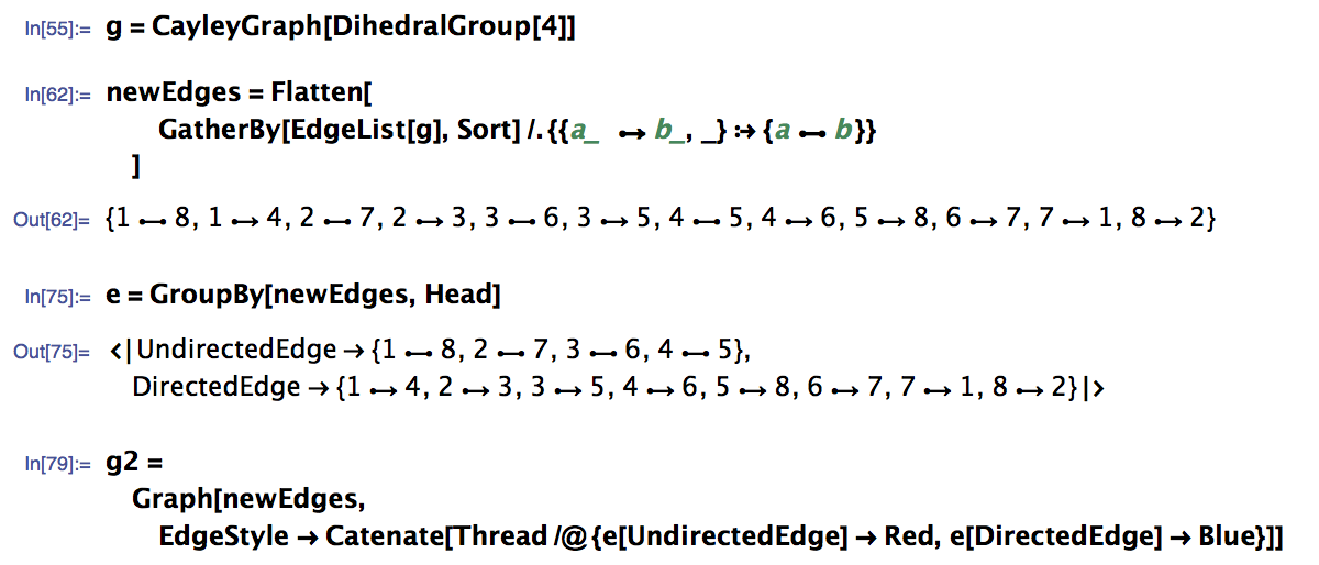
Here's a better example showing actual code:

You can also try Mathematica (serif) or MathematicaMono (fixed width). The fonts are located in $InstallationDirectory/SystemFiles/Fonts.
-
$\begingroup$ Seems weird they would do this when all of their examples are shown with the new font, in addition to the Cloud interface (which essentially is a mathematica notebook). $\endgroup$– bridges2Commented Jul 10, 2014 at 4:20
-
$\begingroup$ @bridges2 For what it's worth I personally loathe the new font. I'm glad they stuck with the current one. :) $\endgroup$ Commented Jul 10, 2014 at 5:30
-
$\begingroup$ Ugly. I am almost tempted to use the term fugly, but shall refrain from doing that. $\endgroup$– wolfiesCommented Jul 10, 2014 at 16:13
-
$\begingroup$ @wolfies I guess I posted the wrong kind of screenshot of a 2D math expression. It doesn't look bad when used for more usual inputs. $\endgroup$– SzabolcsCommented Jul 10, 2014 at 16:47
-
2$\begingroup$ This doesn't work for me. I just get a bunch of empty boxes. $\endgroup$ Commented Jul 10, 2014 at 19:55

DefaultStyleDefinitionssay in advanced preferences? (ps. I am not sure I understand what you mean byI also deleted my entire Library/MathematicaThe default style sheet should use Default.nb $\endgroup$