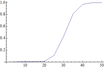
I have the following data:
data = {{0, 0}, {20, 1.4}, {25, 9.8}, {30, 32.2}, {35, 38.2}, {40, 15.6}, {45, 2.7}, {50, 0.1}};
where the second coordinates are frequencies measured as percent of total (adding, therefore, to $100$). I would like to produce a cumulative frequency plot. What would be the neatest way to do so?


{{0,0}, {20,1.4}, ...}mean that $1.4$% of the frequency lies within the interval $[0,20]$ or that $1.4$% lies *exactly* at $20$? Should the plot reflect the data accurately or--as suggested by the accepted answer--attempt to interpolate between the bin cutpoints? Evidently the interpolation must be monotonic, but should it necessarily be linear (as in the accepted answer)? $\endgroup$