12
$\begingroup$

I'm doing density plots in Mathematica where I mostly plot Wigner functions.

The main objective when plotting a Wigner function is to demonstrate that the underlying state is nonclassical, as indicated by negative values in the Wigner function. Therefore I want to make these negative values stand out in the plot.

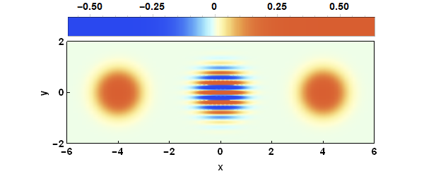
To demonstrate this, I've plotted the Wigner function of an even cat state

cat state

which was generated using the following code

(* Plots the Wigner function of an even Cat State *)
α = Sqrt[
  16];
Wigner[x_, y_] := 
  1/(π Sqrt[
    1 + Exp[-2 α^2]]) (Exp[-2 (x - α)^2 - 2 y^2] + 
     Exp[-2 (x + α)^2 - 2 y^2] + 
     2 Exp[-2 x^2 - 2 y^2]*Cos[4 y α]);

DensityPlot[Wigner[x, y], {x, -6, 6}, {y, -2, 2},
    PlotRange -> All,
    ColorFunction -> "LightTemperatureMap",
    PlotLegends -> Placed[
    BarLegend[
        {"LightTemperatureMap", {-.5, .5}},
        LegendMargins -> {{26, 20}, {-15, 0}},
        LegendMarkerSize -> {475, 30}],
    Above],
    ImagePadding -> {{45, 20}, {45, 10}},
    PlotRangePadding -> None,
    ImageSize -> {600, 200},
    AspectRatio -> Automatic,
    FrameLabel -> {"x", "y"},
    FrameTicks -> {{{-2, 0, 2}, None}, {Table[-6 + 2 i, {i, 0, 6}], 
    None}},
    FrameStyle -> Black,
    FrameTicksStyle -> Directive[Black, 14],
    LabelStyle -> {Black, Bold, 14},
    PlotPoints -> 50
 ]

As you can see in the figure above, it's difficult to distinguish positive and negative values around the zero value.

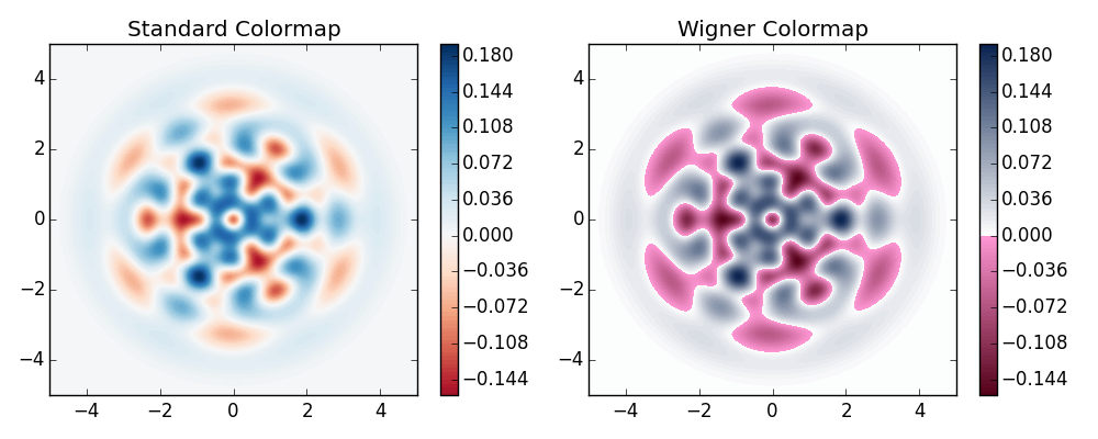
All of the color functions that I've found in Mathematica are linear colormaps where small negative values tend to be near the same color as the zero values, and are thus hidden. I'm looking for a nonlinear color function that colors all negative values differently than positive or zero values

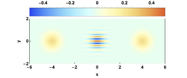
See for example the right figure down below wigner colormap

$\endgroup$
5
  • $\begingroup$ How about something like CoolColorN[ z_ ] := RGBColor[z^3, 1 - z^3, 1]; ContourPlot[Sin[x y], {x, -1, 1}, {y, -1, 1}, ColorFunction -> CoolColor] $\endgroup$
    – Lotus
    Commented Apr 18, 2018 at 9:25
  • $\begingroup$ @Lotus I still want better distinction between the positive and negative values, but I think you're on to something. $\endgroup$ Commented Apr 18, 2018 at 9:33
  • 1
    $\begingroup$ I think you should be able to modify the function however you want. $\endgroup$
    – Lotus
    Commented Apr 18, 2018 at 9:35
  • 1
    $\begingroup$ I recommend looking up the documentation for ColorFunction, ColorData and ColorFunctionScaling. $\endgroup$ Commented Apr 18, 2018 at 9:42
  • $\begingroup$ You might find the answers here to be useful: mathematica.stackexchange.com/q/102132/9490 $\endgroup$
    – Jason B.
    Commented Apr 18, 2018 at 16:15

5 Answers 5

7
$\begingroup$

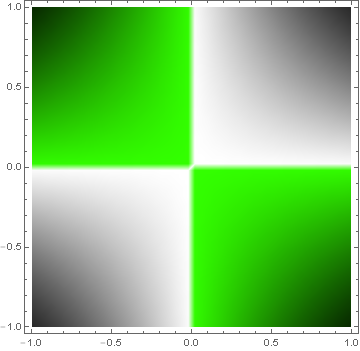
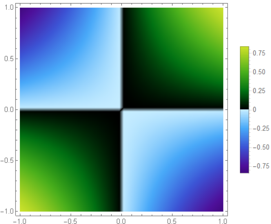
If you want abrupt changes in color, Piecewise seems more appropriate.

colorWig[z_] := Piecewise[{{GrayLevel[1 - z], 0 < z < 1},
                           {Hue[.3, 1, 1 + z], -1 < z < 0}}]

DensityPlot[Sin[x y], {x, -1, 1}, {y, -1, 1}, 
 ColorFunction -> colorWig, ColorFunctionScaling -> False, 
 PlotPoints -> 50]

plot

$\endgroup$
2
  • $\begingroup$ This seems to be it! Thank you! $\endgroup$ Commented Apr 18, 2018 at 9:53
  • $\begingroup$ @Turbotanten You're welcome. Some trial and error might be necessary to remap my sample function to the range of values your function takes. I'd suggest waiting for a while until accepting this answer to see if someone comes up with something better. Many engaged users that have more time on their hands than I do currently create truly stunning works here. $\endgroup$
    – LLlAMnYP
    Commented Apr 18, 2018 at 9:59
9
$\begingroup$

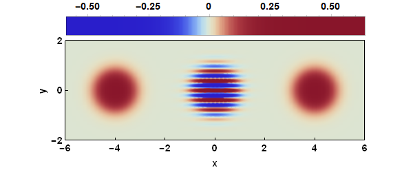
A useful trick for using color functions to distinguish signs is to preprocess with LogisticSigmoid[], which maps $(-\infty,\infty)$ to $(0,1)$. Applied to the OP's example:

DensityPlot[Wigner[x, y], {x, -6, 6}, {y, -2, 2}, 
            AspectRatio -> Automatic, 
            ColorFunction -> (ColorData["LightTemperatureMap", LogisticSigmoid[20 #]] &),
            ColorFunctionScaling -> False, FrameLabel -> {"x", "y"}, 
            FrameTicks -> {{{-2, 0, 2}, None}, {Table[-6 + 2 i, {i, 0, 6}], None}},
            FrameStyle -> Black, FrameTicksStyle -> Directive[Black, 14], 
            ImagePadding -> {{45, 20}, {45, 10}}, ImageSize -> {600, 200}, 
            LabelStyle -> {Black, Bold, 14}, 
            PlotLegends -> Placed[BarLegend[Automatic,
                                            LegendMargins -> {{26, 20}, {-15, 0}},
                                            LegendMarkerSize -> {475, 30}], Above],
            PlotPoints -> 75, PlotRange -> All, PlotRangePadding -> None]

Wigner function colored by sign

Personally, I prefer using "ThermometerColors":

different coloring

$\endgroup$
1
  • $\begingroup$ Wow this looks really good! $\endgroup$ Commented Sep 26, 2018 at 7:31
5
$\begingroup$
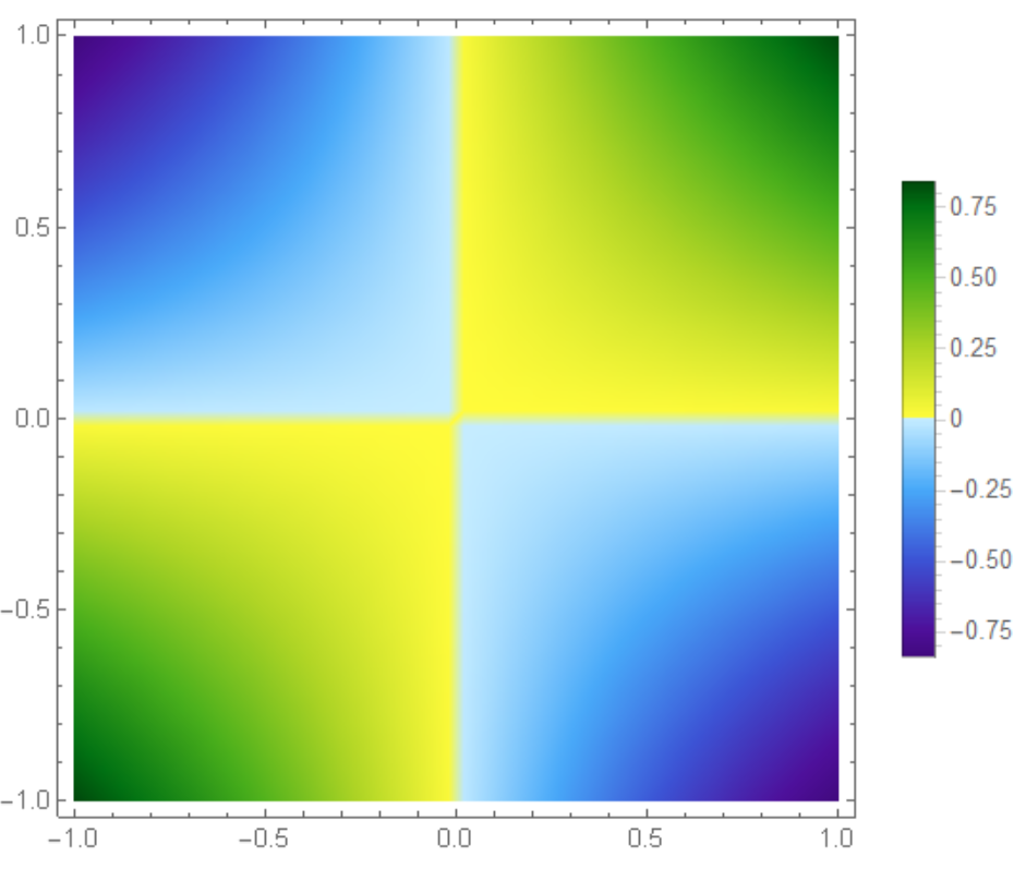
 colorWig[z_] := 
     Which[-1 < z <= 0, ColorData["DeepSeaColors"][Rescale[z, {-1, 0}]], 
      0 <= z < 1, ColorData["AvocadoColors"][Rescale[z, {0, 1}]]]
    DensityPlot[Sin[x y], {x, -1, 1}, {y, -1, 1}, 
     ColorFunction -> colorWig, ColorFunctionScaling -> False, 
     PlotPoints -> 50, PlotLegends -> Automatic]

enter image description here

Reverse AvocadoColors

colorWig[z_] := 
 Which[-1 < z <= 0, ColorData["DeepSeaColors"][Rescale[z, {-1, 0}]], 
  0 <= z < 1, 
  ColorData[{"AvocadoColors", "Reverse"}][Rescale[z, {0, 1}]]]

enter image description here

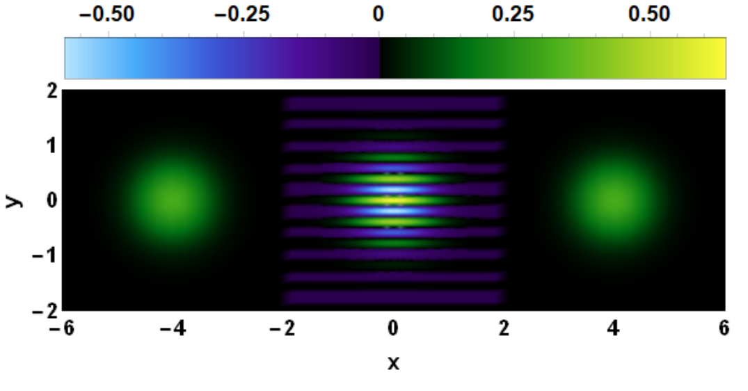
NMaximize[{Wigner[x, y], -6 <= x <= 6, -2 <= y <= 2}, {x, y}, 
 Method -> "DifferentialEvolution"]

{0.63662, {x -> 0., y -> 0.}}

NMinimize[{Wigner[x, y], -6 <= x <= 6, -2 <= y <= 2}, {x, y}, 
 Method -> "DifferentialEvolution"]

{-0.590076, {x -> 8.73424*10^-32, y -> 0.193331}}

So we are safe to choose range [-0.6,0.64]

  colorWig[z_] := 
 Which[-0.6 < z <= 0, 
  ColorData[{"DeepSeaColors", "Reverse"}][Rescale[z, {-0.6, 0}]], 
  0 <= z < 0.65, ColorData["AvocadoColors"][Rescale[z, {0, 0.65}]]]
DensityPlot[Wigner[x, y], {x, -6, 6}, {y, -2, 2}, PlotRange -> All, 
 ColorFunction -> colorWig, ColorFunctionScaling -> False, 
 PlotLegends -> 
  Placed[BarLegend[Automatic, LegendMargins -> {{26, 20}, {-15, 0}}, 
    LegendMarkerSize -> {475, 30}], Above], 
 ImagePadding -> {{45, 20}, {45, 10}}, PlotRangePadding -> None, 
 ImageSize -> {600, 200}, AspectRatio -> Automatic, 
 FrameLabel -> {"x", "y"}, FrameStyle -> Black, 
 FrameTicksStyle -> Directive[Black, 14], 
 LabelStyle -> {Black, Bold, 14}, PlotPoints -> 50]

enter image description here

$\endgroup$
1
$\begingroup$
ColorFunctionScaling -> False, 
ColorFunction -> (Blend[{Blue, White,Red}, (π*#+1)/2]&)

This is a good color scheme for plotting Wigner distributions. Taken from "Using Mathematica for Quantum Mechanics: A Student's Manual"

$\endgroup$
0
$\begingroup$

Old Thread, but I had to do a similar thing and did it in a simpler way. Create the color function like this:

MyColorFunction =
  Function[
    x,
    Blend[{
      {0.500, Hue[000/360, 0.75, 0.75]},
      {0.750, Hue[030/360, 0.75, 0.75]},
      {1.000, Hue[060/360, 0.75, 0.75]},
      {1.125, Hue[120/360, 0.75, 0.75]},
      {1.250, Hue[180/360, 0.75, 0.75]},
      {1.375, Hue[240/360, 0.75, 0.75]},
      {1.500, Hue[300/360, 0.75, 0.75]}
      },
      x
    ]
  ];

The 0.5, 0.75, 1 are the number values, and the colors next to them are the colors that correspond to those values. When applying the color function to a plot, do it like this:

ArrayPlot[
  data,
  ColorFunction -> MyColorFunction,
  ColorFunctionScaling -> False
]

Set ColorFunctionScaling to False so that it uses the number values you assigned to each color.

$\endgroup$

Your Answer

By clicking “Post Your Answer”, you agree to our terms of service and acknowledge you have read our privacy policy.

Not the answer you're looking for? Browse other questions tagged or ask your own question.