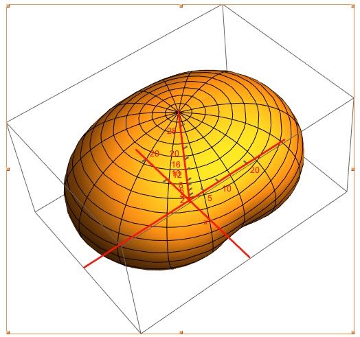
I am stuck on figuring out how to do a "Temperature" Color scheme for a surface plotted using ParametricPlot3D. As an example, here is a plot of one example surface.

This is a antenna gain plot of a dipole antenna. The numeric information is generated by a program and the actual gain data (surface) runs from -25 dB to about 7 dB (in this plot). Since all radial vectors I used in the plot needed to be positive, I scaled the plot by adding 25 dB to all data points so the data runs from about 0 to 32 dB where 25 dB is the zero dB point.
I want to color the surface like a Temperature Map color function where about -6 dB is the cross over from cool colors (which I think of as blues though I know they are higher temperature) to warm colors and reds indicating the highest gain figures. Thus, -6 dB (or, numerically on the plot, 19 dB) is where the colors start changing from blues to yellows to reds with blues on more negative gain values.
It seems to be a rather normal and easy to do thing but I am missing out on how I use the gain figures in with the color function to scale the colors per gain on the plot.
Ignore the red coordinate axes lines as I only put that there to double-check which axes is the x-axis in the plot.
MODIFICATIONS DUE TO POSTED ANSWER:
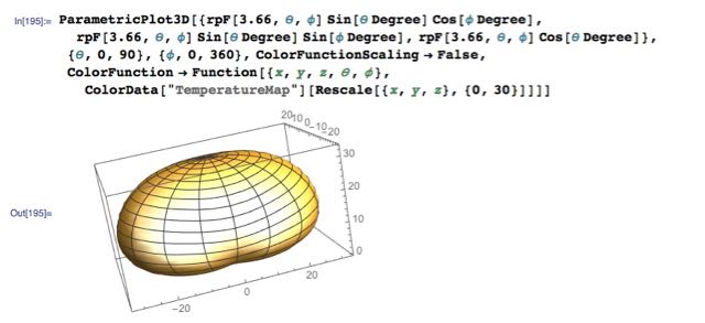
I have used information derived from a posted answer to update my plot but I am not getting the results that I expect.
Here is my plotting command and results:
The function rpF[$f$,$\theta$,$\phi$] is an Interpolation function that is dependent on frequency, theta, and phi. Theta and Phi are the spherical coordinate coordinates (theta of zero is in Z-direction). The value returned from rpF is the gain for the antenna for coordinates theta and phi.
I actually do not understand how the color function works and how the variables I specified (e.g. x, y, z) associate with color data. I have read the documentation but I have not found where this is described to such a neophyte as myself.


