1
$\begingroup$

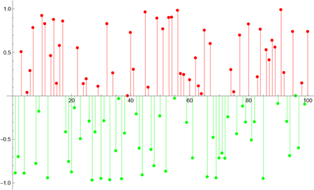
I want to plot a time series so that positive values appear in red and negative values in green.

I have tried all kind of variants of the following, which just plots everything in the last color specified (Green in this case). Also tried with ColorFunction, to no avail.

Maybe it's just me, but I find these trivial plotting issues are some of the most complex and time consuming to figure out in the Wolfram Language.

tsData = TimeSeries[RandomReal[{-1, 1}, 100], {Range[100]}];

   DateListPlot[tsData,Joined->False,Filling->Axis,PlotStyle->{If[#>0,Red,Green]&/@tsData["Values"]}]
$\endgroup$
1
  • 1
    $\begingroup$ Please post an example of tsData. $\endgroup$
    – cvgmt
    Commented Jan 23, 2023 at 10:46

1 Answer 1

5
$\begingroup$

Edit

The solution by @kirma

DateListPlot[List /@ Normal[tsData], Joined -> False, Filling -> Axis,
  PlotStyle -> (If[# > 0, Red, Green] & /@ tsData["Values"])]

Original

  • I don't kown how to make DateListPlot work,so here we only use ListPlot.

  • The PlotStyle using (If[# > 0, Red, Green] & /@ tsData["Values"]) instead of {If[# > 0, Red, Green] & /@ tsData["Values"]}

ListPlot[List /@ MapIndexed[{First@#2, #1} &, tsData["Values"]], 
 Filling -> Axis, 
 PlotStyle -> (If[# > 0, Red, Green] & /@ tsData["Values"])]

enter image description here

$\endgroup$
6
  • 1
    $\begingroup$ For DateListPlot use List /@ Normal[tsData] and Joined -> False. $\endgroup$
    – kirma
    Commented Jan 23, 2023 at 12:26
  • 1
    $\begingroup$ @kirma Thanks! updated. $\endgroup$
    – cvgmt
    Commented Jan 23, 2023 at 12:32
  • $\begingroup$ Firstly, if you have zero values in the time series these show up as unwanted points on the x-axis in the plot. Not an issue, perhaps, if you only have one or two of them, but if you have many of them it ruins the plot. $\endgroup$
    – MMAUser
    Commented Jan 23, 2023 at 13:03
  • $\begingroup$ Secondly, could your or @kirma explain more clearly what he means in his comment about DateListPlot, which is specifically what I want to know about? A code example would be helpful. Thanks. $\endgroup$
    – MMAUser
    Commented Jan 23, 2023 at 13:06
  • $\begingroup$ @MMAUser List /@ Normal[tsData] converts the TimeSeries data into a list where every data point (date and value) is enclosed in its own single-point time series, which are given individually the colour using the list of colours given on PlotStyle. Nothing more fancy than that. $\endgroup$
    – kirma
    Commented Jan 23, 2023 at 13:11

Your Answer

By clicking “Post Your Answer”, you agree to our terms of service and acknowledge you have read our privacy policy.

Not the answer you're looking for? Browse other questions tagged or ask your own question.