My graph is about fires (burned area) over 12 years presented in one Date List Log Plot. Because most of fires are in summer (as expected) I would like to highlight that with different background colors. How can I paint seasons in Date List Plot in different colors? I want to put different background color for winter, spring... Thank you!
-
$\begingroup$ You can put a coloured Rectangle in the Prolog option. $\endgroup$– SzabolcsCommented Mar 11, 2013 at 21:24
-
$\begingroup$ @Szabolcs I was writing a comment in your answer. It took me too long (more than one hour!) because I was interrupted many times by stupid things like work. Now I wonder if non-posted comments to deleted answers are second class citizens of this universe or are just kept in a wormhole until the Schröedinger's cat takes a nap. $\endgroup$– Dr. belisariusCommented Mar 12, 2013 at 0:25
-
$\begingroup$ @belisarius I'm sorry, I didn't know. Do you need me to undelete it? Verbeia's answer was a bit more detailed then mine and I didn't want to keep both ... $\endgroup$– SzabolcsCommented Mar 12, 2013 at 1:10
-
$\begingroup$ @Szabolcs Nahhh .. Let's the wormhole got filled up. $\endgroup$– Dr. belisariusCommented Mar 12, 2013 at 1:21
3 Answers
I would suggest using Prolog and graphics rectangles like this
fakedata =
  Transpose[{DatePlus[{1977, 1}, {#, "Month"}] & /@
     Range[0, 33*12 - 2],
    FoldList[#1 + #2 &, 59.5,
     RandomVariate[NormalDistribution[0.002, 0.5], 33*12 - 2]]}];
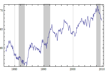
You don't need AbsoluteTime to define the dimensions of the rectangles, but you do need to define the vertical range of the rectangles to be beyond the range of your data. You can't use Scaled in just one dimension. The code below shows how to have multiple rectangles, though in this case I have used recessions and milder economic downturns in Australia rather than summers as the dates for the rectangles. (I happened to have a similar graph lying around.) If you want different colors for the different rectangles, just intersperse the colors in between the Rectangle objects in the list.
DateListPlot[fakedata, Joined -> True,
 Prolog -> {GrayLevel[0.8],
   Rectangle[{{1981, 6}, 0}, {{1983, 7}, 90}],
  Rectangle[{{1989, 11}, 0}, {{1992, 3}, 90}],
   Rectangle[{{2008, 1}, 0}, {{2009, 7}, 90}]}]

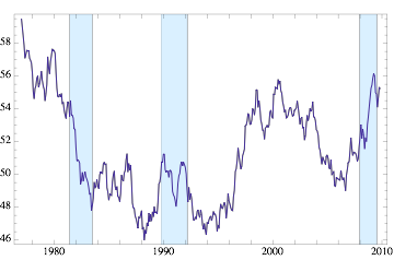
Here is the version I use (it is quite similar to Verbeia's, but I don't want to compute the vertical range every time):
ClearAll[dateListPlotShaded];
Options[dateListPlotShaded] =
  Join[DeleteCases[Options[DateListPlot], GridLines -> _],
        {GridLines -> None, ShadeColor -> LightBlue, ShadeOpacity -> 1}];

With[{opt = First /@ Options[DateListPlot]},
  dateListPlotShaded[ddata_, ShadeDates_, OptionsPattern[]] :=
     Module[{yRange, yPadding},
        With[{plot=DateListPlot[ddata, Sequence@@((#->OptionValue[#])& /@ opt)]},
           yRange= Last[PlotRange/.AbsoluteOptions[plot, PlotRange]];
           yPadding = If[OptionValue[Frame] === True, - .2 Subtract@@yRange, 0];
           Show[plot,
             Prolog -> {{OptionValue[ShadeColor],
               Opacity[OptionValue[ShadeOpacity]],
                 (Rectangle[
                    {AbsoluteTime[#[[1]]],
                       yRange[[1]] - yPadding},
                    {AbsoluteTime[#[[2]]],
                       yRange[[2]] + yPadding}
                    ]&) /@ ShadeDates},
             {OptionValue[Prolog]}}]]]];
Plotting the data:
fakedata =
  Transpose[{DatePlus[{1977, 1}, {#, "Month"}] & /@
    Range[0, 33*12 - 2],
    FoldList[#1 + #2 &, 59.5,
    RandomVariate[NormalDistribution[0.002, 0.5], 33*12 - 2]]}];

dateListPlotShaded[fakedata, {{{1981, 6}, {1983, 7}}, {{1989, 11}, {1992, 3}},
   {{2008, 1}, {2009, 7}}}, Joined -> True]

You can use dateListPlotShaded with all the options of DateListPlot (including Prolog and with Frame -> False).
-
$\begingroup$ Little bit to much for my poor knowledge of programming but I will bookmark this for one day when I will be better and smarter! Thank you for your help! $\endgroup$– danijelCommented Mar 13, 2013 at 21:00
Here's another suggestion - there are (at least) two caveats:
- you need rather dense data (I fill points from axis, so not really good for only single points in a year)
- I can't get it working for
DateListPlot
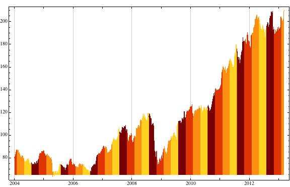
Nevertheless, it looks quite ok to do that sort of coloring for e.g. financial data. And maybe it helps you with your fires.
So in that sense, we can load:
data = FinancialData["IBM", "Jan. 1, 2004"];
And then, we define colors per month (group of months):
setup = {{{11, 12, 1}, ColorData["SolarColors"][1/3]},
{{2, 3, 4}, ColorData["SolarColors"][2/3]},
{{5, 6, 7}, ColorData["SolarColors"][3/3]},
{{8, 9, 10}, ColorData["SolarColors"][0/3]}};
Then:
DateListPlot[data, Joined -> True,
    ColorFunction -> ((Which[MemberQ[setup[[1, 1]], #], setup[[1, 2]],
    MemberQ[setup[[2, 1]], #], setup[[2, 2]],
    MemberQ[setup[[3, 1]], #], setup[[3, 2]],
    MemberQ[setup[[4, 1]], #], setup[[4, 2]]] &)@
    ToExpression@DateString[#1, "Month"] &), Filling -> Axis,
    ColorFunctionScaling -> False, ImageSize -> Large]
and get:

-
$\begingroup$ Thank you! This is also helpfull fo rsome of my graphs! $\endgroup$– danijelCommented Mar 13, 2013 at 20:58
-
