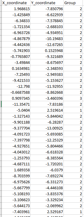
I have generated a dataset that clustered some of data points into three groups, the output was three -column data like this:
there are some points with X,Y coordinates and I already labeled each of them the group number (from 1-3).
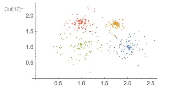
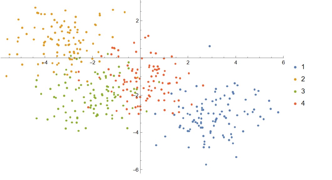
As I want to visualize the result by demonstrating those points on a Cartesian plane, for each group of points using the different color so that people can see the clustering result clearly. Something like this below that plotted by Mathematica ListPlot[FindCluster[]]:
(this pic has showed four groups of data (so 4 types of color), in my case, i just need three kind of whatever color)
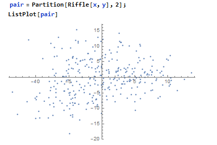
I've used Riffle[] and Partition[] to pair the points' x,y coordinates accordingly. So by ListPlot[] them you can see those points are landing correctly:
So basically I came up with Mathematica when I firstly had some thinking about demonstrating my result. But the tricky part is how could I show different colors for each group. Looks like FindCluster[] could do the most of the part job like this (or I could be wrong), but I might still need one or two more steps to color the points according to my group labels.
Please feel free to leave your comment, I appreciate your help!

