23
$\begingroup$

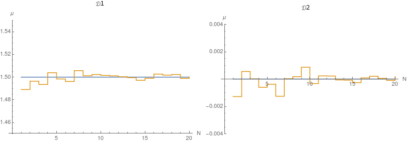
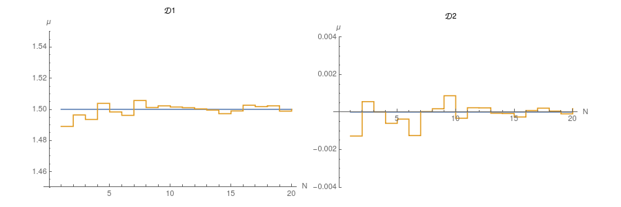
Here are the data that I want to plot:

meandatf1 = Mean /@ datf1
meandatf2 = Mean /@ datf2

{1.48908, 1.49641, 1.49354, 1.50385, 1.49835, 1.49617, 1.50569, \
1.50117, 1.50226, 1.50151, 1.50108, 1.50031, 1.49955, 1.49721, \
1.49898, 1.50266, 1.50177, 1.50227, 1.49886, 1.50002}

{-0.00127783, 0.000556012, 0.0000143709, -0.000602328, -0.000375952, \
-0.00125357, 0.0000228143, 0.000175103, 0.000868018, -0.0003298, \
0.000230178, 0.000222689, -0.0000624273, -0.0000760139, -0.000263302, \
0.0000826082, 0.000206463, 0.0000507921, -0.0000955452, 0.000184107}

And here is how I generate my individual plots:

genPlot[c_, dat_, ymin_, ymax_, legend_] :=
 ListPlot[{
   Table[c, {Length[dat]}], dat},
   AxesLabel -> {"N", "\[Mu]"}, PlotRange -> {Automatic, {ymin, ymax}},
   PlotLegends -> Placed[legend, Above],
   Joined -> True, Mesh -> None, InterpolationOrder -> 0, 
   ImageSize -> 400] (* I tried also without ImageSize, see below *)

plot1 = genPlot[3/2, meandatf1,  1.45,  1.55,  "\[ScriptCapitalD]1"]
plot2 = genPlot[0,   meandatf2, -0.004, 0.004, "\[ScriptCapitalD]2"]

The output of the individual plots is fine:
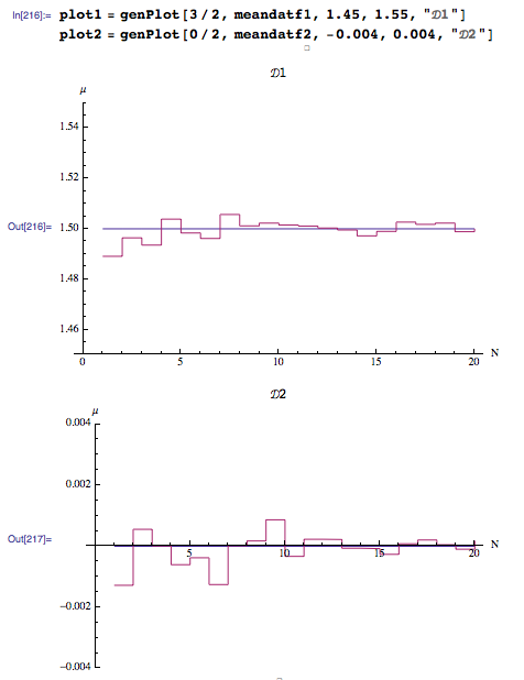
enter image description here

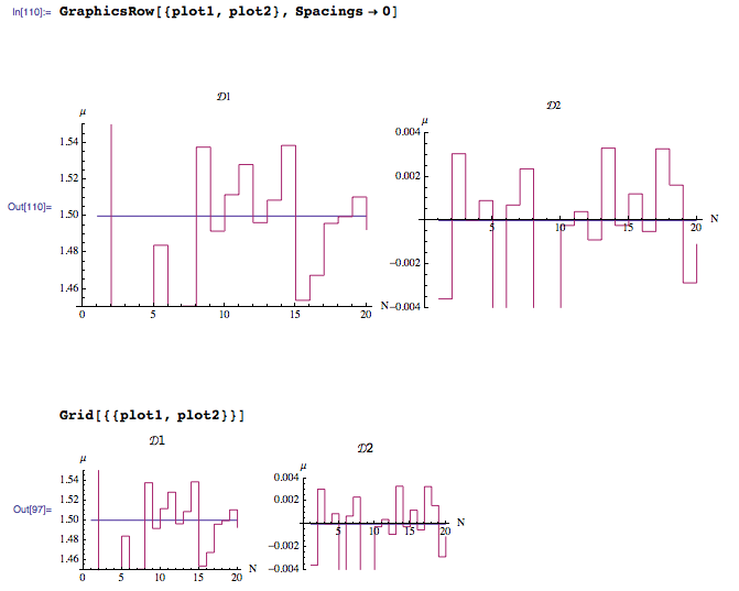
But when I combine the two plots with GraphicsRow[] I get this ugly output:
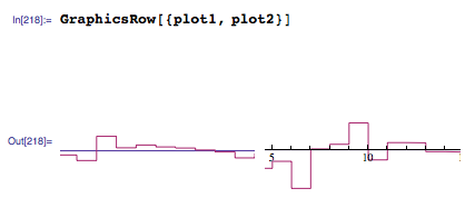
enter image description here

When I don't specify ImageSize in genPlot[] the combined plot is very small (but otherwise looks fine):
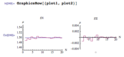
enter image description here

If I set ImageSize in the GraphicsRow[] (and not in genPlot[]) the container image is increased instead of the contained cells (which is reasonable, but was a desperate long shot by my side):
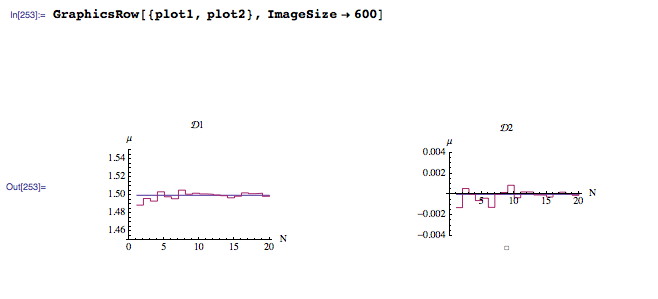
enter image description here

It must be something trivial that I am missing. Any ideas?

EDIT1: I am using Mathematica 9.0.1 under Mac OSX Mavericks.

EDIT2: Pretty much all of the proposed solutions worked for me. I wish I could accept >1 but, since this is not possible, I'll accept the one from @JasonB for its beauty of simplicity.

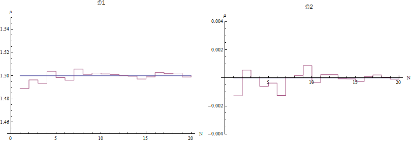
$\endgroup$
1
  • $\begingroup$ I believe the minimal and best solution is per my suggestion here. Does it work for you? $\endgroup$
    – Hedgehog
    Commented Jan 1, 2018 at 22:09

7 Answers 7

25
$\begingroup$

GraphicsRow, GraphicsGrid, or GraphicsColumn can be useful, when you need the output to be a Graphics object. But it's often easier to just use the corresponding non-Graphics version; I find the resizing and spacing options easier to use.

When I do

Grid[{{plot1, plot2}}]

I get enter image description here

which I think is what you want.

$\endgroup$
4
  • $\begingroup$ Did you manually resize the grid @JasonB? I thought that Grid[] worked for me, but the resultant image is very small and I have to manually resize it. $\endgroup$
    – stathisk
    Commented Nov 1, 2013 at 0:41
  • 4
    $\begingroup$ @Zet See this answer on how to prevent downsizing of graphics inside Grid. $\endgroup$ Commented Nov 1, 2013 at 12:22
  • $\begingroup$ Inspired by this very nice solution, I tried Row[{plot1,plot2}], which seems nice as well on the screen. But when Export this Row as an image file, it could automatically become a column-like thing (maybe too wide?). But Grid works fine... Anyone happen to know why? $\endgroup$
    – xiaohuamao
    Commented Mar 15, 2020 at 1:12
  • $\begingroup$ @xiaohuamao that is a good question, and this site probably has the answer somewhere if we can figure out how to ask the question. When you export to an image file, it has to rasterize the expression; also Row does some line breaking (try Row[Range[500]]). Try setting an ImageSize option when you export, or a PlotSize for the plots. If all else fails ask it here and someone will answer or find the duplicate. $\endgroup$
    – Jason B.
    Commented Mar 15, 2020 at 2:18
13
$\begingroup$

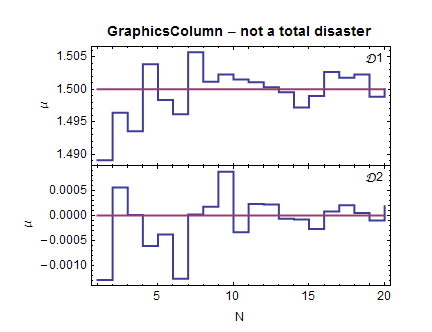
You can often get tolerable results from the likes of GraphicsColumn by specifying explicit values for ImagePadding, making sure you allow enough padding for frame or axis labels.

Here's a stacked plot using GraphicsColumn:

commonopts = {Mesh -> None, InterpolationOrder -> 0, PlotRange -> All,
    PlotStyle -> Thick, Frame -> True, Axes -> False, ImageSize -> 400, AspectRatio -> 0.4, 
   BaseStyle -> {FontFamily -> "Calibri", 12}};

a = ListLinePlot[{meandatf1, 1.5 + 0 meandatf1}, 
   FrameLabel -> {"N", "\[Mu]", Style["GraphicsColumn - not a total disaster", Bold, 14]}, 
   ImagePadding -> {{70, 20}, {0, 40}}, 
   Epilog -> Text["D1", Scaled[{0.95, 0.9}]], commonopts];

b = ListLinePlot[{meandatf2, 0 meandatf2}, 
   FrameLabel -> {"N", "\[Mu]"}, ImagePadding -> {{70, 20}, {40, 0}}, 
   Epilog -> Text["D2", Scaled[{0.95, 0.9}]], commonopts];

GraphicsColumn[{a, b}, Center, 0]

enter image description here

$\endgroup$
7
$\begingroup$

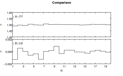
@DavidPark's answer is high quality, extremely well thought out and typical of the care he takes putting together graphics which are designed to display the data in their best light.

An alternative to his Presentations package is LevelScheme. The code below is one graphic that might be produced using this free package.

Needs["LevelScheme`LevelScheme`"]
Block[
 {},
 md1 = {1.48908, 1.49641, 1.49354, 1.50385, 1.49835, 1.49617, 1.50569,
    1.50117, 1.50226, 1.50151, 1.50108, 1.50031, 1.49955, 1.49721, 
   1.49898, 1.50266, 1.50177, 1.50227, 1.49886, 1.50002};

 md2 = {-0.00127783, 0.000556012, 
   0.0000143709, -0.000602328, -0.000375952, -0.00125357, 
   0.0000228143, 0.000175103, 0.000868018, -0.0003298, 0.000230178, 
   0.000222689, -0.0000624273, -0.0000760139, -0.000263302, 
   0.0000826082, 0.000206463, 0.0000507921, -0.0000955452, 
   0.000184107};
 {mnx, mxx} = {1, Length@md1};
 {ny1, xy1} = {Min@md1, Max@md1};
 {ny2, xy2} = {Min@md2, Max@md2};
 Figure[{
   SetOptions[SchemeObject, FontFamily -> "Helvetica", FontSize -> 10],
   ScaledLabel[{.5, .97}, "Comparison", FontSize -> 12, 
    FontWeight -> Bold, Offset -> {0, 0}],
   Multipanel[{2, 1},
    Margin -> 50,
    XPlotRanges -> {mnx, mxx},
    YPlotRanges -> {{1.4, 1.6}, {-.002, .002}},
    XFrameLabels -> {"N"}, BufferB -> 5,
    YFrameLabels -> {"\[Mu]", "\[Mu]"}, BufferL -> 10,
    XFrameTicks -> {LinTicks[1, 20, 2, 2]},
    YFrameTicks -> {
      LinTicks[1.4, 1.6, .05, 1],
      LinTicks[-.002, .002, .002, 1]},
    YGapSizes -> .1, XGapSizes -> .05,
    YPanelSizes -> {1, 1},
    XPanelSizes -> {1},
    First -> "A",
    Order -> Vertical
    ],
   FigurePanel[{1, 1}],
   RawGraphics@
    ListPlot[md1, InterpolationOrder -> 0, PlotStyle -> Black],
   ScaledLabel[{0.085, .86}, "\[ScriptCapitalD]1"],
   FigurePanel[{2, 1}],
   RawGraphics@
    ListPlot[md2, InterpolationOrder -> 0, PlotStyle -> Black],
   ScaledLabel[{0.085, .85}, "\[ScriptCapitalD]2"]
   },
  ImageSize -> 500
  ]
 ]

This produces the image Sample leveScheme graphic

$\endgroup$
2
  • $\begingroup$ Nice, but perhaps you should set the vertical span to be the same in both graphics. This will make it easier to compare the two functions. The first one is literally flattened by the scale. YPlotRanges -> {{1.48, 1.52}, {-.02, .02}} should do it. $\endgroup$
    – Peltio
    Commented Nov 1, 2013 at 14:23
  • $\begingroup$ @Peltio: Of course, this is easy to do (set numbers for YplotRanges & YFrameTicks appropriately). It's just as easy to change the density of ticks on any of the axes. The salient point was that LevelScheme provides a straightforward means to a high-quality end at a great price. $\endgroup$
    – dwa
    Commented Nov 4, 2013 at 4:42
7
$\begingroup$

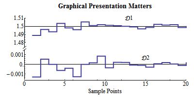
I am rather aghast at how poor those solutions are! Are the two sets of data suppose to be related? They have the same horizontal range so why not put them on top of each other and have only one x axis? Then it is really poor technique to use an Axis plot when the data is crossing the axis. The ticks and labels clobber the data! Look in a journal such as Science and see how many such Axes plots you can find! Then the "mean" line probably should not have been drawn with ListPlot. It is better to draw it separately and use Style to turn off Antialiasing to obtain a sharp line.

Also, I would not too quickly get into writing routines such as genPlot. In a case like this it is better to produce a graphic first by working with the individual elements and doing a lot of perfecting and then, if you are going to produce many such plots, write a routine.

In any case, here is a graphic I produced using the Presentations Application, which I sell for $50. It is an application designed to aid in the production of custom graphics, tables, dynamic presentations, and generally literate notebooks. It has a number of essays on using Mathematica and numerous examples. It is 38 MB in size and has 511 files.

Some of the Presentation routines used here are:

XTickLine and YTickLine for producing free standing scales.

YAxisBreak for producing a broken y axis.

Aliasing as a convenient methods for producing sharp horizontal and vertical lines.

TranslateOp and ScaleOp as convenient post-op commands for graphics transformations.

The ability to freely mix curves and graphics primitives, just drawing one thing after another.

The graphic might be further improved but I don't know enough about what the data represents.

In this approach I am simply drawing on a piece of paper and using scaling and translation to position the curves.

<< Presentations`
Draw2D[
 {YTickLine[{0, 4, -0.01}, {-0.0015, 0.0010}, {-0.001, 0.0010, 0.001},
    5],
  YAxisBreak[5, 2, 0.2, 0.2],
  YTickLine[{6, 10, -0.01}, {1.48, 1.51}, {1.48, 1.51, 0.01}, 5],
  XTickLine[{0, 20, -0.2}, {0, 20}, {0, 20, 5}, 5],
  (* Draw the second set *)
  {Aliasing@Draw[0, {x, 0, 20}],
     ListDraw[meandatf2,
      Joined -> True, Mesh -> None, PlotStyle -> Thick,
      InterpolationOrder -> 0]} // ScaleOp[{1, 1600}, {0, 0}] // 
   TranslateOp[{0, 2.4}],
  (* Draw the first set *)
  {Aliasing@Draw[3/2, {x, 0, 20}],
     ListDraw[meandatf1,
      Joined -> True, Mesh -> None, PlotStyle -> Thick,
      InterpolationOrder -> 0]} // ScaleOp[{1, 400/3}, {0, 0}] // 
   TranslateOp[{0, -191.33}],
  (* Add Labels *)
  Text["\[ScriptCapitalD]1", {13, 10}],
  Text["\[ScriptCapitalD]2", {15, 3.5}],
  Text["Sample Points", {10, -2}],
  Text[Style["Graphical Presentation Matters", 14, Bold], {10, 12}]},
 AspectRatio -> 1/2,
 Frame -> False, Axes -> False,
 PlotRange -> {{-3, 21}, {-3, 13}},
 BaseStyle -> {FontSize -> 12},
 ImageSize -> 400]

enter image description here

$\endgroup$
3
  • 2
    $\begingroup$ Pesentation Matters, but spelling not so much... Nice output though :-) $\endgroup$ Commented Nov 1, 2013 at 11:13
  • $\begingroup$ Nice demo of the Presentations package, which I never knew existed. $\endgroup$
    – shrx
    Commented Nov 1, 2013 at 11:59
  • $\begingroup$ Sorry about the spelling. I was doing it in the middle of the night and have corrected it. $\endgroup$
    – David Park
    Commented Nov 1, 2013 at 14:47
6
$\begingroup$

Another solution that worked for me (besides using Grid[] that @JasonB suggested) is to set ImageSize->Full in genPlot[]. According to the docs this means "fill out the enclosing region". Then, use ImageSize->600 or whatever value to GraphicsRow. As the container increases in size, the contained cells follow because they try to fill in all the region.

enter image description here

$\endgroup$
2
  • 1
    $\begingroup$ AspectRatio -> Full can sometimes also be useful in these situations. $\endgroup$ Commented Nov 2, 2013 at 20:32
  • $\begingroup$ I believe the minimal and best solution is per my suggestion here. Does it work for you? $\endgroup$
    – Hedgehog
    Commented Jan 1, 2018 at 22:09
5
$\begingroup$

Aside from the variety of good formatting alternatives presented in the answers here, I suspect that the problem comes from the PlotLegends option, which causes the output to have the head Legended instead of Graphics.

Head /@ {plot1, plot2}
(* {Legended, Legended} *)

Further Legended has its own DisplayFunction that I suspect interferes with its display in GraphicsRow. GraphicsRow uses Inset to align graphics inside another Graphics. I have occasionally but rarely found that Inset does not play nice with some objects, but I've never been able to fully understand why.

If you use PlotLabel instead of PlotLegends, the plots can be shown in GraphicsRow. If you need PlotLegends, then adapt one of the other answers.

genPlot[c_, dat_, ymin_, ymax_, legend_] := 
 ListPlot[{Table[c, {Length[dat]}], dat}, AxesLabel -> {"N", "\[Mu]"},
   PlotRange -> {Automatic, {ymin, ymax}}, PlotLabel -> legend, Joined -> True, 
   Mesh -> None, InterpolationOrder -> 0, ImageSize -> 400]

plot1 = genPlot[3/2, meandatf1, 1.45, 1.55, "\[ScriptCapitalD]1"];
plot2 = genPlot[0, meandatf2, -0.004, 0.004, "\[ScriptCapitalD]2"];

GraphicsRow[{plot1, plot2}]

Mathematica graphics

$\endgroup$
0
$\begingroup$

I believe the following is the most effective abd elegant solution to "ugly" or rasterized text in graphics. This also works for Plot3D ListPointPlot3D etc.

Note: Also this improves the output of MaTeX[] available here

ggrough = Grid[{{plot1, plot2}}];
Export[NotebookDirectory[] <> "rough.pdf", ggrough]
Export[NotebookDirectory[] <> "rough.svg", ggrough]

ggsmooth=Graphics[Inset[gg], ImageSize->{UpTo[900], UpTo[1100]}, AspectRatio -> Full]
Export[NotebookDirectory[] <> "smooth.pdf", ggsmooth]
Export[NotebookDirectory[] <> "smooth.svg", ggsmooth]

Rough notebook display Smooth notebook display

While there is a discernible difference in the MMA Notebook display, enlarging makes the distinction clearer. Note the change of font:

  • Rough PDF and SVG: Rough PDF and enter image description here
  • Smooth PDF and SVG: Smooth PDF and enter image description here
$\endgroup$

Your Answer

By clicking “Post Your Answer”, you agree to our terms of service and acknowledge you have read our privacy policy.

Not the answer you're looking for? Browse other questions tagged or ask your own question.