I have a list of points that I am trying to plot. Is there a way to make a ListPlot where the y-axis increases normally by 1 every interval but the x-axis increases by $x^2$, i.e., 1, 4, 9, 16, etc.?
$\begingroup$
$\endgroup$
3
-
$\begingroup$ Welcome to Mathematica.SE! I hope you will become a regular contributor. To get started, 1) take the introductory Tour now, 2) when you see good questions and answers, vote them up by clicking the gray triangles, because the credibility of the system is based on the reputation gained by users sharing their knowledge, 3) remember to accept the answer, if any, that solves your problem, by clicking the checkmark sign, and 4) give help too, by answering questions in your areas of expertise. $\endgroup$– bbgodfreyCommented Jun 4, 2015 at 19:27
-
$\begingroup$ closely related, unfortunately my answer doesn't seem to work in V10. $\endgroup$– KubaCommented Jun 4, 2015 at 20:49
-
$\begingroup$ of course the requested power law interval is not logarithmic. You ought to edit the question or title to clarify what you mean. $\endgroup$– george2079Commented Jun 16, 2015 at 19:47
Add a comment
|
3 Answers
$\begingroup$
$\endgroup$
This is precisely what ListLogLinearPlot achieves--logarithmic $x$ and linear $y$ axes:
ListLogLinearPlot[Table[{n, Sqrt[n]}, {n, 100}]]
$\begingroup$
$\endgroup$
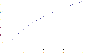
You need to make custom ticks and transform the data:
 list = Table[ {x, Log[x]} , {x, 1, 25} ];
 ListPlot[{Sqrt[#[[1]]], #[[2]]} & /@ list ,
               Ticks -> {{#, #^2} & /@ Range[1, 5], Automatic} ]

$\begingroup$
$\endgroup$
1
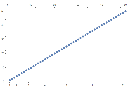
To do this, you can define your own ticks marks when you do the plot.
   data = Table[{i, i}, {i, 1, 50, 1}]
   SpecialTicks = Table[{i^2, i}, {i, 1, 50, 1}];
   ListPlot[data, Frame -> True, FrameTicks -> {{Automatic, None}, {SpecialTicks, All}}]

Here, I've added "All" just to show the linear tick marks at the top of the graph, but you can remove them.
-
$\begingroup$ I changed from ListLinePlot to ListLogLinearPlot but it didn't connect the data points anymore. So I had to add ,Joined -> True. I also had to fiddle with axis origin to remove a vertical line that appeared. $\endgroup$– simonCommented Dec 12, 2019 at 18:13
