1
$\begingroup$

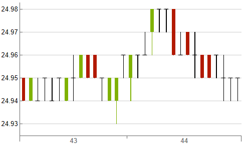
I use CandlestickChart to display some price data. The data is only 30 seconds long and contains one candle per second. I'd like the chart to display a separate tick on the x-axis for every single second. I tried:

CandlestickChart[data, TargetUnits -> {"Seconds", "Dollars"}]

enter image description here

Unfortunately, as you can see the chart still shows just vague regions for minutes on the x-axis. Which syntax can I use to make it show year-month-day-hour-minute-second for each candle?

PS: The data is in the following format for each candle:

data = {
           ... ,
           {{year,month,day,hour,minute,second},{open, high,low,close,volume}},
           ...
        }

EDIT:

Example data (not the same as in picture above):

data = { {{2022,9,15,15,43,50},{5, 6,4,5,1}},
         {{2022,9,15,15,43,51},{5, 6,4,5,1}},
         {{2022,9,15,15,43,52},{5, 6,4,5,1}},
         {{2022,9,15,15,43,53},{5, 6,4,5,1}},
         {{2022,9,15,15,43,54},{5, 6,4,5,1}},
         {{2022,9,15,15,43,55},{5, 6,4,5,1}},
         {{2022,9,15,15,43,56},{5, 6,4,5,1}},
         {{2022,9,15,15,43,57},{5, 6,4,5,1}},
         {{2022,9,15,15,43,58},{5, 6,4,5,1}},
         {{2022,9,15,15,43,59},{5, 6,4,5,1}},
         {{2022,9,15,15,44,00},{5, 6,4,5,1}},
         {{2022,9,15,15,44,01},{5, 6,4,5,1}} };

I imagine if the plot works for this data, it will work for my actual data as well.

$\endgroup$
5
  • $\begingroup$ Edit your question to include some data. $\endgroup$
    – Bob Hanlon
    Commented Sep 16, 2022 at 14:39
  • $\begingroup$ @BobHanlon I've added some generated example data. $\endgroup$
    – Kagaratsch
    Commented Sep 16, 2022 at 14:51
  • $\begingroup$ This doesn't look trivial as methods using with ChartLabel and FrameTicks do not work. (It seems CandlestickChart has an override on the x-axis. eg: CandlestickChart[ dataObjects, Frame -> True, FrameTicks -> { { {4.5, 5.5}, None }, { {{2022, 9, 15, 15, 43, 52}, {2022, 9, 15, 15, 43, 58}}, None } }, FrameTicksStyle -> Directive[Orange, 12] ] does not highlight the x-axis.) Could you use another chart type or is CandlestickChart a must ? $\endgroup$ Commented Sep 27, 2022 at 16:25
  • $\begingroup$ @IntroductionToProbability I was hoping to plot a candlestick chart... maybe there is a way to mcGyver together "candlesticks" into a regular Plot? Not sure... $\endgroup$
    – Kagaratsch
    Commented Sep 28, 2022 at 16:21
  • 1
    $\begingroup$ @Kagaratsch you might get inspiration here mathematica.stackexchange.com/q/139653/60568 $\endgroup$ Commented Sep 28, 2022 at 17:19

0

Your Answer

By clicking “Post Your Answer”, you agree to our terms of service and acknowledge you have read our privacy policy.

Browse other questions tagged or ask your own question.