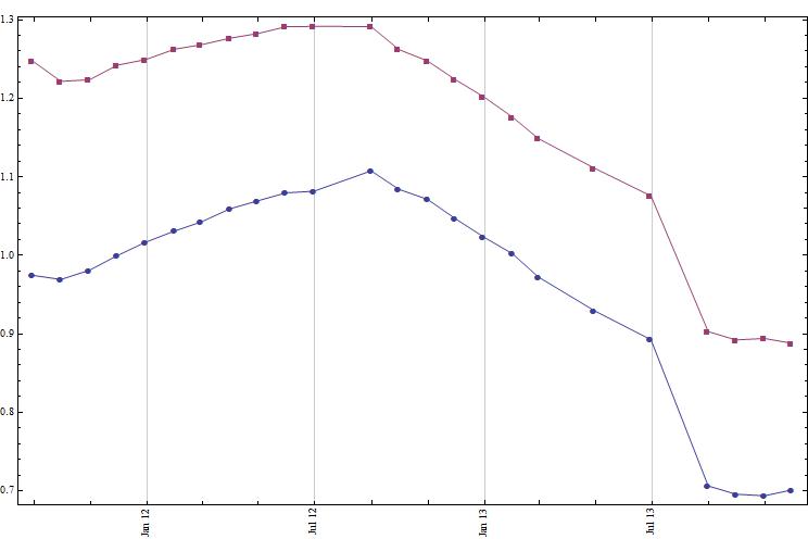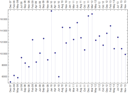
The code below generates the plot above,
DateListPlot[{Drop[series[7], 1], Drop[series[16], 1]},Joined -> True,
              PlotMarkers -> {Automatic, Small}, Frame -> True,
              DateTicksFormat -> {"MonthNameShort", " ", "YearShort"} ] /.
              x : (FrameTicks -> _) :> (x /. s_String :> Rotate[s, 90 Degree])
I would like to show, on the x-axis, each and every one of the dates for which I have data. If that gets too cluttered then I would like to show a sampling of it that covers some of the staggered months. I will paste this into a pdf so tooltips won't be of use. Maybe for within year data, I can mention just the month, if it will improve readability. With non-date data, I know that I can enter ticknames and tick positions but I don't know how to do it with date data and also, I was wondering if this could be automated where I could tell it to show only the month for certain dates and month-year for others.

