Before I ask the exact question, I would like to add that I know similar questions have been asked multiple times but I have tried several of those techniques but have failed to get the desired result in Mathematica 11.3. I have two lists of data which I want to compare with each other by having two contour plots that have the same color axis.
list1={{150, 5, 3.9716}, {300, 5, 4.093}, {450, 5, 4.153}, {600, 5,
  4.1736}, {750, 5, 4.2122}, {900, 5, 4.2176}, {1000, 5,
  4.1704}, {150, 10, 1.5728}, {300, 10, 1.6434}, {450, 10,
  1.6508}, {600, 10, 1.6888}, {750, 10, 1.701}, {900, 10,
  1.7276}, {1000, 10, 1.7168}, {150, 15, 0.9102}, {300, 15,
  0.913}, {450, 15, 0.934}, {600, 15, 0.9244}, {750, 15, 0.927}, {900,
   15, 0.9382}, {1000, 15, 0.9612}, {150, 20, 0.615}, {300, 20,
  0.5922}, {450, 20, 0.5916}, {600, 20, 0.6032}, {750, 20,
  0.6132}, {900, 20, 0.6264}, {1000, 20, 0.6418}, {150, 25,
  0.4348}, {300, 25, 0.4268}, {450, 25, 0.4322}, {600, 25,
  0.4404}, {750, 25, 0.4442}, {900, 25, 0.4566}, {1000, 25,
  0.4446}, {150, 30, 0.3236}, {300, 30, 0.3232}, {450, 30,
  0.318}, {600, 30, 0.331}, {750, 30, 0.3322}, {900, 30,
  0.3384}, {1000, 30, 0.3396}};
list2={{150, 5, 3.1898}, {300, 5, 3.4746}, {450, 5, 3.6446}, {600, 5,
  3.6668}, {750, 5, 3.6532}, {900, 5, 3.6914}, {1000, 5,
  3.7056}, {150, 10, 1.2118}, {300, 10, 1.4098}, {450, 10,
  1.464}, {600, 10, 1.5088}, {750, 10, 1.4864}, {900, 10,
  1.5074}, {1000, 10, 1.4844}, {150, 15, 0.6198}, {300, 15,
  0.749}, {450, 15, 0.7956}, {600, 15, 0.8304}, {750, 15,
  0.8528}, {900, 15, 0.8412}, {1000, 15, 0.831}, {150, 20,
  0.358}, {300, 20, 0.4734}, {450, 20, 0.5176}, {600, 20,
  0.5346}, {750, 20, 0.5352}, {900, 20, 0.5604}, {1000, 20,
  0.5614}, {150, 25, 0.2494}, {300, 25, 0.3254}, {450, 25,
  0.3538}, {600, 25, 0.3774}, {750, 25, 0.397}, {900, 25,
  0.3896}, {1000, 25, 0.3982}, {150, 30, 0.169}, {300, 30,
  0.2262}, {450, 30, 0.2672}, {600, 30, 0.285}, {750, 30,
  0.3014}, {900, 30, 0.3068}, {1000, 30, 0.2946}};
min=0.01;max=5;
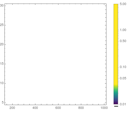
ListContourPlot[list1,
  ScalingFunctions -> {"Linear", "Linear", "Log10"},
  ColorFunction -> MPLColorMap["Viridis"],
  PlotLegends ->
   BarLegend[{MPLColorMap["Viridis"], {min, max}},
    LabelStyle -> Directive[Black], LegendMarkerSize -> 350]]
(MPLColorMap is from here.)
This gave me an empty picture, albeit with the proper legend

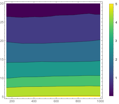
After a survey of posted questions on the forum, I tried the following but to no avail.
ListContourPlot[list1,ScalingFunctions -> "Log10", PlotRange->{min,max},ColorFunctionScaling->False,
 ColorFunction -> (MPLColorMap["Viridis"][Rescale[#, {min, max}]] &),
 PlotLegends ->
  BarLegend[{MPLColorMap["Viridis"], {min, max}},
   LegendMarkerSize -> 370]]]
This gives me:
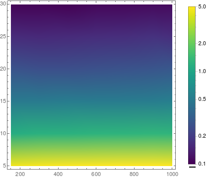
If I use:
min=0.1;
ListDensityPlot[list1,
  ScalingFunctions -> {"Linear", "Linear", "Log10"},
  ColorFunction -> MPLColorMap["Viridis"],
  PlotLegends ->
   BarLegend[{MPLColorMap["Viridis"], {min, max}},
    LabelStyle -> Directive[Black], LegendMarkerSize -> 350]]
This gives me something I would expect:

Consequently if I change scaling functions in the contour plot to ScalingFunctions -> {"Linear", "Linear", "Log10"}, I get an error until I remove the plot range I provide.
Can anyone shed any light as to what is it am I doing wrong and what I can do to have a logarithmic color axis in contour plots to compare the two lists.


ListDensityPlotworks with MMA11.1.10 and MMA11.2. Could you check your code again? In first case with empty plot the barlegend shows 2.0 to 5.0 not 0.1 to 5.0. $\endgroup$