9
$\begingroup$

Is there a way to use a logarithmic scale in the colour legend of a ListContourPlot? The contours can be logged by taking the Log10 of the data, but this doesn't transfer to the legend. As an example, with the code:

test = Flatten[Table[{i, j, Log10[RandomReal[{0, 1*^10}]]}, {j, 1, 100}, {i, 1, 100}], 1];

ListContourPlot[test, InterpolationOrder -> 0, PlotLegends -> Automatic, 
    Contours -> 20, ColorFunction -> "Rainbow", ColorFunctionScaling -> True, 
    PlotRange -> All]
Mathematica graphics

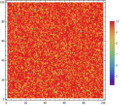
I get equally spaced contours for values <7, 8, 9 and 10. Could I plot these data with equally spaced contours corresponding to values 0.1, 1 and 10?


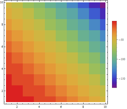
Another example, where you'd expect to see logarithmic data:

test = Flatten[Table[{i, j, Log10@Exp[-(i + j)^2]}, {j, 1, 10}, {i, 1, 10}], 1];
ListContourPlot[test, InterpolationOrder -> 0, 
 PlotLegends -> Automatic, Contours -> 20, ColorFunction -> "Rainbow",
  ColorFunctionScaling -> True, PlotRange -> All]
Mathematica graphics

$\endgroup$
5
  • $\begingroup$ One way is to segment the data into as many sections as you want color resolution, 1) order set 2) divide into k equaly large parts 3) make a function that returns which division a value would lie in divided by number of divisions 4) scale ColorFunctions argument with that manually, I tried implementing this but got stuck here's how far I got $\endgroup$
    – ssch
    Commented Dec 17, 2012 at 19:28
  • $\begingroup$ I wonder if the CustomTicks package can be used here. $\endgroup$
    – Eli Lansey
    Commented Dec 17, 2012 at 19:34
  • $\begingroup$ Misunderstood the question, but I guess you could still pass the divisions to Contours $\endgroup$
    – ssch
    Commented Dec 17, 2012 at 19:58
  • $\begingroup$ Do you get something close to what you need playing with the parameters in PlotLegends -> BarLegend[{"Rainbow", {0, 1}}, Function[{min, max}, Rescale[{.1, 1, 5, 10}, {0, 10}, {min, max}]]]? $\endgroup$
    – kglr
    Commented Dec 17, 2012 at 22:53
  • $\begingroup$ Thank you all for your valuable help! Unfortunately I was not yet able to solve my problem. Using kguler's suggestion, the tick values in the legend are displayed as I would want them, but the colour gradation stays the same - not logarithmic as I would like. To make myself clear, the jump in colour from 0.1 to 1 is smaller than the jump from 1 to 10, and so on. Any further suggestions are appreciated! Thanks $\endgroup$
    – user5071
    Commented Dec 18, 2012 at 11:51

1 Answer 1

6
+50
$\begingroup$

I think I found a way to solve the problem.

Using a different example:

test = Flatten[Table[{i, j, Exp[RandomReal[{0, 10}]]}, {j, 1, 100}, {i, 1, 100}], 1];

min = Log[10, Min[test[[;; , 3]]]];
max = Log[10, Max[test[[;; , 3]]]];

ListContourPlot[test,
InterpolationOrder -> 0, 
Contours -> Flatten[Table[{1., 2., 5.}*10^n, {n, 1, 4}]], 
ColorFunction -> Function[{f}, ColorData["Rainbow"][(Log[10, f] - min)/(max - min)]],
ColorFunctionScaling -> False,
PlotLegends -> BarLegend[Automatic, All], 
PlotRange -> All]

The result is

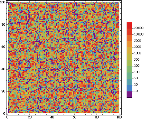
enter image description here

Thank you all for your input!

$\endgroup$
0

Your Answer

By clicking “Post Your Answer”, you agree to our terms of service and acknowledge you have read our privacy policy.

Not the answer you're looking for? Browse other questions tagged or ask your own question.