1
$\begingroup$

Suppose I have a relationship between four different variables, two of which are discrete and the other two are continuous. For example, let's look at the Binomial Distribution's PMF. If a random variable $X$ follows $B(n,p)$, meaning $P(X=x)= {n \choose x}p^x(1-p)^{n-x}$, then the four values I would want to plot would be:

$P(X=x)$, which is continuous and between 0 and 1.

$x$, which is discrete and a non-negative integer.

$n$, which is discrete and a non-negative integer.

$p$, which is continuous and between 0 and 1.

The only way that I can think of to effectively visualize this in Mathematica would be to use an ArrayPlot with the $x$ and $n$ being the axes and one of $P(X=x)$ or $p$ being mapped to a color function and the other to "time" (such as a slider in manipulate or an animation).

But suppose I wanted one axis of ArrayPlot to be one of the continuous variables and another to be one of the discrete variables. Well, ArrayPlot isn't really the best for the job anymore. But I'm not sure what other options would be good for the job. How would you do it?

$\endgroup$
1

3 Answers 3

1
$\begingroup$

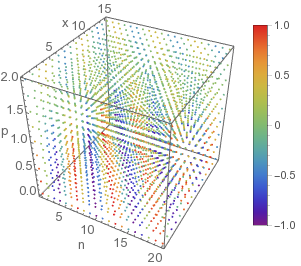
Here is another way to visualise using the fourth variable as colour.

f[n_, x_, p_] = Sin[n + x] Cos[p]; (*any function*)
data = Flatten[Table[{n, x, p, f[n,x,p]}, {n,1,20,1}, {x,1,15,1}, {p, 0, 2, 0.25}],2];
(*a 4 column data*)
zmin = Min[data[[All, 4]]]
zmax = Max[data[[All, 4]]]
Grid[{{Graphics3D[{ColorData["Rainbow"][(#[[4]] - zmin)/(zmax - zmin)], 
       PointSize[0.01], Point[#[[1 ;; 3]]]} & /@ data, 
       BoxRatios -> {1, 1, 1}, Axes -> True,
       AxesLabel -> {"n", "x", "p"}, LabelStyle -> 12],
     BarLegend[{"Rainbow", {zmin, zmax}}]}}]

enter image description here

Note that the method is applicable for both discrete and continuous variables.

$\endgroup$
1
$\begingroup$

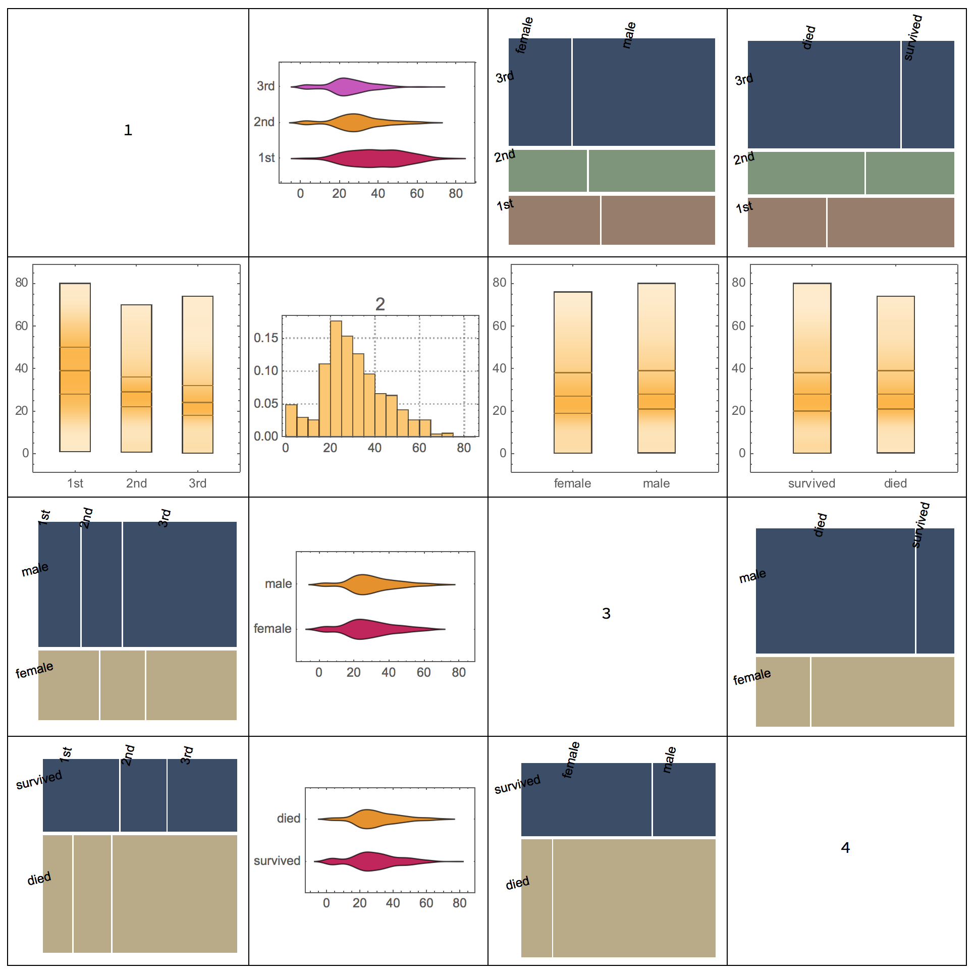
May you can use the function VariableDependenceGrid of the package MathematicaForPredictionUtilities.m... Here is an example.

data = ExampleData[{"MachineLearning", "Titanic"}, "Data"];
data = Map[Flatten, List @@@ data];

Import["https://raw.githubusercontent.com/antononcube/\
MathematicaForPrediction/master/MathematicaForPredictionUtilities.m"]

VariableDependenceGrid[data]

enter image description here

?VariableDependenceGrid

VariableDependenceGrid[data_?MatrixQ,columnNames,opts] makes a grid with variable dependence plots.

$\endgroup$
0
$\begingroup$

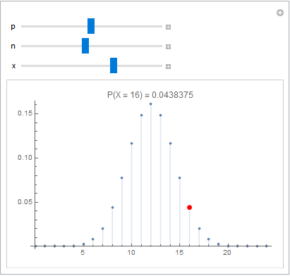
It depends on what you're hoping to get from your visualization. If you're just looking for a way to get a feel for how the various quantities relate to each other, and you're happy using Manipulate, perhaps this work for you?

ClearAll[n, p, x, v]
Manipulate[
 Show[
  DiscretePlot[
   PDF[BinomialDistribution[n, p], v],
   {v, 0, n},
   PlotRange -> All, PerformanceGoal -> "Quality"],
  Graphics[{PointSize[Large], Red, 
    Point[{x, PDF[BinomialDistribution[n, p], x]}]}],
  PlotLabel -> 
   "P(X = " <> ToString[x] <> ") = " <> 
    ToString[PDF[BinomialDistribution[n, p], x]]
  ],
 {{p, 0.5}, 0, 1}, {{n, 10}, 2, 50, 1}, {{x, 0}, 0, n, 1}]

enter image description here

But if you want something a bit less slider-y and a bit more flashy, that probably won't fit the bill.

$\endgroup$

Your Answer

By clicking “Post Your Answer”, you agree to our terms of service and acknowledge you have read our privacy policy.

Not the answer you're looking for? Browse other questions tagged or ask your own question.