I am hoping to get some guidance as to how to tackle this problem. I have the following sample dataset with the dates in YYYYMMDD format:
data={{{20120802}, 193.9}, {{20120912}, 493.9}, {{20130412}, 33.9},{{20130502}, 193.9},
 {{20130802}, 193.9}, {{20130822}, 193.9}, {{20131002}, 193.9}, {{20131022}, 193.9}};
The "Y" values themselves don't matter for this question since I am looking at frequency. I am wondering how I would be able to calculate the frequency that such data points occur relative to the time period. I want to divide it so when I graph it in a line plot, it is divided into 4 quarters (3 months each) over the span of several years (in the example above it is 2 years) and for each quarter it includes all the points that occurred within that date range.
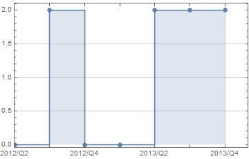
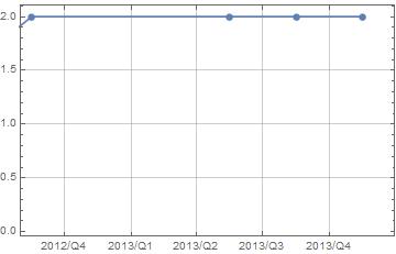
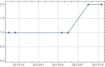
For visualization sake with the data above, the line plot that I want to make would have an x-axis with the tickers: 2012Q1, 2012Q2, 2012Q3, 2012Q4, 2013Q1, 2013Q2, 2013Q3, 2013Q4 and the data points would only be located on those tickers. So for points {{20130412},33.9},{{20130502},193.9}, this would be a "2" on the y-axis and have the x-coordinate of 2013Q2.
If any has any pointers on how to tackle this I would really appreciate it.


