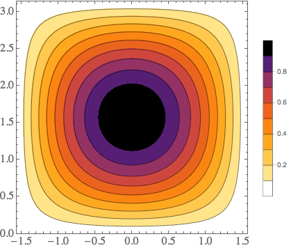
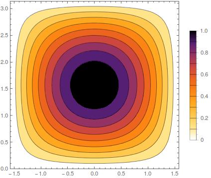
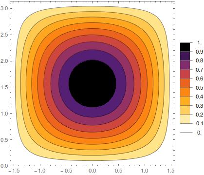
I have been struggling recently to get a bar legend appearance the way I want.
I have a contour plot which shows a transmission coefficient going from 0 to 1, with 9 contours (constant 0.1, 0.2, ..., 0.9) and I would like the bar legend to display the labels 0.2, 0.4, 0.6, 0.8, as well as values 0 and 1.
A simple example with the commands I have been using so far is displayed below:
testplot = ContourPlot[Cos[x]*Sin[y], {x, -Pi/2, Pi/2}, {y, 0, Pi}, PlotRange -> {{-Pi/2, Pi/2}, {0, Pi}, {0, 1}}, PlotLegends -> {Placed[BarLegend[Automatic, Ticks -> {0, 0.2, 0.4, 0.6, 0.8, 1}, LegendMarkerSize -> 250], Right]}, ColorFunction -> ColorData[{"SunsetColors", "Reverse"}], Contours -> 9, Exclusions -> None]
which yields
How to add extremum values 0 and 1 to the bar legend, please?


Contours -> 12it will work. $\endgroup$