12
$\begingroup$

I am having trouble making a custom range for a legend in ContourPlot since the legend doesn't "talk" to the PlotRange and adjust its scale accordingly. How do I go about fixing this?

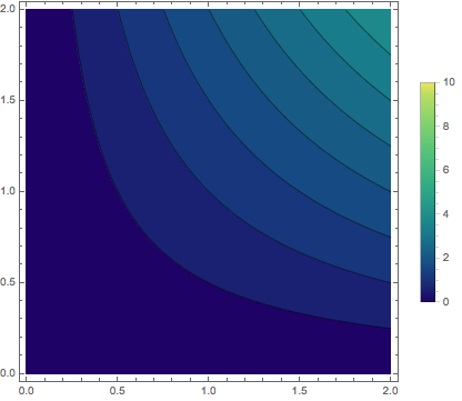
As an explicit example consider the following. If I run ContourPlot with an automatic legend I get the right scaling:

 ContourPlot[x y , {x, 0, 2}, {y, 0, 2}, PlotLegends->Automatic,
ColorFunction ->"BlueGreenYellow"]
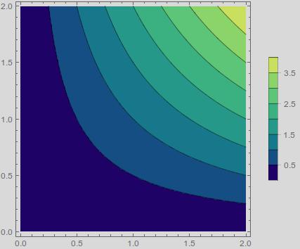
enter image description here

But if I use a custom legend range then the legend no longer corresponds to the image:

ContourPlot[x y , {x, 0, 2}, {y, 0, 2},
PlotLegends -> BarLegend[{"BlueGreenYellow", {0, 10}}]
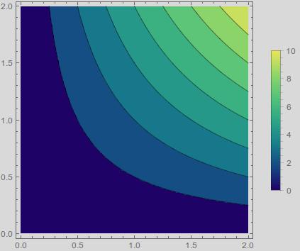
enter image description here

How do I get the plot to use the same scale as the legend?

$\endgroup$

2 Answers 2

13
$\begingroup$

This was more involved than I expected. First, you need to set the ColorFunction to encompass the full range,

ColorData[{"BlueGreenYellow", {0, 10}}]

Interestingly, I did not know about that form of ColorData until earlier this week, so I recommend reading through the Details section closely. Now, to use this within ContourPlot, you need to set

ColorFunctionScaling -> False

otherwise ContourPlot will rescale everything. As to the legend, you need to specify both the contour range, like you were doing, and the number of contours to force it to use the range correctly,

BarLegend[{Automatic, {0, 10}}, 20]

Note the use of Automatic, the color function is automatically passed to the legend, so you do not to add it again. The range is necessary because the legend is only passed the range present in the plot itself. Lastly, the number of contours has to be large enough for BarLegend to use the full range, and 20 works here. All together, this is

ContourPlot[x y, {x, 0, 2}, {y, 0, 2},
  PlotLegends -> BarLegend[{Automatic, {0, 10}}, 20], 
  ColorFunction -> ColorData[{"BlueGreenYellow", {0, 10}}],
  ColorFunctionScaling -> False
]

enter image description here

$\endgroup$
3
  • $\begingroup$ @m_goldberg thanks for fixing the typo. $\endgroup$
    – rcollyer
    Commented Jul 6, 2015 at 3:01
  • $\begingroup$ Doesn't PlotLegends -> BarLegend[{Automatic, {0, 4}}, {Automatic, 8}], ColorFunction -> ColorData[{"BlueGreenYellow", {0, 4}}] give a plot closer to what the OP asks for? The results of using these options look better to me. $\endgroup$
    – m_goldberg
    Commented Jul 6, 2015 at 3:15
  • $\begingroup$ @rcollyer This is much more clever than the way i resolved this problem. Thanks for the different perspective! I explicitly normalized the function being plotted and the color function - forcing both functions to scale from zero to one. I should really read the details on the ColorData as you suggest! $\endgroup$
    – xsk8rat
    Commented Jul 6, 2015 at 3:32
8
$\begingroup$

This is an addendum to rcollyer's answer. I'll delete this should he choose to incorporate the gist of this answer into his.

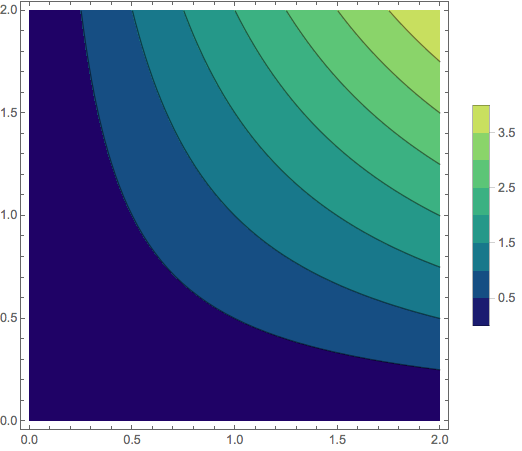
I think there are better choices to be made for the PlotLegends and ColorFunction options. Consider the following:

ContourPlot[x y, {x, 0, 2}, {y, 0, 2}, 
  PlotLegends -> BarLegend[{Automatic, {0, 4}}, {Automatic, 8}], 
  ColorFunction -> ColorData[{"BlueGreenYellow", {0, 4}}], 
  ColorFunctionScaling -> False]

plot

$\endgroup$
1
  • 1
    $\begingroup$ I think {Automatic, 8} is a good variant for the contours, but as to the range of interest: the op asked for 0 to 10. That said, the range used is mostly semantics in this case as the important part is in how to get both the legend and the plot to use a color function that is outside of the usual 0 to 1 range. +1 $\endgroup$
    – rcollyer
    Commented Jul 6, 2015 at 12:42

Your Answer

By clicking “Post Your Answer”, you agree to our terms of service and acknowledge you have read our privacy policy.

Not the answer you're looking for? Browse other questions tagged or ask your own question.