Not only scaling of Y-axis but also an alignment of X-axis appears to be somehow "brute-force".
I'll show an example on a harmonic signal:
NumberOfObservations = 600;
Signal = Table[Sin[ 2 Pi/40 x], {x, 0, NumberOfObservations}];
ListPlot[Signal, FrameLabel -> {"Time/minute", "Amplitude/Pa"},
 ImageSize -> Large, Frame -> True, LabelStyle -> "Author",
 GridLines -> Automatic]
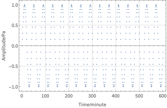
We generated a sine wave, amplitude 1, period = 40 minutes (2400 s), 600 samples. This should correspond to magnitude 0 at 0.00042 Hz, the rest should be at the background level.
So, you perform spectral analysis:
FFTValues = 2*Fourier[Signal]/Sqrt[NumberOfObservations];
FFTValuesR = 10 Log10[Abs[
  RotateRight[FFTValues, Floor[NumberOfObservations/2] - 1]]];
swapping the values is very important, such that your frequencies are aligned with the values. The values are already converted to decibel scale. Remember, that decibel scale is reference scale. So in fact you display how the value relates to the arbitrary value. In this case, it is 1 nm, but you should make sure that your reference is consistent with what you'd like to display. In sound, it is a pressure 10W/m2 if I'm not mistaken (please double check!). In systems, e.g. electronics, your reference is input signal.
If it turns out it should be power, not energy/amplitude, use factor 20 instead of 10.
Now, we can also scale frequencies accordingly. Here, for complexity, we had samples in minutes but frequency is in Hz (1/s):
cps2cpm = 1/60;
Dv = cps2cpm/NumberOfObservations;
frequencyValues =
  Table[Dv (i - NumberOfObservations/2), {i, 1,
    NumberOfObservations};
Confirm what is the sampling rate of your signal in order to obtain proper units on x-axis. This solution is much more robust than the way you select samples manually. So, finally, the plot:
FFTPlot =
  ListPlot[Table[{frequencyValues[[i]], FFTValuesR[[i]]}, {i, 1,
     NumberOfObservations}],
   PlotRange -> {{0, Dv NumberOfObservations/2}, {-40,0},
   FrameLabel -> {"Frequency/Hz", "Magnitude/dB"}, ImageSize -> Large,
   Frame -> True, LabelStyle -> "Author",
   GridLines -> Automatic];
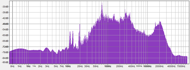
You can add an option Filling->Axis and use ListLogLinearPlot (as you did) if you want to make it more "audacity-like".
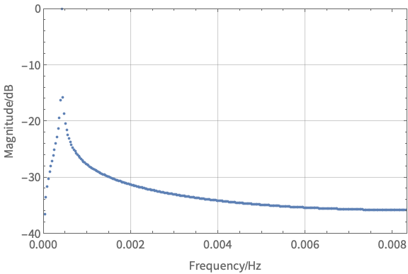
So the peak matches the expectation. This was simple example for one frequency for demonstration. You could simply use the signal you have.
BONUS: In signal processing, prior to Fourier transform, you might need to multiply the signal by the window function (tapering). You could use HannWindow for example. This could sharpen your peak, and what we see in the plot is an effect of a subtle spectral leakage.


ListLogLogPlot? $\endgroup$