Edit
I updated the definitions of reportColorRange and colorLegend: added more comments in the code, allowed more customization options for the legend. Color gradients are produced by VertexColors for better-looking PDF export; gradients can also be replaced by color bands (using the "ColorSwathes" option). The labels on the color bar can be specified by adding the option Contours -> n where n is the number of subdivisions of the color legend. I'll add some examples at the end ot illustrate these new features.
End Edit
This question needs two parts to be answered fully:
- How to extract the range of height values from a
ListDensityPlot
- How to get a legend, because
ShowLegend has many problems: e.g., the numerical labels on the color bar are cut off, and it's just plain ugly.
So I'll address both points here.
Extract height range
This is a particular challenge if the plot range is clipped, as happens for example when there is a near-divergence in the plot. To get the necessary values, one could do what Michael suggested in his answer. Instead, I collect the height values at the time the plot is created. My rationale is that this may make it possible to apply the same extraction algorithm not just to ListDensityPlot but also to other types of plot that work with ColorFunction, such as ContourPlot, in a more robust way that doesn't depend precisely on the internal tree structure of the plot output. I'll test that below, but first let's define a test list that has a near-singularity:
t = Flatten[
   Table[{x, y, 2/((x - 1)^2 + y^2)}, {x, -5, 5, .3}, {y, -5, 5, .3}],
    1];
The function that extracts all the necessary information while simultaneously doing the plot is defined here:
reportColorRange[plotFunction_] := Module[
  {p, min, max, plotHead, plotBody, colFunc, colScale, h, b, cf,
   cfs},
  {plotHead, plotBody} = First@Cases[
     Hold[plotFunction], h_[b__] -> {h, Hold[b]}, 1
     ];
  (* plotBody is kept inside Hold because it will later be wrapped in
     plotHead which may have attribute HoldAll *)
  colFunc = Replace[
    (* Replace wraps string colorfunction names in ColorData[...] *)
       First@
     Join[Cases[plotBody,
       HoldPattern[ColorFunction -> cf_] -> cf], {ColorData[
        "LakeColors"]}
      (*Extract color function or use default*)
      ],
    s_String :> ColorData[s]];
  colScale =
   First@Append[
     Cases[plotBody,
      HoldPattern[ColorFunctionScaling -> cfs_] -> cfs], True
     (*ColorFunctionScaling is True by default*)];
  (*Turn off ColorFunction and scaling:*)
  plotBody =
   plotBody /.
    HoldPattern[ColorFunction -> _] |
      HoldPattern[ColorFunctionScaling -> _] -> Sequence[];
  (*Make plot with Hue because it takes a single argument that's
    linear in the heigh value.*){min, max} =
   {Min[#], Max[#]} &@Flatten@Last@Reap[
       p =
        Apply[
         plotHead,
         Join[
          (*  Join creates a single Hold[...] expression,
          and Apply replaces hold with plotHead: *)
          plotBody,
          Hold[
           (* Collect the function values -
           color function scaling must be turned off: *)
           ColorFunction -> {(Sow[#]; Hue[#]) &},
           ColorFunctionScaling -> False]
          (* Hue now could have arguments outside the interval [0,1].
          We'll recover them when restoring the original
           ColorFunction. *)
          ]
         ]
       ];
  (*Reap collects the unscaled height values,
  and we keep the extremal values max,
  min to rescale if desired:*)
  {If[
    (* If p consists of ploygons colored by Hue,
    convert it back to the original color function: *)
    Cases[p, Hue[_], Infinity] =!= {},
    If[
     (* Recover function values from Hue and plot them with desired
        color, scaled/unscaled: *)
     colScale,
     p /. Hue[x_] :> colFunc[(x - min)/(max - min)],
     p /. Hue[x_] :> colFunc[x]
     ],
    (* If plotHead is one of my private custom plot functions,
    then p may be a raster image where Hue no longer appears
     explicitly. Then we have to re-
    do the entire plot with the original color function: *)

    plotFunction
    ], colFunc,
   {min, max}
   }
  (* The auxiliary Hue is replaced by the original ColorFunction
     stored in colFunc.*)]
SetAttributes[reportColorRange, HoldAll];
The last line means that you can provide an argument to this function that represents a density plot command, but the command isn't executed right away. Instead, the command is stored in the variable plotFunction and then pre-processed by changing the color function temporarily. The original, user-specified (or default) color function is restored to the plot result after extracting the height values.
Here is what the function does to a ListDensityPlot of the test table t:
{plot, colors, range} =
 reportColorRange[
  ListContourPlot[t]
  ]

This will work with DensityPlot or ListDensityPlot as well. The last tuple is the desired range information, and the first element is the plot. In the middle, we also receive the color function that has been used. I keep that information because it's needed to make the plot legend next.
Important usage note: As mentioned above, reportColorRange monitors the plotting function as it creates the plot. Therefore, you have to provide the actual plotting function as the argument: reportColorRange[DensityPlot[...]] and not something like this: p = DensityPlot[...]; reportColorRange[p]. The latter won't work because the variable p then contains the already finished plot, and this can't be used to monitor the true minima and maxima of the function range that was explored during the creation of p.
Color bar legend
The legend first needs a color bar, and the output of the above test shows us how to get started: just look at the InputForm of the bar appearing in ColorDataFunction and copy the code. That's essentially what I did to define the colorLegend function listed below. There are a couple of other functions required for the display that I'll also list here:
trimPoint[n_,
  digits_] :=
 (* display number n with given number of sig. digits, \
trim trailing decimal point *)
 NumberForm[n, digits,
  NumberFormat -> (DisplayForm@
      RowBox[Join[{StringTrim[#1, RegularExpression["\\.$"]]},
        If[#3 != "", {"\[Times]", SuperscriptBox[#2, #3]}, {}]]] &)]

Options[colorLegend] = {LabelStyle -> Black, Background -> LightGray,
   FrameStyle -> None, RoundingRadius -> 10, "ColorSwathes" -> None,
   "LeftLabel" -> False, "Digits" -> 3, Contours -> None,
   BoxFrame -> 0, "ColorBarFrameStyle" -> Black};

colorLegend[cFunc_, rawRange_, OptionsPattern[]] := Module[
  {frameticks, tickPositions, nColor, nTick,
   range =
    N@Round[rawRange,
      10^Round[Log10[Abs@First@Differences[{-1.5, .5}]]]/1000],
   colors,
   contours = OptionValue[Contours],
   colorBarLabelStyle = OptionValue[LabelStyle],
   colorBarFrameStyle = OptionValue["ColorBarFrameStyle"],
   outerFrameStyle = OptionValue[FrameStyle],
   colorSwathes = OptionValue["ColorSwathes"]
   },
  (* Here we decide how many color gradations to diplay -
  either a given number, equally spaced, or "continuous," i.e.
  256 steps: *)
  Switch[colorSwathes,
   _?NumericQ,
   nColor = colorSwathes;
   colors = (Range[nColor] - 1/2)/nColor;
   nTick = nColor,
   _,
   nColor = 256;
   colors = (Range[nColor] - 1)/(nColor - 1);
   nTick = 1
   ];
  (* Number of labels is nTick+1,
  unless changed by numerical Contours setting below: *)
  Switch[contours,
   _?NumericQ,
   tickPositions = (range[[
        1]] + (range[[-1]] - range[[1]]) (Range[contours + 1] - 1)/
         contours);
   ,
   List[Repeated[_?NumericQ]],
   tickPositions = contours,
   _,
   tickPositions = (range[[
        1]] + (range[[-1]] - range[[1]]) (Range[nTick + 1] - 1)/nTick);
   ];
  frameticks = {If[TrueQ[OptionValue["LeftLabel"]],
       Reverse[#], #] &@{None,
      Function[{min,
        max}, {#, trimPoint[#, OptionValue["Digits"]], {0, .1}} & /@
        tickPositions]}, {None, None}};
  (* DisplayForm@
  FrameBox replaces Framed because it allows additional BoxFrame
   option to specify THICKNESS of frame: *)
  DisplayForm@FrameBox[
    (* Wrapped in Pane to allow unlimited resizing: *)
    Pane@Graphics[
      Inset[
       Graphics[
        (* Create strip of colored, translated unit squares.
        If colorSwathes are selected,
        colors don't vary inside squares. Otherwise,
        colors vary linearly in each of 256 squares to get smooth
        gradient using VertexColors: *)
        MapIndexed[
         {
           Translate[
            Polygon[
             {{0, 0}, {1, 0}, {1, 1}, {0, 1}},
             VertexColors ->
              {
               cFunc[#[[1]]], cFunc[#[[1]]], cFunc[#[[2]]],
               cFunc[#[[2]]]
               }
             ],
            {0, #2[[1]] - 1}
            ]
           } &,
         Transpose[
          If[
           colorSwathes === None
           ,
           {Most[colors], Rest[colors]}
           (*
           Offset top versus bottom colors of polygons to create
            linear VertexColors *)
           ,
           {colors, colors}
           (*
           Top and bottom colors are same when uniform colorSwathes
            are desired *)
           ]
          ]
         ]  (** End MapIndexed **),
        (* Options for inset Graphics: *)
        ImagePadding -> 0,
        PlotRangePadding -> 0,
        AspectRatio -> Full
        (* AspectRatio ->
        Full allows colored squares to strecth with resizing in the
         following. *)
        ],
       (* Options for Inset: *)
       {0, First[range]},
       {0, 0},
       {1, range[[-1]] - range[[1]]}
       (*
       this sets the size of the inset in the enclosing Graphics
        whose PlotRange is given next: *)
       ],
      (* Options for enclosing Graphics: *)
      PlotRange -> {{0, 1}, range[[{1, -1}]]},
      Frame -> True,
      FrameTicks -> frameticks,
      FrameTicksStyle -> colorBarLabelStyle,
      FrameStyle -> colorBarFrameStyle,
      AspectRatio -> Full
      ],
    (* Options for FrameBox: *)
    Background -> OptionValue[Background],
    FrameStyle -> outerFrameStyle,
    RoundingRadius -> OptionValue[RoundingRadius],
    BoxFrame -> OptionValue[BoxFrame]
    ]
  ]

at[position_, scale_: Automatic][obj_] :=
  (*
  convenience function to position objects in Graphics *)
  Inset[obj, position, {Left, Bottom}, scale];

display[g_, opts : OptionsPattern[]] := Module[
  {frameOptions = FilterRules[{opts}, Options[Graphics]]},
  (* Same as Graphics, but with fixed PlotRange *)
  Graphics[
   g,
   PlotRange -> {{0, 1}, {0, 1}},
   Evaluate@Apply[Sequence, frameOptions]
   ]
  ]
The functions at and display are adapted from another answer and serve only to make it easier to position the plot and its legend in a single Graphics.
The trimPoint is adapted from here, and is intended to make the labels in the legend look nicer.
To illustrate how it's used, take the above example plot for t:
contour = display[{
   plot // at[{0, 0}, .8],
   colorLegend[colors, range] // at[{0.85, .1}, Scaled[{.15, .5}]]},
  AspectRatio -> .85]
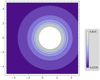
The variables plot, colors and range are the ones returned by reportColorRange above.
The first argument of at is the desired position of the bottom left corner of the Graphics object preceding them. These positions are measured in a range from 0 to 1 across the horizontal and vertical dimensions of the output.
The second argument of at is the scale at which the preceding graphic is to be placed in the output. It could be be specified as a single number (e.g, 0.8 above), as a tuple {width, height} or as a Scaled tuple (e.g., Scaled[{.15, .5}] above). The Scaled is useful only if you plan to include the final result in another plot, because then Scaled will be measured relative to that new size. I'm using that for the colorLegend, but it's not required.
The colorLegend is very malleable, in that you can stretch or squeeze it arbitrarily using the second (scale) argument to at.
To show some more customization, let's take different example:
{plot, colors, range} =
  reportColorRange[
   DensityPlot[1/(x^2 + y^2), {x, -5, 5}, {y, -5, 5},
    ColorFunction -> ColorData["FallColors"],
    ClippingStyle -> Automatic]
   ];

density = display[{
   plot // at[{0, 0}, 1],
   colorLegend[colors, range, "Digits" -> 2] //
    at[{0.8, .1}, Scaled[{.15, .5}]]},
  AspectRatio -> 1]
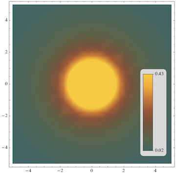
Here, I placed the legend inside the plot. That happened because the width for plot is specified by at to be 1 (corresponding to 100%), and the bottom right corner of the legend has been placed at position {0.8, .1}.
The plot legend can sometimes become too ugly if you include too many digits of the height extrema. That's why I added an option "Digits" -> 2 to the function that specifies the number of significant digits to display in the labels. The other options accepted by colorLegend are "LeftLabel" (if True, make labels on the left of the color bar), LabelStyle (color etc. for the labels), Background (to change from LightGray to something else), FrameStyle and RoundingRadius.
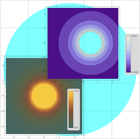
The central tool for combining plots and legends above is Inset. To show how much flexibility that approach gives you for positioning graphics (compared to GraphicsGrid, e.g.), I'll just combine the two examples from above with some arbitrary arrangement:
display[{
  Graphics[{Opacity[.5], Cyan, Disk[]}] // at[{0, 0}, 1],
  density // at[{0, 0}, .6],
  contour // at[{0.3, 0.4}, .7]
  },
 AspectRatio -> 1,
 ImageSize -> 600,
 GridLines -> Automatic]
Edit: illustrating additional options
The following examples show some of the customizations for the color bar, such as frame color and thickness, and the style and orientation of the labels.
A density plot with a legend that uses almost all of the available options:
{densityPlot, densityColors, densityRange} =
  reportColorRange[
   DensityPlot[
    1/(1 + Cos[x - 1]^20) - 1/(1 + Cos[(y - 1)^2 + x^2]^20), {x, -3,
     3}, {y, -3, 3}, ColorFunction -> ColorData["Rainbow"],
    PlotPoints -> 80]];

With[{plotWidth = .85, aspectRatio = .9},
 density = display[{
    densityPlot // at[{0, 0}, plotWidth],
    colorLegend[
      densityColors,
      densityRange,
      LabelStyle -> LightGray,
      FrameStyle -> Orange,
      "ColorBarFrameStyle" -> LightGray,
      Background -> Darker@Darker@Darker@Blue,
      "ColorSwathes" -> None,
      Contours -> 10,
      RoundingRadius -> 0,
      BoxFrame -> 3,
      "Digits" -> 2
      ] // at[{plotWidth, 0}, {1 - plotWidth, plotWidth/aspectRatio}
      ]},
   AspectRatio -> aspectRatio,
   ImageSize -> 400]
 ]
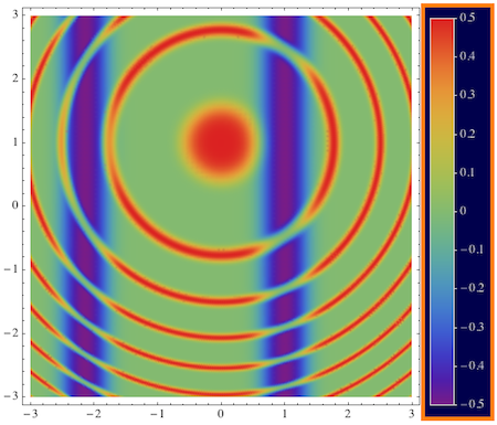
The actual plot is contained in the variable densityPlot, and it is combined with the legend as in the previous examples. You could try to play with the settings to see what the options do.
I also added some extra calculations to determine the positions of the plot and legend above. The goal was to give two parameters: plotWidth and aspectRatio, and determine how to fit the plot and legend into the resulting image so as to use up all available space.
The plotWidth is specified as a fraction of the horizontal plot width. Since by default the aspect ratio of the plot (densityPlot) is fixed, there will be wasted space or clipping if we play around with the aspectRatio variable which applies to the entire image including the legend. For example, try setting aspectRatio -> 1 or .5. This shows that there may still be some manual adjustment required to find the best positioning of the legend.
Keep in mind that the position and size of the legend can always be editd using the interactive tools as well, see the documentation on Resizing, Cropping, and Adding Margins to Graphics.
Next, a test with a different kind of plot (SmoothDensityHistogram) that also uses a color ramp:
data = RandomReal[1, {100, 2}];

{sDensityPlot, sDensityColors, sDensityRange} =
  reportColorRange[
   SmoothDensityHistogram[data, 0.015, "PDF",
    ColorFunction -> "Rainbow", Mesh -> 0,
    PlotRange -> {{0, 1}, {0, 1}}]];

With[{labelWidth = .15, labelHeight = .5, aspectRatio = .8},
 density = display[{
    sDensityPlot // at[{1 - aspectRatio, 0}, {aspectRatio, 1}],
    colorLegend[sDensityColors, sDensityRange,
      Background -> None,
      "LeftLabel" -> True
      ] // at[{0, 0}, {labelWidth, labelHeight}
      ]},
   AspectRatio -> aspectRatio,
   ImageSize -> 400]
 ]
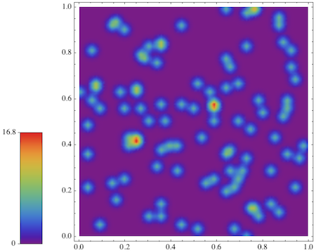
Here, I also tried a different way of calculating the positioning of the legend: I assumed the width and height of the legend are given as fractions of the image dimensions in labelWidth and labelHeight, and decided to align the legend with the left side, the plot with the right side of the image.
So now you will see that the alignments behave differently when you change the value of aspectRatio. Try making it smaller, e.g., aspectRatio = .6, and you'l see extra white space between the legend and plot. Also try increasing labelHeight to 1.
Finally, here is an example with ContourPlot where I would like to show a legend that has color bands instead of gradients. This goes back to the first example of the post (see above):
t = Flatten[
   Table[{x, y, 2/((x - 1)^2 + y^2)}, {x, -5, 5, .3}, {y, -5, 5, .3}],
    1];

{contourPlot, contourColors, contourRange} =
  reportColorRange[ListContourPlot[t]];

Block[{
  labelWidth = .15,
  labelHeight = 1,
  aspectRatio = .8,
  numberOfContours = Length[Cases[contourPlot, Tooltip[__], Infinity]],
  plotRange},
 plotRange =
  FindDivisions[Round[contourRange, .1], numberOfContours];
 numberOfContours = Length[plotRange] - 1;
 display[{contourPlot // at[{0, 0}, aspectRatio],
   colorLegend[contourColors, plotRange[[{1, -1}]],
     LabelStyle -> Darker[Brown],
     Background -> None,
     "ColorSwathes" -> numberOfContours
     ] // at[{1 - labelWidth, 0}, {labelWidth, 1}
     ]},
  AspectRatio -> aspectRatio,
  ImageSize -> 400]
 ]
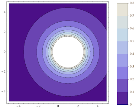
As in the first example, note that the white region in the middle isn't part of the color range - it's an exclusion due to the singularity in the data. That's why the color legend doesn't have white at the top.
The important option here is "ColorSwathes" which says how many color bands there are. To figure out that number isn't completely straightforward, though. That's why I don't have an automated way of doing it, except what I added in the Block above. The idea is that numberOfContours can be obtained by counting the number of Tooltip occurrences, assuming that the ContourPlot follows the default setting which wraps each contour in Tooltip. This would be easier if the contours could be extracted using AbsoluteOptions, but that's unfortunateley not the case.
I still use the results of reportColorRange to determine what the correct labels for the legend should be. But here, too, there is some work required because with the Automatic setting for the contours in ContourPlot, the values will be at "nice" divisions that don't have to be rationally related to the minimum or maximum function values. I used FindDivisions to guess what the contour divisions should be.
Edit
The last example with a banded color legend was also the topic of another question where I added a different variant of colorLegend. That definition can be added to the one in this answer without conflict. The linked version simply has a third argument n corresponding to the number of discrete tick marks in the legend. This may sometimes be more convenient that the "ColorSwathes" option.


 "
"