6
$\begingroup$

I want to plot some weather data series. Unfortunately the series were collected in different episodes, from which some overlap. I would like to plot them as different plots in a column, but with exactly the same time scale. However datespec option doesn't work for this purpose. I know I can always add a single point at the beginning and at the end of series, however I would like to ask if there is some more elegant solution.

For example:

start = {2003, 8, 6, 0, 1, 29};
end = {2004, 1, 24, 23, 46, 58};
GraphicsColumn[{DateListPlot[SomeTimeData1, {start, end}], 
  DateListPlot[SomeTimeData2, {start, end}]}]

gives:
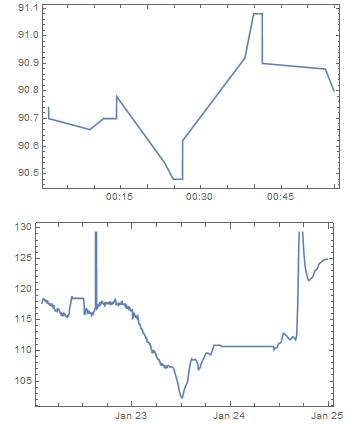
enter image description here

$\endgroup$
2
  • $\begingroup$ What is episodesH2? :) $\endgroup$
    – Öskå
    Commented Oct 10, 2014 at 13:57
  • $\begingroup$ @Öskå I apologise, that was the name of my data series, now changed to SomeTimeData1 and 2 $\endgroup$
    – Misery
    Commented Oct 10, 2014 at 14:00

1 Answer 1

8
$\begingroup$

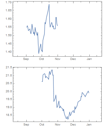
One way would be to specify an explicit x-axis range on the plots, using AbsoluteTime to convert the desired date range into the coordinate values required by PlotRange:

$data1 = FinancialData["AAPL", {{2003, 9}, {2003, 11}}];
$data2 = FinancialData["MSFT", {{2003, 10}, {2004, 1}}];

$start = {2003, 8, 6, 0, 1, 29};
$end = {2004, 1, 24, 23, 46, 58};

$rangeOption = PlotRange -> {AbsoluteTime /@ {$start, $end}, Automatic};

GraphicsColumn[
  { DateListPlot[$data1, $rangeOption]
  , DateListPlot[$data2, $rangeOption]
  }
]

plot screenshot

$\endgroup$

Your Answer

By clicking “Post Your Answer”, you agree to our terms of service and acknowledge you have read our privacy policy.

Not the answer you're looking for? Browse other questions tagged or ask your own question.