I have date and time data and want to plot its frequency histogram. Ideally I want to be able to customize the bin size (for example, every 5 minutes or a day). Anybody has this experience?
3 Answers
In version 7 I don't have the fancy functions Verbeia used. One can still process the data as any other. Gather and GatherBy, as Verbeia alluded to, are good options.
For example, starting with some random date data in DateList format:
range = AbsoluteTime /@ {{2013}, {2014}};
dates = DateList /@ RandomInteger[range, 5000];
And using DateListPlot with CapForm["Butt"]:
plot[dat_, style__] :=
  DateListPlot[dat, PlotStyle -> None, Filling -> Bottom,
   FillingStyle -> Directive[CapForm["Butt"], style]]
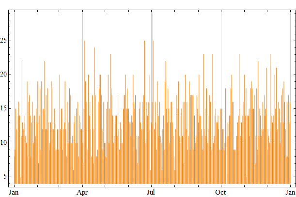
We could bin by day:
bins = {#[[1]], Length@#} & /@ Sort@Gather[dates[[All, ;; 3]]];

plot[bins, Orange, Thickness[0.001]]
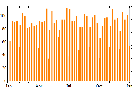
By calendar weeks:
bins = {#[[1]] + {0, 0, 3.5}, Length@#} & /@
          Sort @ Gather[{#, #2, Floor[#3, 7]} & @@@ dates];

plot[bins, Orange, Thickness[0.01]]
By absolute seven-day periods:
week = 60^2 * 24 * 7;

bins = {#[[1]] + week/2, Length@#} & /@
         Sort @ Gather @ Floor[AbsoluteTime /@ dates, week];

plot[bins, Orange, Thickness[0.01]]
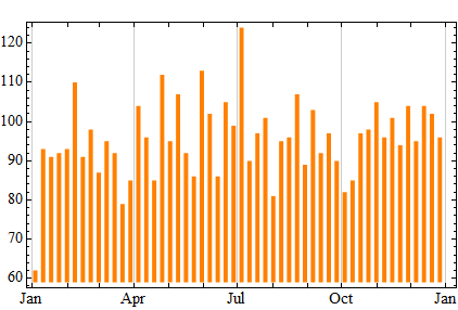
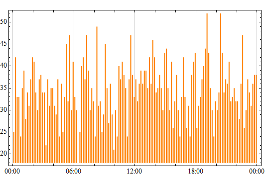
By ten-minute intervals (with data covering a single day):
range = AbsoluteTime /@ {{2013, 9, 1}, {2013, 9, 2}};
dates = DateList /@ RandomInteger[range, 5000];

bins = {#[[1]] + {0, 0, 0, 0, 5}, Length@#} & /@
   Sort @ Gather[{#, #2, #3, #4, Floor[#5, 10]} & @@@ dates];

plot[bins, Orange, Thickness[0.004]]
-
$\begingroup$ This is really nice, since I don't have
Mma 9. But does this work for time range rather than date range? $\endgroup$– Qiang LiCommented Sep 3, 2013 at 1:05 -
$\begingroup$ @QiangLi Do you mean by hours of the day? As in bins: (0:01, 6:00), (6:01, 12:00), (12:01, 18:00), (18:01, 24:00) or similar? $\endgroup$ Commented Sep 3, 2013 at 1:10
-
$\begingroup$ Yes. Or even by 10 minutes, when I have a lot of data. Oh, just upvoted. :) $\endgroup$– Qiang LiCommented Sep 3, 2013 at 1:11
-
Someone else will probably come up with something involving GatherBy, but I would like to showcase the undocumented TemporalData functions I recently posted about.
You could convert your time series (list of date-value pairs) into TemporalData and use the Aggregate function in the TemporalData` package like this:
timeAggregate[data_,basis_,method_:Mean] (* single series, or TemporalData head *):=
With[{tddata= If[Head[data]===TemporalData,data,TemporalData[data]]},
    If[TemporalData`ValidTemporalDataQ[tddata],
    Apply[{DateList[#1],Sequence@@##2}&,
     (TemporalData`Aggregate[tddata,basis,method]["Paths"]),{2}],
    Message[timeAggregate::nottd]
    ]]
where the message would be something like:
timeAggregate::nottd = "The data provided is not or cannot be converted to valid TemporalData."
This function converts the date-value pair into TemporalData if it is not already in TemporalData form, tests that it is valid TemporalData (using another undocumented function in that package), and then aggregates the data according to the time specification basis. The aggregation method method can be any function that returns a scalar from a list of values, but I presume you want totals.
Usage would be along the lines of:
timeAggregate[mydata,{5, "Minute"},Total]
So for example:
mydata = Transpose@{AbsoluteTime@DateList[] + Range[4000],
RandomVariate[NormalDistribution[0, 1], 4000]};

aggred = timeAggregate[mydata, {5, "Minute"}, Total];
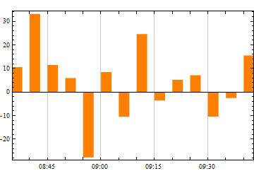
You could then strip off the dates to use BarChart directly, or alternatively use the method described by Mr.Wizard here to make a quick-and-dirty bar chart of dated data:
DateListPlot[aggred, Filling -> Axis, PlotStyle -> None,
 FillingStyle ->  Directive[Orange, CapForm["Butt"], AbsoluteThickness[15]],
 Axes -> True]
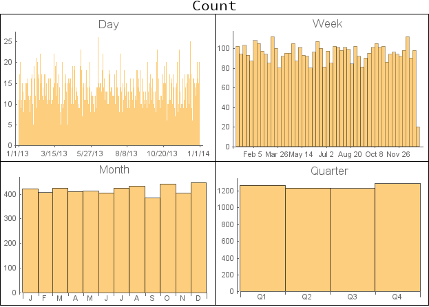
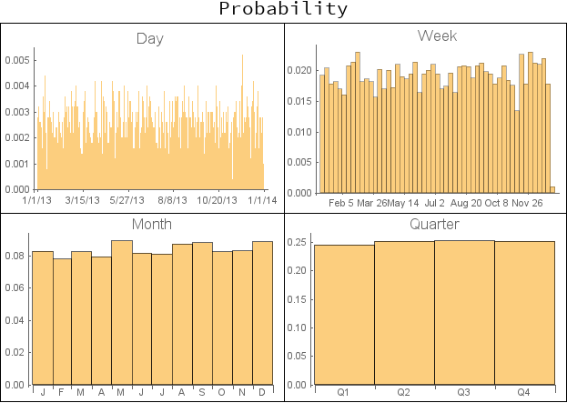
New in version 10.2: DateHistogram
Using the example setup in Mr.Wizard's answer:
range = AbsoluteTime /@ {{2013}, {2014}};
dates =  DateList /@ RandomInteger[range, 5000];

Labeled[Grid[Partition[#,2]&@Table[DateHistogram[dates, b,
  PlotLabel ->Style[b, 16], ImageSize->300],
 {b, {"Day", "Week", "Month", "Quarter"}}], Dividers->All],
 Style["Count", 20], {Top, Left}]
Labeled[Grid[Partition[#,2]&@Table[DateHistogram[dates, b, "Probability",
  PlotLabel ->Style[b, 16], ImageSize->300],
 {b, {"Day", "Week", "Month", "Quarter"}}], Dividers->All],
 Style["Probability", 20], {Top, Left}]

