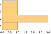
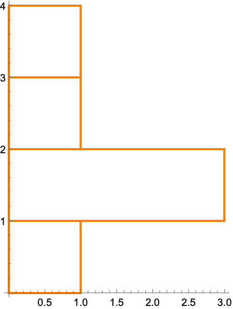
What is the nicest way to visualize change of variables as below density as below? IE, value 2 appears 3 times, so it gets a higher bin-count than other values, but the histogram is vertical to align with the values in the leftmost plot.
Here's the visualization of the leftmost plot
ListPlot[{4, 3, 2, 2, 2, 1}, Filling -> Axis]


