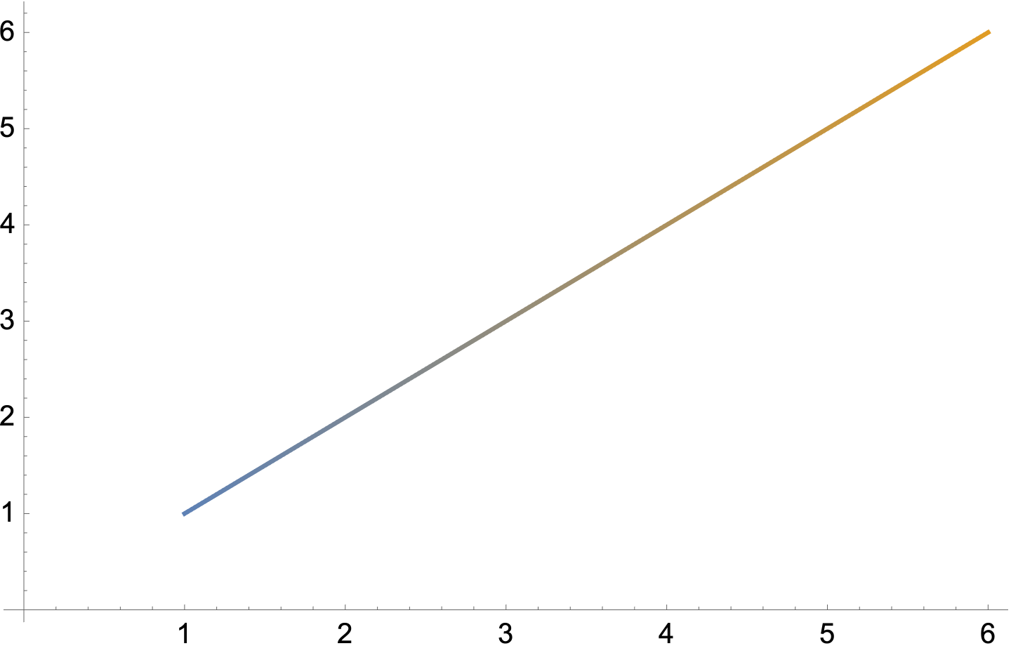
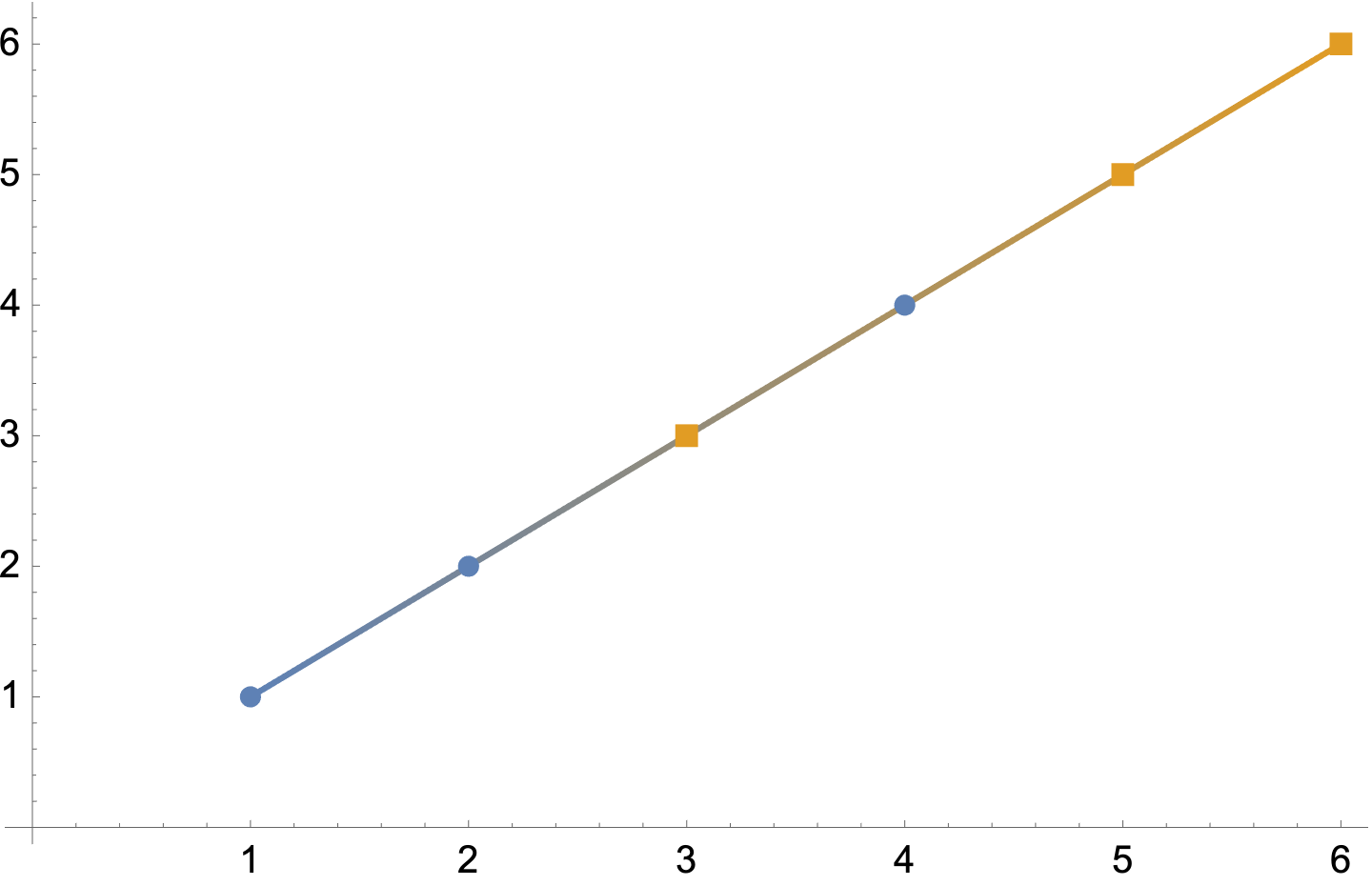
Suppose I plot out two sets of data on the same graph as follows:
ListPlot[{{{1, 1}, {2, 2}, {4, 4}}, {{3, 3}, {5, 5}, {6, 6}}}]
The colours of the points change based on which data set it belongs in. However, when I join the points up:
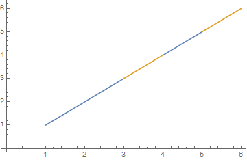
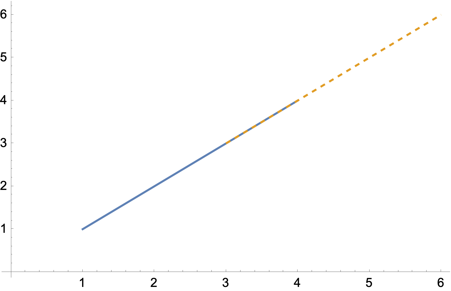
ListPlot[{{{1, 1}, {2, 2}, {4, 4}}, {{3, 3}, {5, 5}, {6, 6}}},Joined -> True]
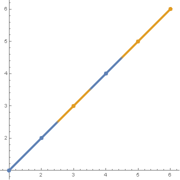
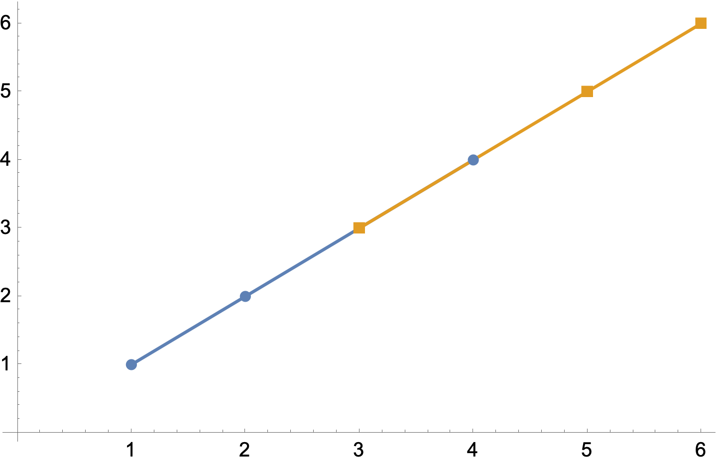
it treats the two data sets separately and over-rides the curves. Is there a way to manipulate the colours when joining the points together such that it is treated as a single data set, but changes colour based on the set that the nearest point belongs to? I guess this may involve combining the sets in order while keeping track of which data set each point belongs to, but I'm not sure how to do this.
Thanks in advance for any help.

