1
$\begingroup$

I would like to know why when I change +1 in a discrete Sine change the list line plot and when I plot the function sine anything change.

Nmax = 128; (*Number of sites*)

n0 = Nmax/2;(*initial condition*)

\[Psi]inin = Table[Sin[\[Pi] (n0 n)/Nmax], {n, 1, Nmax}];

ListLinePlot[\[Psi]inin]

\[Psi]ini = Table[Sin[\[Pi] (n0 n)/(Nmax + 1)], {n, 1, Nmax}];

ListLinePlot[\[Psi]ini]

Plot[Sin[\[Pi] n0 /Nmax n], {n, 1, Nmax}]

Plot[Sin[\[Pi] (n0 n)/(Nmax + 1)], {n, 1, Nmax}]
```
$\endgroup$
1
  • 2
    $\begingroup$ It looks like aliasing, effectively undersampling the sine wave which will introduce other frequencies in the plot as your sine frequency goes higher. Ever heard of a Moiré pattern? That's likely what's happening here. It's easier to see if you do this: Nmax = 128; Manipulate[ ListLinePlot[Table[Sin[2 Pi f n ], {n, 1, Nmax}]] , {f, 0.1, 4}] $\endgroup$
    – flinty
    Commented Jun 18, 2021 at 21:24

1 Answer 1

2
$\begingroup$

The reason for the different discrete values is that you're using the same sample rate (Nmax) to sample two sine functions with different frequencies. The first sine function has frequency = n0/(2 Nmax) = .25. The second sine function has a lower frequency = n0/(2(Nmax+1)) = 0.248062.

Let's show the difference in the sine waves by plotting a few periods of each function - the first function in blue, and the second in red. Compute the frequencies and periods, then draw a graph of both functions on the same graph. It's difficult to see the difference in your graphs because the plots include many periods of the functions and their frequencies are nearly the same.

Nmax = 128;(*number of samples*)
n0 = Nmax/2;
N@{f1 = n0/(2 Nmax), p1 = 1/f1}
N@{f2 = n0/(2 (Nmax + 1)), p2 = 1/f2}
Show[ 
 Plot[Sin[2 \[Pi] f1 t], {t, 0, 5 p1}, PlotStyle -> Blue], 
 Plot[Sin[2 \[Pi] f2 t], {t, 0, 5 p2}, PlotStyle -> Red]
]
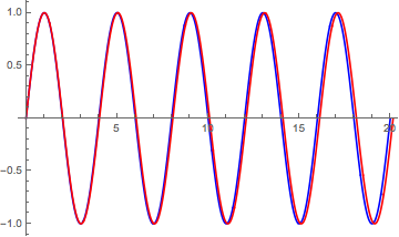
sine functions with different frequencies

When you sample the first sine function, the sample rate selects the crest and zero of each period. Let's plot the sine function and the discrete samples (red dots) on the same graph.

\[Psi]inin = Table[Sin[\[Pi] (n0 n)/Nmax], {n, 1, Nmax}];
Show[
 ListLinePlot[\[Psi]inin, Joined -> False, PlotStyle -> Red], 
 Plot[Sin[\[Pi] n0 /Nmax n], {n, 1, Nmax}]]
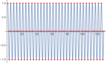
discrete samples of first sine function

When you sample the second sine function with the same sample rate, the samples happen between the crests and zeros. Again, let's plot the sine function and the samples on the same graph. See how the samples don't match the frequency? This demonstrates why the second discrete sine looks different from the first one.

\[Psi]ini = Table[Sin[\[Pi] (n0 n)/(Nmax + 1)], {n, 1, Nmax}];
Show[
 ListLinePlot[\[Psi]ini, Joined -> False, PlotStyle -> Red],
 Plot[Sin[\[Pi] (n0 n)/(Nmax + 1)], {n, 1, Nmax}]]
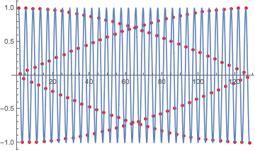
discrete samples of second sine function

$\endgroup$
3
  • 1
    $\begingroup$ Thanks, now I understand the sample rate in the second discrete sine. There is a form to change the sample rate with the same points and take the crests an zeros like the other discrete sine? $\endgroup$ Commented Jun 19, 2021 at 4:44
  • 1
    $\begingroup$ @MiguelZarate Use Subdivide with Table[Sin[π (n0 n)/(Nmax + 1)], {n, Most@Subdivide[(2(Nmax + 1)/n0)/4,(Nmax + 1)((2(Nmax + 1)/n0)/4), Nmax]}] to sample at the crests and zeros. $\endgroup$
    – creidhne
    Commented Jun 19, 2021 at 12:36
  • 1
    $\begingroup$ Thanks a lot, it was very helpful your answer $\endgroup$ Commented Jun 19, 2021 at 15:25

Your Answer

By clicking “Post Your Answer”, you agree to our terms of service and acknowledge you have read our privacy policy.

Not the answer you're looking for? Browse other questions tagged or ask your own question.