7
$\begingroup$

Consider the following code

Manipulate[a,
 Control[{{a, {}, ""}, {1 -> "1", 4 -> "4", 7 -> "7", 2 -> "2", 
    5 -> "5", 8 -> "8", 3 -> "3", 6 -> "6", 9 -> "9"},
   Appearance -> "Vertical" -> {3, 3}, ControlType -> TogglerBar, 
   Background -> RGBColor[.36, .67, .38]}]
 ]

which yields

enter image description here

By default, whenever I press any of the buttons, I get a change in the background colour (from the Background colour I set to what I presume to be white). For example,

enter image description here

How do I change this whitish colour to any other colour whenever any of the buttons are pressed?

Also, it seems that in some computers, WolframPlayer keeps the background colour, despite the Pressed appearance of the buttons. Any ideas why this happens?

Edit: This might be OS dependent, as suggested in m_goldberg's answer below. I'm running this code on Windows. However, on MacOS, the background colour remains present for pressed buttons. See, for example, the case

enter image description here

The different button sizes and absence of labelling is simply due to my particular main code. Changing the Pressed colour to white might be tricky, but I wonder if there is any clearer way of displaying pressed buttons in the TogglerBar. Any suggestions?

$\endgroup$
1
  • $\begingroup$ What OS are you running on? I ask because this seems to be OS depended. I'm running V11.3 on MacOS and things look quite different on my screen. $\endgroup$
    – m_goldberg
    Commented Dec 16, 2019 at 19:11

2 Answers 2

5
$\begingroup$

A custom toggler grid with the desired look:

ClearAll[togglerGrid]
togglerGrid[Dynamic[y_], vals_, dims_, cols_: {RGBColor[.36, .67, .38], 
    Lighter@ Lighter@RGBColor[.36, .67, .38]}, size_: {15, 20}] :=  Deploy @
  Grid[ArrayReshape[Table[With[{i = i}, 
    Item[Setter[Dynamic[MemberQ[y, i], BoxForm`TogglerBarFunction[y, i] &], {True}, i, 
           Appearance -> None, Alignment -> Center, ImageSize -> size],
       ItemSize -> {All, All}, 
       Frame -> Dynamic[If[MemberQ[y, i], {{Gray, White}, {White, Gray}}, White]], 
       FrameStyle -> Thick,
       Background -> Dynamic[If[MemberQ[y, i], cols[[2]], cols[[1]]]]]], 
     {i, vals}], dims], 
   Spacings -> {0, 0}, Dividers -> All, FrameStyle -> White, Alignment -> {Center, Center}]

Examples:

You can use togglerGrid (like Slider, Checkbox etc.) as the control type for control variables:

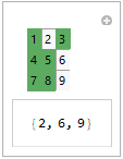
Manipulate[a, {{a, {}, ""}, Range @ 9, togglerGrid[#, Range @ 9, {3, 3}] &}]

enter image description here

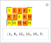
Manipulate[a, {{a, {}, ""}, Range@15, togglerGrid[#, Range@15, {3, 5}, {Orange, Yellow}]&}]

enter image description here

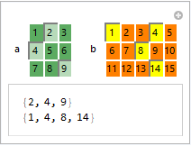
Manipulate[Column[{a, b}], 
 Row[{Control@{{a, {2, 4}, "a"}, Range@9, 
      togglerGrid[#, Range@9, {3, 3}] &}, 
   Spacer[20], 
   Control@{{b, {1, 4, 8, 14}, "b"}, Range@15,
     togglerGrid[#, Range@15, {3, 5}, {Orange, Yellow}] &}}]]

enter image description here

Alternatively, you can use it as a dynamic object in the control area:

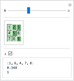
Manipulate[Column[{a, b, c}], 
  {a, {}, None}, 
  {{b, 0}, 0, 1}, 
  Delimiter, 
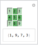
 Dynamic @ Panel @ togglerGrid[Dynamic@a, Range[9], {3, 3}], 
 Delimiter, 
 {{c, 0}, { 0, 1}}]

enter image description here

$Version

"11.3.0 for Microsoft Windows (64-bit) (March 7, 2018)"

$\endgroup$
1
  • 1
    $\begingroup$ Works in v10.1 too; nice! $\endgroup$
    – Mr.Wizard
    Commented Dec 19, 2019 at 22:36
3
$\begingroup$

It seems to be OS dependent. I think WRI tries to make their controls look like the ones OS's SDK builds. That means the effect of options such as Background will vary from OS to OS, and you can't expect the controls built-in by WRI to give much latitude. Of course, you can build a custom control that works exactly as you wish, but that might be a lot of work.

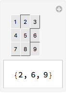
As an example of the how the OS influences the look and feel of controls, consider how much a toggle bar can differ on MacOS from what you see on your system.

Manipulate[a,
  {{a, {}, ""}, Range[9], TogglerBar,
   Appearance -> "Horizontal" -> {3, 3},
   Background -> GrayLevel[.9]}]

toggle_bar

You can see that on MacOS WRI goes for a shallow 3D button effect. And you might also note that your code can be simplified quite a bit.

I used GrayLevel[.9] as the background color because all the alternatives I tried looked awful.

Update

This update attempts to address an issue raised the OP in comment to this answer.

I have made a number of custom controls for various apps I have built. None mimicked a toggle bar. However, some were close enough that I can give you a brief outline on how to go about implementing a toggle bar mimic.

  1. The basic idea is use an array of Button expressions.

  2. Grid would used to display the array.

  3. Each Button expression in the array would have the form:

    Button[label[state, ...], state = newState[...]; action[state, ...],
      Appearance -> None,
      ImageSize -> {width, height}]]
    
  4. The function label returns a graphic which renders the look of button; the graphic depends the value of state. In your case, state would toggle between two values, True for pressed and False for not-pressed.

  5. The function action performs whatever side effect should be performed as a result of the state change. In your case that would mean adding or deleting an element from a list of selected values.

$\endgroup$
4
  • $\begingroup$ Ah, I see. I'm running it on Windows. So indeed I get a 'whitish' look in a pressed button. I asked a friend to run a respective CDF file on Mac and the look was significantly different, which I suspect is what you get (see edited question). I'm honestly surprised that switching a colour for a pressed vs unpressed buttons on a TogglerBar is "hard work". Do you have any ideas on how to go around it? If not, how could I display the buttons on a thicker grid, p.e, such that pressed buttons become slightly more "clear"? This is mainly for aesthetics, but I do appreciate your answer! (+1) $\endgroup$
    – sam wolfe
    Commented Dec 17, 2019 at 2:17
  • $\begingroup$ @samwolfe. I didn't use the term "hard work", I wrote "might be a lot of work". How much work would depend on how fancy you want your custom control to be. One thing that is still not clear to me why the look of a toggle bar grid on you show doesn't work for you. I think green white for selected and green for rejected is perfectly clear. Another thing not clear is what alternative you are seeking to replace the behavior you currently have. $\endgroup$
    – m_goldberg
    Commented Dec 17, 2019 at 5:24
  • $\begingroup$ @m_goldbert. Sorry, I wasn't really quoting you. You indeed wrote "might be a lot of work", but the reason for my quotation marks was also partly due to the fact that I've tried to look for an answer online and couldn't find a straightforward one, which I find strange, because it doesn't seem that hard, hence the "hard work" term. The main reason I want this is because I would like a uniform look over different OS, since I will be sharing a CDF file containing such interactive objects, with people that might have different OS. That's all. Your update seems good, I will take a look. Thanks! $\endgroup$
    – sam wolfe
    Commented Dec 17, 2019 at 11:06
  • $\begingroup$ @samwolfe. It would appear that kglr has provided an implementation of a toggle bar somewhat along the lines I suggested. So perhaps you can just go with that. $\endgroup$
    – m_goldberg
    Commented Dec 17, 2019 at 14:29

Your Answer

By clicking “Post Your Answer”, you agree to our terms of service and acknowledge you have read our privacy policy.

Not the answer you're looking for? Browse other questions tagged or ask your own question.