1
$\begingroup$

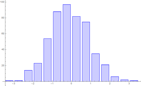
I want to create a histogram which has spacing between its bins (as shown below): histogram

to create this I used the following method:

     data1 = RandomVariate[NormalDistribution[0, 1], 500];

     f2[d_][{{xmin_, xmax_}, {ymin_, ymax_}}, ___] := Rectangle[{xmin + d (xmax - xmin)/2, ymin}, {xmax - d (xmax - xmin)/2, ymax}]
     h1=Histogram[data1, Automatic, ChartElementFunction -> f2[0.1]]

However, I want to export this data as is to a list so I can apply some functions and try to see how much worse my fits get as I try to increase the space in between the bins. To export the data to a list I use:

     histData=HistogramList[h1]

which understandably gives me errors. Is there a way I can get the data as it is shown in the drawn histogram (image above) to a list so I can try to apply fits on it with a function etc. This is just a test example, my real function is for 10^7 points and has a custom probability distribution function

$\endgroup$
6
  • $\begingroup$ You want HistogramList[data1] but you'd want to add any specifications of bin spacing, etc. $\endgroup$
    – JimB
    Commented Aug 31, 2018 at 15:09
  • $\begingroup$ yes but it doesn't export the binspaces. which is the main thing I want to do. So more of data manipulation than histogram plotting. How do I add bin spacing specifications in the data generation by using Random Variate? $\endgroup$
    – WaleeK
    Commented Aug 31, 2018 at 15:12
  • 1
    $\begingroup$ Please be specific as to what you mean by the "binspaces". Here's what you get from your example: {{-3, -(5/2), -2, -(3/2), -1, -(1/2), 0, 1/2, 1, 3/2, 2, 5/2, 3, 7/ 2}, {1, 8, 22, 59, 67, 112, 80, 80, 42, 22, 6, 0, 1}}. The first element consists of the boundaries of the bins. The specifications for the bins is done in HistogramList and not in RandomVariate. $\endgroup$
    – JimB
    Commented Aug 31, 2018 at 15:16
  • $\begingroup$ yes but if I export the data as you suggest i.e. HistogramList[data1], I get a set of bins which are all equally filled i.e. a normal Histogram of data1. I don't want want that. I want the to check the behavior of how having these "dead zones" (the spaces in between the bins as shown in the image, which is set to 10% in the code above. The plan is to move from 10 to 50 in steps of 10, so having a bin of data, 10% of dead bin space and then another bin. And so on) affect my fit on an ErrorListPlot generated from the HistogramList(not shown here). $\endgroup$
    – WaleeK
    Commented Aug 31, 2018 at 16:07
  • 2
    $\begingroup$ As @Johu mentioned, the dead zone has nothing to do with the data. The bin heights are exactly the same and the bins just get thinner but still centered at the same midpoint as d goes from 0.1 to 0.5. The point is not that you're doing something wrong but rather many of us aren't understanding what you want. $\endgroup$
    – JimB
    Commented Aug 31, 2018 at 16:51

2 Answers 2

1
$\begingroup$

I think I now know what you want (but I certainly don't understand fitting objective).

The following will get you the coordinates of the "thinned" bins.

(* Generate some data *)
SeedRandom[12345];
data1 = RandomVariate[NormalDistribution[0, 1], 500];

(* Construct a histogram *)
b0 = HistogramList[data1]
(* {{-(7/2), -3, -(5/2), -2, -(3/2), -1, -(1/2), 0, 1/2, 1, 3/2, 2, 5/2, 3, 7/2},
    {1, 1, 14, 23, 54, 88, 97, 82, 75, 35, 21, 6, 2, 1}} *)


(* Get the binwidth, bin heights, and midpoints *)
binWidth = b0[[1, 2]] - b0[[1, 1]]
(* 1/2 *)
binHeights = b0[[2]]
(* {1, 1, 14, 23, 54, 88, 97, 82, 75, 35, 21, 6, 2, 1} *)
midPoints = (b0[[1, 2 ;; Length[b0[[1]]]]] + b0[[1, 1 ;; Length[b0[[1]]] - 1]])/2
(* {-(13/4), -(11/4), -(9/4), -(7/4), -(5/4), -(3/4), -(1/4), 1/4, 
    3/4, 5/4, 7/4, 9/4, 11/4, 13/4} *)

(* Function to get the bin boundaries of the thinned bins *)
thinnedBins[d_] := Table[{midPoints[[i]] - binWidth (1 - d)/2, 
   midPoints[[i]] + binWidth (1 - d)/2}, {i, Length[midPoints]}]

(* Create a dataset with the thinned bin boundaries, plot the correspoinding histogram *)
b = thinnedBins[0.3]
(* {{-3.425, -3.075}, {-2.925, -2.575}, {-2.425, -2.075}, {-1.925, -1.575},
    {-1.425, -1.075}, {-0.925, -0.575}, {-0.425, -0.075}, {0.075, 0.425},
    {0.575, 0.925}, {1.075, 1.425}, {1.575, 1.925}, {2.075, 2.425}, 
    {2.575, 2.925}, {3.075, 3.425}} *)
newHistogram = Table[{{b[[i, 1]], 0}, {b[[i, 1]], binHeights[[i]]}, {b[[i, 2]], 
    binHeights[[i]]}, {b[[i, 2]], 0}}, {i, Length[midPoints]}];
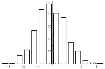
ListPlot[newHistogram, Joined -> True, PlotStyle -> Black]

Histogram with gaps

$\endgroup$
0
0
$\begingroup$

You may use DiscretePlot with it's ExtentSize option.

With

SeedRandom[12345];
data1 = RandomVariate[NormalDistribution[0, 1], 500];
hList = HistogramList[data1];

Then

update to centre "bars"

Module[{i = 1},
 DiscretePlot[
  hList[[2, i++]],
  {bin, Differences@hList[[1]]/2 + Most@hList[[1]]},
  PlotStyle -> Directive[Thin, Blue, EdgeForm[{Thin, Blue}]],
  ExtentSize -> Scaled[.8]
  ]
 ]

Mathematica graphics

Increasing the Scaled ExtentSize towards one will shrink the gap and decreasing it towards zero will widen the gap.

Note that with continuous data there should be no spaces between the bars as the data can appear within these spaces but your plot communicates that it cannot. If you have discrete data then you should see BarChart.

Hope this helps.

$\endgroup$

Your Answer

By clicking “Post Your Answer”, you agree to our terms of service and acknowledge you have read our privacy policy.

Not the answer you're looking for? Browse other questions tagged or ask your own question.