1
$\begingroup$

I have a plot based on real-world data. I want to make it possible, that the user can enter any value of x (enter manually or as dropdown or as slider) and the respective y value appears. At the same time, there should be a point, which jumps to the entered x-value.

The data I use is the following:

data = {{-96000, 1}, {-12949, 2}, {-4842, 3}, {-2222, 4}, {-735, 
   5}, {-81, 6}, {30, 7}, {187, 8}, {423, 9}, {816, 10}, {1194, 
   11}, {1561, 12}, {2097, 13}, {2720, 14}, {3268, 15}, {3833, 
   16}, {4538, 17}, {5042, 18}, {5555, 19}, {6165, 20}, {6839, 
   21}, {7660, 22}, {8418, 23}, {9290, 24}, {10241, 25}, {11205, 
   26}, {12089, 27}, {13077, 28}, {13945, 29}, {15332, 30}, {16691, 
   31}, {17994, 32}, {19368, 33}, {21034, 34}, {22470, 35}, {24308, 
   36}, {26118, 37}, {28138, 38}, {30701, 39}, {33409, 40}, {36651, 
   41}, {39924, 42}, {43709, 43}, {48337, 44}, {53194, 45}, {58966, 
   46}, {64870, 47}, {70386, 48}, {76917, 49}, {84542, 50}, {91719, 
   51}, {100206, 52}, {109028, 53}, {115236, 54}, {121209, 
   55}, {128617, 56}, {136466, 57}, {145436, 58}, {154077, 
   59}, {161558, 60}, {168802, 61}, {177820, 62}, {188075, 
   63}, {197551, 64}, {207513, 65}, {216346, 66}, {223449, 
   67}, {230092, 68}, {239571, 69}, {250742, 70}, {260915, 
   71}, {271182, 72}, {281361, 73}, {291735, 74}, {303973, 
   75}, {315228, 76}, {325877, 77}, {337903, 78}, {351584, 
   79}, {363072, 80}, {371321, 81}, {382482, 82}, {396815, 
   83}, {408623, 84}, {420767, 85}, {437121, 86}, {453049, 
   87}, {471017, 88}, {493422, 89}, {517036, 90}, {544031, 
   91}, {581599, 92}, {626884, 93}, {702909, 94}, {801905, 
   95}, {904205, 96}, {1074064, 97}, {1390025, 98}, {2013260, 
   99}, {14045856, 100}}

I plotted the data as follows:

ListLinePlot[data]

I already tried this one, the slider looks good, but the plot does not work.

Manipulate[
 Show[ListLinePlot[data, {lpd, 0, 10000}, 
   PlotRange -> {0, 1000000}]], {Assets, 0, 1000000, 
  Appearance -> "Labeled"}]

Thank you!

$\endgroup$
1
  • 1
    $\begingroup$ your plot does not work because lpd is undefined and after fixing that, the PlotRange is completely wrong. ( a single range is imposed on the vertical axis ) $\endgroup$
    – george2079
    Commented May 8, 2018 at 16:11

2 Answers 2

2
$\begingroup$

You can achieve what you want using Interpolation function. Read the documentation.

Answering what you asked, here's my solution:

Make the interpolation function:

f = Interpolation[data, InterpolationOrder -> 1];

In order to check how good the interpolation function is, plot f:

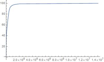
fPlot = Plot[f[x], {x, First[data][[1]], Last[data][[1]]}, 
           PlotRange -> Full];

interpolation plot

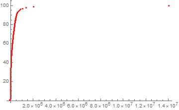
And Plot the original data:

dPlot = ListPlot[data, PlotStyle -> Red];

original data

Here's how you compare them:

Show[{fPlot, dPlot}]

comparison

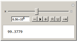
And to check the data with a slider:

Manipulate[N[f[x]], {x, First[data][[1]], Last[data][[1]]}];

manipulate slider

Edit:

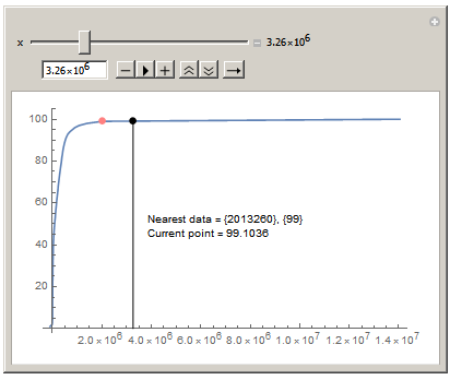
Thanks to @george2079's answer, I learned something new and put this code together. Check it out ;)

near = Nearest[data[[All, 1]] -> Automatic];
Manipulate[
 ListLinePlot[data, 
  Epilog -> {Inset[
     Text[Column[{"Nearest data = " <> ToString[data[[near[x], 1]]] <>
          ", " <> ToString[data[[near[x], 2]]], 
        "Current point = " <> ToString[f[x]]}]]], 
    Line[{{x, 0}, {x, f[x]}}], PointSize[.02], Point[{x, f[x]}], , 
    Pink, Point[data[[near[x]]]]}, PlotRange -> All], {x, 
  Min[data[[All, 1]]], Max[data[[All, 1]]], Appearance -> "Labeled"}]

post edit

$\endgroup$
5
  • $\begingroup$ Thanks you so much. Looks like it is working. But is there a way how I can combine the slider and the interpolated graph? $\endgroup$
    – MARIUS
    Commented May 8, 2018 at 16:09
  • $\begingroup$ demonstrations.wolfram.com/… A perfect solution would be similiar to this t0 slider, so that the x-values and the area below the function has a colour, dependend on the slider $\endgroup$
    – MARIUS
    Commented May 8, 2018 at 16:25
  • $\begingroup$ @MARIUS There you have it. Slider and the interpolated graph combined. $\endgroup$
    – Pedram
    Commented May 8, 2018 at 17:37
  • $\begingroup$ Great. Thank you so much. $\endgroup$
    – MARIUS
    Commented May 8, 2018 at 18:34
  • $\begingroup$ @MARIUS You're welcome ^_^ $\endgroup$
    – Pedram
    Commented May 8, 2018 at 20:22
1
$\begingroup$

This highlights the actual data point closest to the user input via slider.

near = Nearest[data[[All, 1]] -> Automatic]
Manipulate[ListLinePlot[data, Epilog -> {PointSize[.02],
    Point[data[[near[Assets]]]]}, PlotRange -> All],
 {Assets, Min[data[[All, 1]]], Max[data[[All, 1]]], Appearance -> "Labeled"}]
$\endgroup$

Your Answer

By clicking “Post Your Answer”, you agree to our terms of service and acknowledge you have read our privacy policy.

Not the answer you're looking for? Browse other questions tagged or ask your own question.