1
$\begingroup$

I have file with the flux as a function of time given as Modified Julian Day (MJD). Now I need to make a histogram of the all fluxes. I also need put into each bar information about times when given flux point occured. The main idea is to divide each bar into $n$ pieces ($n$ is the number of repetitions of a given flux value) and each piece should have a color depending on time (color bar). Is there any option to do this easily in Mathematica? I have tried StackedBarChart option, but with no results on this moment. Below is part of my code in Mathematica, but at this moment I'm able to get only simple histogram (beginner level).

mydata = Import["MJD_Flux_HR.dat", {"Data"}];
time = mydata[[All, 1]];
Rate = mydata[[All, 2]];

Histogram[
  Log[Rate], 50, 
  ChartElementFunction -> "FadingRectangle", 
  ChartStyle -> Orange, 
  GridLines -> {None, {2, 4, 6, 8, 10, 15, 20, 30, 40, 50, 60, 70, 80, 90, 100}}, 
  GridLinesStyle -> Directive[Orange, Dashed],  
  AxesLabel -> {log[Flux], N}]

I will be very grateful for any tip or for a link if a similar problem was already resolved.

Edit

MJD                      Flux

5.629479115953703877e+04 1.968644999999999978e+00
5.629479810398148402e+04 2.117290000000000116e+00
5.629493004842592927e+04 2.360141000000000044e+00
5.629493699287037452e+04 2.449203999999999937e+00
5.629494393731481978e+04 2.565354000000000134e+00
5.629495782620370301e+04 3.023746000000000045e+00
5.630207443500000227e+04 1.597088999999999981e+00
...
5.638481801138888841e+04 1.853978000000000037e+01
5.638482495583332638e+04 1.915412999999999855e+01
5.638483190027777164e+04 1.835502999999999929e+01
...
$\endgroup$
1
  • 3
    $\begingroup$ Share a sample from your data so we can better understand what you are working with. If you can find an example of a plot in the style you want, that would be helpful too. $\endgroup$
    – MarcoB
    Commented Apr 26, 2018 at 18:59

2 Answers 2

4
$\begingroup$

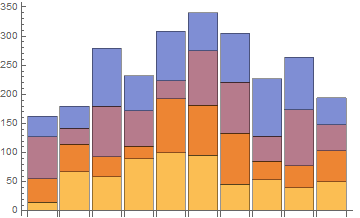
Is this along the lines of what you have in mind?

data = RandomReal[{10, 100}, {10, 4}];

BarChart[
 data,
 ChartLayout -> "Stacked"
]

Mathematica graphics

How to achieve this will strongly depend on the structure of your data though. It would be best if you could share some.

$\endgroup$
4
$\begingroup$

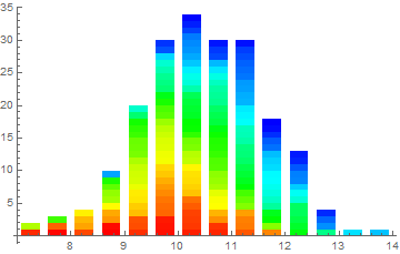
my interpretation:

data = MapIndexed[{#2[[1]], #} &, Join[
    RandomVariate[NormalDistribution[10, 1], 100] ,
    RandomVariate[NormalDistribution[11, 1], 100] ]];

hbins = HistogramList[data[[All, 2]]][[1]];
bw = -Subtract @@ hbins[[1 ;; 2]];
bins = Interval[#] & /@ Partition[hbins, 2, 1];
bindata = 
  Function[{bin}, Select[data, IntervalMemberQ[bin, #[[2]]] &]] /@ 
   bins;
trange = MinMax@data[[All, 1]];
bar[x_, w_, colors_] := 
 Graphics[ {#[[1]], Rectangle[Sequence @@ #[[2]]]} & /@
   MapIndexed[ {#, {{x - w/2, First@#2 - 1}, {x + w/2, First@#2}}} &, 
    colors ]]
Show[MapThread[ 
  bar[#1, .7 bw, 
    Hue[Rescale[#, trange, {0, 2/3}]] & /@ #2[[All, 1]]] &,
  {Mean /@ Partition[hbins, 2, 1], bindata}], Axes -> True, 
 AspectRatio -> 1/GoldenRatio, PlotRange -> All]

enter image description here

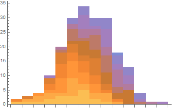
Edit, oh I knew there was a simpler way:

BarChart[HistogramList[data][[2]] // Transpose, 
 ChartLayout -> "Stacked"]

enter image description here

$\endgroup$

Your Answer

By clicking “Post Your Answer”, you agree to our terms of service and acknowledge you have read our privacy policy.

Not the answer you're looking for? Browse other questions tagged or ask your own question.