1
$\begingroup$

This is a follow-up question of my previous post: How to combine several plots with different $x$ and $y$-axis?

gthres = 1/3 + (19 - 3 Sqrt[33])^(1/3)/3 + (19 + 3 Sqrt[33])^(1/3)/3;
data1 = {{E^0.609378, 10}, {E^0.609379, 8}, {E^0.609395, 
   6}, {E^0.610285, 4}, {E^0.61073, 3.8}, {E^0.611392, 
   3.6}, {E^0.612376, 3.4}, {E^0.613835, 3.2}, {E^0.615994, 
   3}, {E^0.619176, 2.8}, {E^0.62384, 2.6}, {E^0.630628, 
   2.4}, {E^0.640412, 2.2}, {E^0.654347, 2}, {E^0.663323, 
   1.9}, {E^0.673925, 1.8}, {E^0.686401, 1.7}, {E^0.70103, 
   1.6}, {E^0.718126, 1.5}, {E^0.738047, 1.4}, {E^0.761207, 
   1.3}, {E^0.788093, 1.2}, {E^0.819291, 1.1}, {E^0.855529, 
   1}, {E^0.897738, 0.9}, {E^0.94715, 0.8}, {E^1.005469, 
   0.7}, {E^1.075163, 0.6}, {E^1.160036, 0.5}, {E^1.266435, 
   0.4}, {E^1.406236, 0.3}};
datak1 = {{E^0.000355, 0.001}, {E^0.288254, 1}, {E^0.450301, 
   2}, {E^0.538749, 3}, {E^0.592586, 4}, {E^0.628792, 5}, {E^0.654981,
    6}, {E^0.674948, 7}, {E^0.690774, 8}, {E^0.703694, 
   9}, {E^0.714485, 10}, {E^0.731594, 12}, {E^0.744646, 
   14}, {E^0.759428, 17}, {E^0.770506, 20}, {E^0.783981, 
   25}, {E^0.79363, 30}, {E^0.800917, 35}, {E^0.806631, 
   40}, {E^0.811241, 45}, {E^0.815042, 50}};
yminmax1 = MinMax@data1[[All, 2]];
yminmaxk1 = MinMax@datak1[[All, 2]];
datak1rescaled = 
 Transpose[{#, Rescale[#2, yminmaxk1, yminmax1]} & @@ 
   Transpose[datak1]];
ListLinePlot[{datak1rescaled, data1}, 
 GridLines -> {{gthres}, None}, 
 GridLinesStyle -> Directive[AbsoluteThickness[1], Blue, Dashed], 
 PlotStyle -> {{Green},{AbsoluteThickness[2], Red}}, 
 PlotLegends -> {"\[Theta]-g curve (k=1)","k-g curve"}, 
 PlotRange -> {{1, 4}, {0, 10}}, LabelStyle -> 16, ImageSize -> Large,
  Frame -> True, FrameLabel -> {{"\[Theta]", "k"}, {"g", None}}, 
 FrameStyle -> {{Black, Red}, {Automatic, Automatic}}, 
 FrameTicks -> {{Charting`FindTicks[yminmax1, yminmaxk1], 
    All}, {Automatic, Automatic}}]

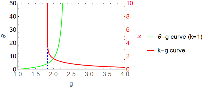
The plot looks fine except that the range of the $\theta$-axis on the left is misleading: There's a short section below zero which I don't want. I tried several methods like "PlotRange -> {{1, 4}, {{0,50},{0, 10}}}", "PlotRange -> {{{1, 4},{None}}, {{0,50},{0, 10}}" etc. But none worked. Can someone help? Thanks in advance!

$\endgroup$
3
  • $\begingroup$ Change definition of yminmax1 to yminmax1 = {0, Max@data1[[All, 2]]} $\endgroup$
    – Bob Hanlon
    Commented Jun 9, 2023 at 17:11
  • $\begingroup$ Thanks! But 0 on the left disappears. Is there a way to fix that? $\endgroup$ Commented Jun 9, 2023 at 17:26
  • 2
    $\begingroup$ Set: yminmax1 = {.001, Max@data1[[All, 2]]} $\endgroup$ Commented Jun 9, 2023 at 19:53

1 Answer 1

1
$\begingroup$

Note: The fixes to make this answer work are now published in the function repository. Use

ResourceRemove["CombinePlots"]

to revert back to using that version: After executing this, ResourceFunction["CombinePlots"] will once again use the public version.

Main answer

If you want maximal control over your secondary axis, there is ResourceFunction["CombinePlots"]: It allows you to simply take any two plots & merge them into one, similar to Show. However, it allows you more control over how the plots are merged. In particular, it allows you to specify that some plots should have their axis moved to the right/top via the "AxesSides" option. For your example, this would look like the following:

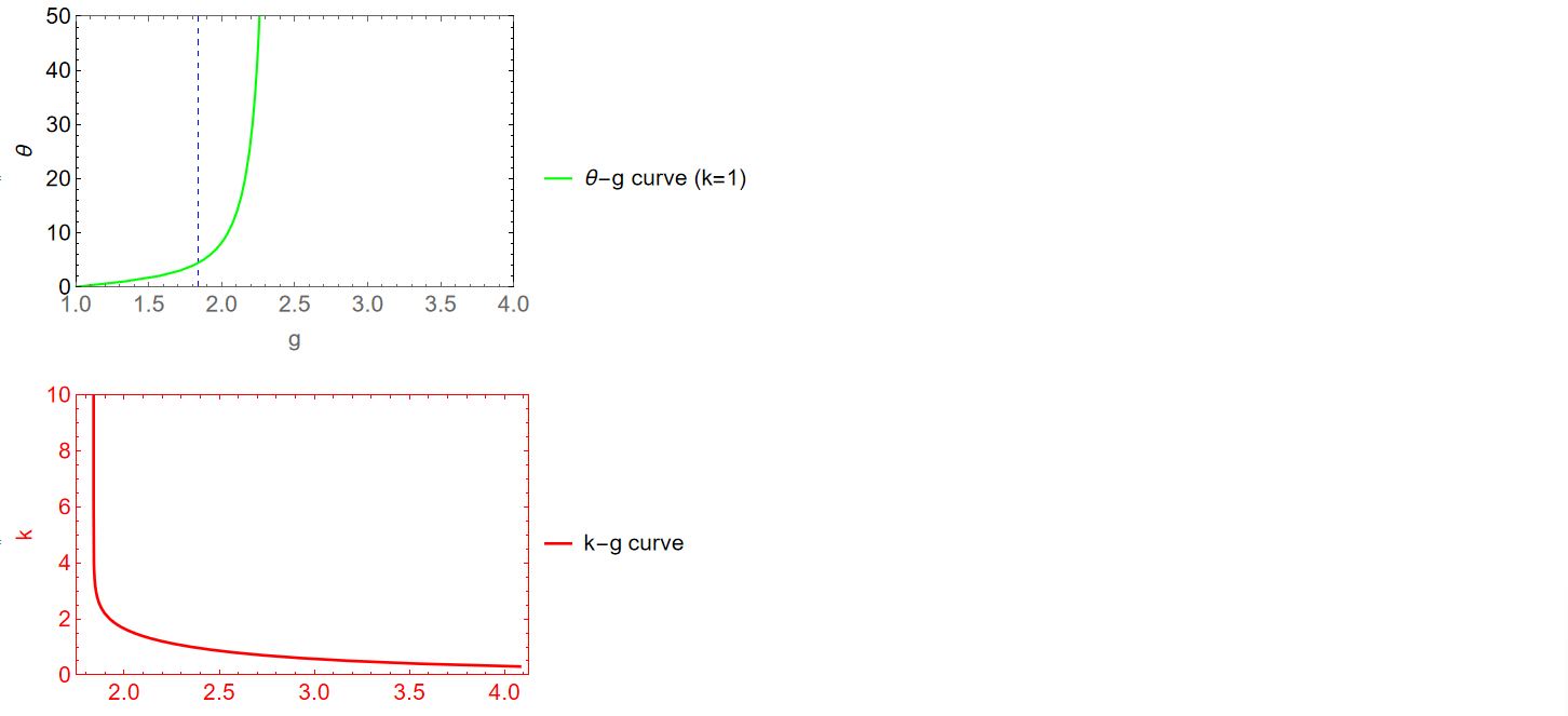
First, create the two plots to be combined:

plotk1 = ListLinePlot[datak1,
  GridLines -> {{gthres}, None},
  GridLinesStyle -> Directive[AbsoluteThickness[1], Blue, Dashed],
  PlotStyle -> Green,
  PlotLegends -> {"\[Theta]-g curve (k=1)"},
  PlotRange -> {{1, 4}, {0, 50}},
  LabelStyle -> 16,
  Frame -> True,
  FrameLabel -> {"g", "\[Theta]"},
  FrameStyle -> {Black, Automatic}
  ]
plot1 = ListLinePlot[data1,
  PlotStyle -> {AbsoluteThickness[2], Red},
  PlotLegends -> {"k-g curve"},
  PlotRange -> {Automatic, {0, 10}},
  LabelStyle -> 16,
  Frame -> True,
  FrameLabel -> {None, "k"},
  FrameStyle -> Red
  ]

enter image description here

Note that I effectively split up your styling specifications and applied only the relevant part to each plot. This way, it is straightforward to specify the desired plot range for each plot separately. Combining them is now done using ResourceFunction["CombinePlots"] with the setting "AxesSides"->"TwoY". This will use the vertical axis of the second plot to generate the axis on the right:

ResourceFunction["CombinePlots"][plotk1, plot1, "AxesSides" -> "TwoY"]

enter image description here

$\endgroup$

Your Answer

By clicking “Post Your Answer”, you agree to our terms of service and acknowledge you have read our privacy policy.

Not the answer you're looking for? Browse other questions tagged or ask your own question.