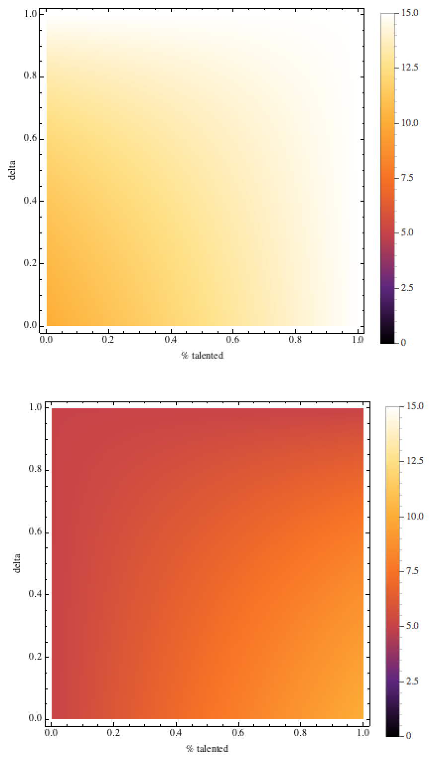
One approach could be to set the scaling of the colors yourself: (I slightly cleaned up the code a bit, so that we do not get confused by double-setting the options)
Module[{R1, R2, x, \[CapitalDelta], eqs},
 R1 = 15;
 R2 = 5;
 eqs = {-((R1 + R2 + R1 x - R2 x - R2 \[CapitalDelta] -
        R1 x \[CapitalDelta] +
        R2 x \[CapitalDelta])/(-2 + \[CapitalDelta])), -((2 R2 +
        R1 x - R2 x - R2 \[CapitalDelta] - R1 x \[CapitalDelta] +
        R2 x \[CapitalDelta])/(-2 + \[CapitalDelta]))};
 Row[DensityPlot[#, {x, 0, 1}, {\[CapitalDelta], 0, 1},
     ImageSize -> Medium, FrameLabel -> {"% talented", "delta"},
     PlotLegends -> Placed[BarLegend[{Automatic, {0, 15}}], Right],
     ColorFunction -> (ColorData["SunsetColors"][#/15] &),
     ColorFunctionScaling -> False] & /@ eqs
  ]]
I use ColorFunctionScaling->False to keep Mathematica from rescaling the colors. Note that I hardcoded the 15. You might want to adjust that.
Note: I kept your version of the legend.
EDIT, including ContourPlot
For ContourPlot, we have to define the legend differently (I guess this is due to the fact that Mathematica tries to build the legend around the existing contours of the graph, thus cuts off the rest of the legend - hence we apply some force)
 Module[{R1, R2, x, \[CapitalDelta], eqs, cf},
 R1 = 15;
 R2 = 5;
 cf = ColorData["SunsetColors"][#/15] &;
 eqs = {-((R1 + R2 + R1 x - R2 x - R2 \[CapitalDelta] -
        R1 x \[CapitalDelta] +
        R2 x \[CapitalDelta])/(-2 + \[CapitalDelta])), -((2 R2 +
        R1 x - R2 x - R2 \[CapitalDelta] - R1 x \[CapitalDelta] +
        R2 x \[CapitalDelta])/(-2 + \[CapitalDelta]))};
 Row[
  ContourPlot[#, {x, 0, 1},
  {\[CapitalDelta], 0, 1},
  ImageSize -> Medium,
  FrameLabel -> {"% talented", "delta"},
  PlotLegends -> Placed[BarLegend[{cf, {0, 15}}, 30], Right],
  ColorFunction -> cf, ColorFunctionScaling -> False] & /@ eqs]]
There is probably a more direct way to implement that. The way I suggest here specifies the ColorFunction once more with the proper scaling and creates the legend based on that.
Note: this legend works for both DensityPlot and ContourPlot, it seems.
end of edit
The resulting image (DensityPlot) looks like (I like SunsetColors):


