4
$\begingroup$

I am working with 5 different stress/strain data sets that I have graphed individually using ListPlot. Is there a way I can graph the average of the 5 sets and possibly show some form of a standard deviation using a shaded region? They have different increments of strain (some data sets may measure in increments of 1%, others in increments of .5%) if that affects the process.

Thank you so much!

$\endgroup$
5
  • 1
    $\begingroup$ If you provide data with a sample image of the specified plot, makes answering a lot easier. $\endgroup$
    – Ben Izd
    Feb 20, 2021 at 7:38
  • 1
    $\begingroup$ You may interpolate your data using Interpolateand then calculate data for common values of the independent variable. With these values you may get the mean and STD. $\endgroup$ Feb 20, 2021 at 13:34
  • $\begingroup$ Do the datasets overlap at specific strain values? If so, it might be scientifically prudent to only average at those values, depending on how much you want to approximate. Otherwise, using Mathematica's curve-fitting functions (as Daniel Huber suggested) is a good idea. $\endgroup$
    – thorimur
    Feb 21, 2021 at 1:20
  • 1
    $\begingroup$ Also, just to reiterate, if you provide the data, that would make this question answerable in more concrete terms! $\endgroup$
    – thorimur
    Feb 21, 2021 at 1:23
  • $\begingroup$ Besides the data you also need to describe how the data was collected because if the calculation of the standard deviation is to make any sense, there should be an underlying model describing the error structure. In other words, it's not just about the data values. $\endgroup$
    – JimB
    Feb 21, 2021 at 18:32

1 Answer 1

4
$\begingroup$

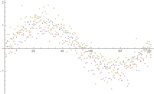
Let's start by creating some example datasets:

signal = Table[Sin[x], {x, Subdivide[0, 2 Pi, 100]}];
noise = {
   RandomVariate[NormalDistribution[0.2, 0.1], 101],
   RandomVariate[NormalDistribution[0.1, 0.2], 101],
   RandomVariate[NormalDistribution[0.4, 0.3], 101],
   RandomVariate[NormalDistribution[-0.1, 0.3], 101],
   RandomVariate[NormalDistribution[-0.2, 0.25], 101]
   };
data = signal + # & /@ noise;

Dimensions[data]

{5, 101}

ListPlot[data, ImageSize -> 500]
Mathematica graphics

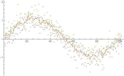
Now, for each point along the x-axis, compute the mean and standard deviation:

{mean, std} = Transpose[
   {Mean[#], StandardDeviation[#]} & /@ Transpose[data]
   ];

ListPlot[
 Append[data, mean],
 Joined -> {False, False, False, False, False, True},
 ImageSize -> 500
 ]
Mathematica graphics

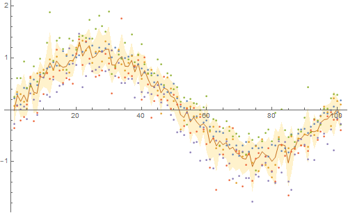
Now let us plot the standard deviation as a shaded area:

upper = mean + std;
lower = mean - std;
ListPlot[
 Join[data, {mean, upper, lower}],
 Joined -> {False, False, False, False, False, True, True, True},
 ImageSize -> 500,
 PlotStyle -> {Automatic, Automatic, Automatic, Automatic, Automatic, Automatic, None, None},
 Filling -> {8 -> {7}}
 ]
Mathematica graphics

You may find further inspiration in the post Plot confidence interval around curve.

Please let me know if this is not what you were looking for.

$\endgroup$

Your Answer

By clicking “Post Your Answer”, you agree to our terms of service and acknowledge you have read our privacy policy.

Not the answer you're looking for? Browse other questions tagged or ask your own question.