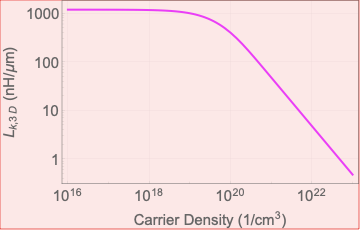
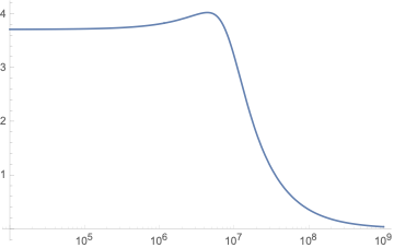
Below two figures are just for example. What should I do if I want to plot the two figures below on the same plot with the same y-axis only that the x-axis is also same but not labeled such that. As you can see both the plots have vastly different x-axes, I just want to plot the y values and compare them on the same plot showing the trend of y-values (domains of both the plots are different). How do I remove the x-axis and show the two figures on the same plot.
2 Answers
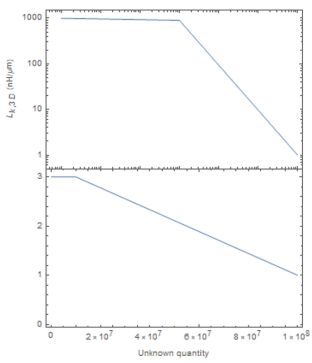
You can use ResourceFunction["PlotGrid"] to do this:
plt1 = ListLogLogPlot[
  {{10^16, 1000}, {10^19, 900}, {10^22, 1}},
  Frame -> True,
  Joined -> True,
  FrameLabel -> {"Carrier Density (1/\!\(\*SuperscriptBox[\(cm\), \(3\)]\))", "\!\(\*SubscriptBox[\(L\), \(k, 3  D\)]\) (nH/\[Mu]m)"}
  ]
plt2 = ListLinePlot[
  {{10^4, 3}, {10^7, 3}, {10^8, 1}},
  Frame -> True,
  FrameLabel -> {"Unknown quantity", None}
  ]

ResourceFunction["PlotGrid"][{{plt1}, {plt2}}]
PlotGrid will simply stack the plots exactly on top of each other, even if the plot ranges are different (note the mismatched ticks in between the plots.
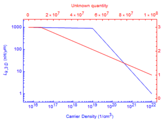
An alternative solution is to use ResourceFunction["CombinePlots"] with the "AxesSides" options:
plt1 = ListLogLogPlot[
   {{10^16, 1000}, {10^19, 900}, {10^22, 1}},
   Frame -> True,
   PlotStyle -> Blue,
   FrameStyle -> Blue,
   Joined -> True,
   FrameLabel -> {"Carrier Density (1/\!\(\*SuperscriptBox[\(cm\), \(3\)]\))", "\!\(\*SubscriptBox[\(L\), \(k, 3  D\)]\) (nH/\[Mu]m)"}
   ];
plt2 = ListLinePlot[
   {{10^4, 3}, {10^7, 3}, {10^8, 1}},
   Frame -> True,
   PlotStyle -> Red,
   FrameStyle -> Red,
   FrameLabel -> {"Unknown quantity", None}
   ];

ResourceFunction["CombinePlots"][plt1, plt2, "AxesSides" -> "TwoXY"]
Note how I styled both the lines and the frame of the two plots differently to make it easier to tell which axis belongs to which line. This has the added advantage of showing both lines directly on top of each other, while still preserving all the plot range information.
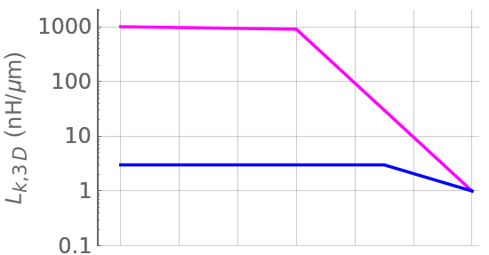
This can be done with Overlay. A few useful tricks for best results are
- Specify the same
Frameoption in both plots. This determines which ticks and frame labels show. - Specify the same
ImageSizein both plots. - Specify the same
ImagePaddingin both plots. This aligns the axes and allows room for the frame labels. - Use
GridLinesin one plot, but not in the other - Use the
PlotRangeoption to force the same or different scales.
Here is an example that applies the above tricks.
plt1 = ListLogLogPlot[{{10^16, 1000}, {10^19, 900}, {10^22, 1}},
   GridLines -> Automatic,
   PlotStyle -> Magenta, Joined -> True,
   PlotRange -> {All, {1/10, 2000}},
   ImageSize -> 250, ImagePadding -> {{50, 5}, {5, 5}},
   Frame -> {{True, False}, {False, False}},
   FrameLabel -> {"Carrier Density (1/\!\(\*SuperscriptBox[\(cm\), \
\(3\)]\))", "\!\(\*SubscriptBox[\(L\), \(k, 3  D\)]\) (nH/\[Mu]m)"}];
plt2 = ListLogLogPlot[{{10^4, 3}, {10^7, 3}, {10^8, 1}},
   PlotStyle -> Blue, Joined -> True,
   PlotRange -> {All, {1/10, 2000}},
   ImageSize -> 250, ImagePadding -> {{50, 5}, {5, 5}},
   Frame -> {{True, False}, {False, False}},
   FrameLabel -> {"Unknown quantity", None}];
Overlay[{plt1, plt2}]

