25
$\begingroup$

I've been asked to reproduce a bar chart generated in Excel in Mathematica. The original Excel chart looks like this;
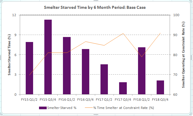
Excel chart

My Mathematica version looks like this;
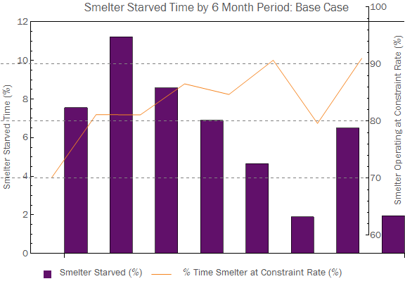
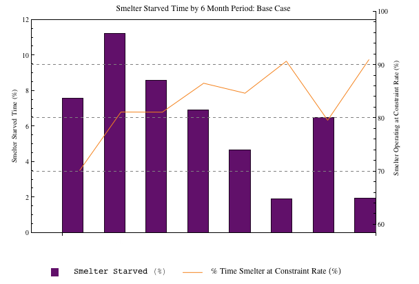
Mathematica chart

There are a couple of things wrong that I'd like to fix;

  1. The BarChart and ListPlot overlay doesn't seem to match up.
  2. The ChartLabels seem to have disappeared on the BarChart.
  3. Is there a nice way to make the ticks on the left and right sides match up (like when the Excel chart matches 9 % on the left to 90 % on the right)?
  4. I can't get the box and line to center align to the text in the legend.

Questions 1 and 2 are what I really need to fix, but 3 and 4 would be nice to have. Any help would be appreciated.

Here's the code I used to generate my chart;

purple = RGBColor[97/255, 16/255, 106/255];
orange = RGBColor[245/255, 132/255, 31/255];
labels = 
  {
    "FY15 Q1/2", "FY15 Q3/4", "FY16 Q1/2", "FY16 Q3/4", 
    "FY17 Q1/Q2", "FY17 Q3/Q4", "FY18 Q1/2", "FY18 Q3/4"
  };
starvedTime = {7.55, 11.23, 8.58333, 6.88833, 4.65167, 1.89, 6.49833, 1.95};
satTime = {70.1483, 81.1467, 81.115, 86.5483, 84.6833, 90.685, 79.6017, 91.0133};

plot1 = BarChart[starvedTime, 
  PlotRange -> {0, 12}, 
  ChartStyle -> purple, 
  BaseStyle -> "Text", 
  Frame -> {True, True, True, False},
  FrameTicks -> {False, True}, 
  FrameLabel -> {None, Style["Smelter Starved Time (%)", "Text"], None, None}, 
  PlotLabel -> "Smelter Starved Time by 6 Month Period: Base Case", 
  ImageSize -> Large, 
  ChartLabels -> {Placed[Style[#, "Text"] & /@ labels, Below], None},
  AxesOrigin -> {0, 0}, 
  PlotRangePadding -> {0, 0}, 
  BarSpacing -> 1];

plot2 = ListPlot[satTime, 
 Joined -> True, 
 PlotRange -> {60, 100}, 
 PlotStyle -> orange, 
 Frame -> {False, False, False, True}, 
 FrameTicks -> {None, None, None, All}, 
 FrameLabel -> 
  {None, None, None, Style["Smelter Operating at Constraint Rate (%)", "Text"]}, 
 BaseStyle -> "Text", 
 GridLines -> {None, Automatic}, 
 GridLinesStyle -> Directive[Gray, Dashed],
 ImageSize -> Large];

box = Graphics[{purple, Rectangle[]}, ImageSize -> 12];
text = Style["   Smelter Starved (%)   ", "Text"];
line = Graphics[{orange, Line[{{0, 0.5}, {1, 0.5}}]}, ImageSize -> {30, Automatic}];
text2 = Text[Style["    % Time Smelter at Constraint Rate (%)       ", "Text"]];
legend = Row[{box, text, line, text2}];

Column[{Overlay[{plot1, plot2}], legend}, Alignment -> {Center, Center}]
$\endgroup$

2 Answers 2

24
$\begingroup$

Answers to your 4 questions step by step to see how each of these changes the composite plot:

1. The image padding around the two images differs so you need to set a fixed value for each. With ImagePadding -> {{50, 50}, {50, 10}} as an option for both plots I get this:

enter image description here

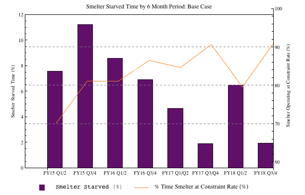
2. ChartLabels -> Placed[Style[#, "Text"] & /@ labels, Below],ImagePadding -> {{50, 50}, {20, 10}},

enter image description here

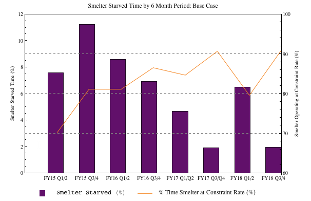
3. in plot #2 add PlotLabel -> ""

enter image description here

4. I almost always prefer Grid to Row:

box = Graphics[{purple, Rectangle[]}, ImageSize -> 12];
text = "Smelter Starved (%)";
line = Graphics[{orange, Line[{{0, 0.5}, {1, 0.5}}]}, ImageSize -> {30, Automatic}];
text2 = "% Time Smelter at Constraint Rate (%)";
legend = Grid[{{box, text, line, text2}}, Alignment -> {{Right, Left}, Center},
BaseStyle -> Directive[FontFamily -> "Arial"], Spacings -> {{0, 0.5, 2}, 0}];

enter image description here

Finishing touches

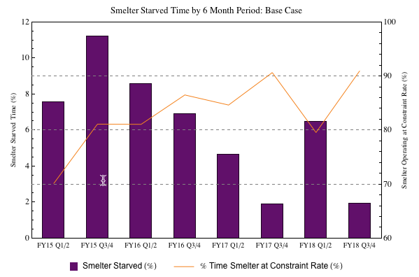
Bar chart plot ranges go from 0.5 to length of data + 0.5. So set the plot range of your bar chart to PlotRange -> {{0.5, 8.5}, {0, 12}} and for the list plot to PlotRange -> {{0.5, 8.5}, {60, 100}}. Now set your data range for ListPlot to be DataRange -> {1, 8}. This will ensure that the point coincide with the middle of your bars.

plot1 = BarChart[starvedTime, AspectRatio -> 1/GoldenRatio, 
   AxesOrigin -> {0, 0}, BarSpacing -> 1, 
   BaseStyle -> Directive[FontFamily -> "Arial"], 
   ChartLabels -> Placed[labels, Below], ChartStyle -> purple, 
   Frame -> {True, True, True, False}, 
   FrameLabel -> {None, "Smelter Starved Time (%)", None, None}, 
   FrameTicks -> {{#, "", {0, 0.01}} & /@ Range[0.5, 8.5, 1], {0, 3, 
      6, 9, 12}, None, None}, FrameTicksStyle -> Directive[Plain, 12], 
   GridLines -> {None, {3, 6, 9}}, 
   GridLinesStyle -> Directive[Gray, Dashed], 
   ImagePadding -> {{50, 50}, {20, 10}}, ImageSize -> 600, 
   LabelStyle -> Directive[Bold, 12], 
   PlotLabel -> 
    Style["Smelter Starved Time by 6 Month Period: Base Case", 13], 
   PlotRange -> {{0.5, 8.5}, {0, 12}}, PlotRangePadding -> 0, 
   Ticks -> None];

plot2 = ListPlot[satTime, AspectRatio -> 1/GoldenRatio, Axes -> False,
    BaseStyle -> Directive[FontFamily -> "Arial"], 
   DataRange -> {1, 8}, Frame -> {False, False, False, True}, 
   FrameTicks -> {None, None, None, {60, 70, 80, 90, 100}}, 
   FrameTicksStyle -> Directive[Plain, 12], 
   FrameLabel -> {None, None, None, 
     "Smelter Operating at Constraint Rate (%)"}, ImageSize -> 600, 
   ImagePadding -> {{50, 50}, {20, 10}}, Joined -> True, 
   LabelStyle -> Directive[Bold, 12], PlotRangePadding -> 0, 
   PlotRange -> {{0.5, 8.5}, {60, 100}}, PlotStyle -> orange, 
   PlotLabel -> Style["", 13]];

enter image description here

Note #1. there is scope for you to match the fonts of the Excel chart.

Note #2. Labeled could be used instead of Column.

Note #3. To completely match the Excel chart you actually need the grid lines to be used in the bar chart rather than the list plot.

Note #4. Added some ticks between the bars.

Note #5. Corrected labels: "FY17 Q1/Q2", "FY17 Q3/Q4",

$\endgroup$
1
  • $\begingroup$ Great tips. I particularly like the use of Grid, I haven't really done that before. I'm using a Stylesheet to match the fonts. $\endgroup$
    – Cam
    Commented Mar 13, 2013 at 2:15
21
$\begingroup$

Often I find it easier to construct such graphics directly from Graphics primitives.

First your data:

purple = RGBColor[97/255, 16/255, 106/255];
orange = RGBColor[245/255, 132/255, 31/255];
labels = {"FY15 Q1/2", "FY15 Q3/4", "FY16 Q1/2", "FY16 Q3/4",
          "FY17 Q1/Q2", "FY17 Q3/Q4", "FY18 Q1/2", "FY18 Q3/4"};
starvedTime = {7.55, 11.23, 8.58333, 6.88833, 4.65167, 1.89, 6.49833, 1.95};
satTime = {70.1483, 81.1467, 81.115, 86.5483, 84.6833, 90.685, 79.6017, 91.0133};

Then some prepared parts:

lblspec =
  Join[
   MapIndexed[{#2[[1]], #, 0} &, labels],
   {#, "", {0, 0.01}} & /@ Range[1.5, 8, 1]
  ];

box = Graphics[{purple, Rectangle[{0, 0}, {2.7, 1}]}, ImageSize -> 27];
text = "Smelter Starved (%)";
text2 = "% Time Smelter at Constraint Rate (%)";
line = Graphics[{orange, Line[{{0, 0.5}, {1, 0.5}}]}, ImageSize -> 30];
legend = Row@{box, Spacer[5], text, Spacer[50], line, Spacer[5], text2};

Then auxiliary functions and a style definition:

style1 = {FontFamily -> "Tahoma", 11};

bar[w_][h_, {p_}] := Rectangle[{p - w/2, 0}, {p + w/2, h}] (* width, height, position *)

scale = Rescale[#, {60, 100}, {0, 12}] &; (* range of each y axis *)

Finally, the Graphics:

Graphics[{
   {purple, bar[0.4] ~MapIndexed~ starvedTime},
   {orange, Thickness[0.0025], Line[{#2[[1]], scale @ #} & ~MapIndexed~ satTime]}
  },
  PlotRange -> {{0.5, 8.5}, {0, 12}},
  GridLines -> {None, {3, 6, 9}},
  GridLinesStyle -> Directive[Gray, Dashed],
  Frame -> True,
  FrameTicks -> {{Range[0, 12, 3], {scale @ #, #} & /@ Range[60, 100, 10]}, {lblspec, None}},
  LabelStyle -> style1, 
  FrameLabel -> {None, Style["Smelter Starved Time (%)", Bold], Spacer[{0, 10}], 
    Style["Smelter Operating at Constraint Rate (%)", Bold]},
  PlotLabel -> Style[
    "Smelter Starved Time by 6 Month Period: Base Case",
    FontFamily -> "Helvetica", Bold, 14],
  ImageSize -> 580,
  AspectRatio -> 0.55
] // Grid[List /@ {#, legend ~Style~ style1}] &

Mathematica graphics

I didn't get the fonts exact, and I didn't bother to increase the space around the left and right Tick labels but otherwise I think you'll agree it's pretty close.

$\endgroup$
3
  • $\begingroup$ I agree it is very close. It's an interesting approach doing it using Graphics primitives. Thanks for your help. $\endgroup$
    – Cam
    Commented Mar 13, 2013 at 2:17
  • $\begingroup$ @Cam You are welcome. May I know, out of curiosity, why you Accepted the other answer? (To my eye this method is cleaner but perhaps my perspective is lacking.) $\endgroup$
    – Mr.Wizard
    Commented Mar 13, 2013 at 2:39
  • $\begingroup$ It's certainly less code. The answer from Mike was similar to the way that I originally coded it (which may not be a good thing). However, it does mean that I would have more hope of modifying it myself in the future. Your answer did get me thinking about how I do these kinds of charts but at the moment it's probably a bit too complex for my skill level. $\endgroup$
    – Cam
    Commented Mar 13, 2013 at 3:40

Your Answer

By clicking “Post Your Answer”, you agree to our terms of service and acknowledge you have read our privacy policy.

Not the answer you're looking for? Browse other questions tagged or ask your own question.