5
$\begingroup$

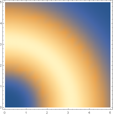
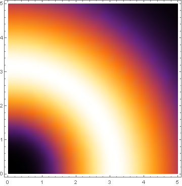
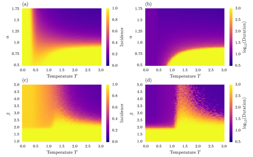
I would like to create a heat map like that following:

enter image description here

This code:

f[x_, y_] := (x^2 + y^2)^2 Exp[-((x^2 + y^2)/5)]
DensityPlot[f[x, y], {x, 0, 5}, {y, 0, 5}]

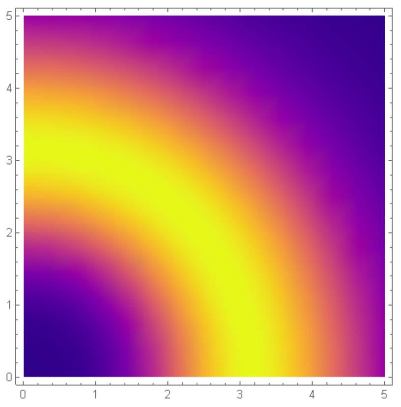
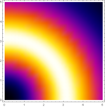
gives me the following:

enter image description here

Is there a color scheme that looks more than the first picture? Is there a way to add labels and legend that are part of the picture? I would like to just export it to pdf and add it in latex.

PS. By the way, I am not asking about a table of 4 heat maps, I just need to know how to create this kind of heat maps.

$\endgroup$
1
  • 1
    $\begingroup$ This looks like Python plasma color. $\endgroup$ Commented Aug 9, 2019 at 15:41

6 Answers 6

8
$\begingroup$

The color looks like Python's plasma color. When we follow this strategies on this answers and get the color gradient here and copy paste and cropped it carefully, we get the following plot.enter image description here

{col, row} = ImageDimensions@plasma;

plasmaMMA = 
  Module[{colorlist}, 
   colorlist = 
    Catenate@
     ImageData@ImageTake[plasma, {Round[row/2], Round[row/2]}, All];
   Evaluate[Blend[RGBColor @@@ colorlist, #] &]];
f[x_, y_] := (x^2 + y^2)^2 Exp[-((x^2 + y^2)/5)]
DensityPlot[f[x, y], {x, 0, 5}, {y, 0, 5}, ColorFunction -> plasmaMMA]

enter image description here

You can repeat the same procedure for this img. Crop the bar legend from the image get the figure.

$\endgroup$
7
$\begingroup$

If you don't need precisely that scheme, the named gradient scheme SunsetColors is pretty close to what you want:

f[x_, y_] := (x^2 + y^2)^2 Exp[-((x^2 + y^2)/5)]
DensityPlot[f[x, y], {x, 0, 5}, {y, 0, 5}, 
  ColorFunction -> ColorData["SunsetColors"]]
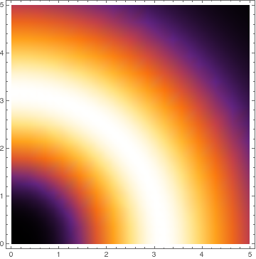
enter image description here

There are several named color schemes built into Mathematica. The easiest way to browse through them is to type "ColorData" into an input cell and then select "Choose Color Scheme" from the contextual menu that pops up under your input.

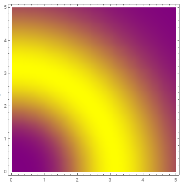
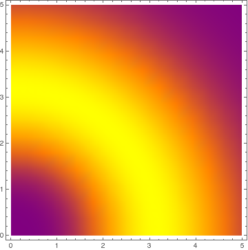
Alternately, you can use Blend to roll your own scheme that linearly interpolates between purple, orange, and yellow:

DensityPlot[f[x, y], {x, 0, 5}, {y, 0, 5}, 
  ColorFunction -> (Blend[{Purple, Orange, Yellow}, #1] &)]
enter image description here

This can be tweaked by replacing the arguments Purple, Orange, or Yellow with other RGBColor objects. (For example, the Purple used by Mathematica is redder, while the purple color in your examples is a bluer shade that I might call "violet". Mathematica's Yellow also has a higher saturation than the yellow in your examples.) The "speed" of the interpolation can also be controlled; consult the Blend documentation for details.

$\endgroup$
1
  • $\begingroup$ The standard color maps are also listed in the documentation. $\endgroup$
    – Julius
    Commented Aug 9, 2019 at 13:50
6
$\begingroup$

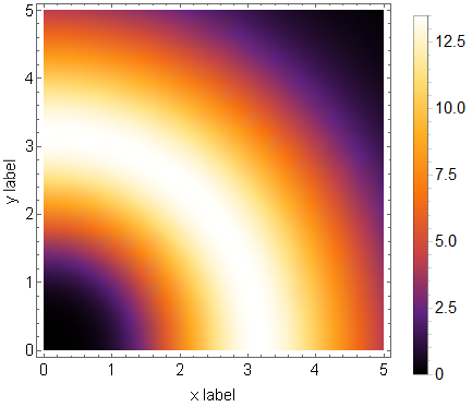
In addition to the previous suggestions for changing the color scheme, here's how you can add labels and export it to a pdf you can use in Latex

SetDirectory[NotebookDirectory[]]; (*Change directory for output*)

f[x_, y_] := (x^2 + y^2)^2 Exp[-((x^2 + y^2)/5)]
p1 = DensityPlot[f[x, y], {x, 0, 5}, {y, 0, 5},
  ColorFunction -> ColorData["SunsetColors"], (*Change color scheme*)
  FrameLabel -> {"x label", "y label"}, (*Add some labels*)
  LabelStyle -> {Black, 15},(*Change label style*)
  PlotLegends -> True (*Add a legend*)
  ] 
Export["filename.pdf", p1] (*Export to file*)

enter image description here

You might also find the documentation of DensityPlot[] useful.

$\endgroup$
4
$\begingroup$

You can make a custom color function Blending Purple and Yellow:

f[x_, y_] := (x^2 + y^2)^2 Exp[-((x^2 + y^2)/5)]

DensityPlot[f[x, y], {x, 0, 5}, {y, 0, 5}, 
  ColorFunction -> (Blend[{Purple, Yellow}, #] &)]

enter image description here

$\endgroup$
4
$\begingroup$

Here is a way to extract a color scheme from one you like from the web. I found an image of the FLIR iron pallete from this blog post. By executing the following code, you can blend a color scheme and compare the results to "SunsetColors".

img = Import[
   "http://lh6.ggpht.com/-ML05X6b7Acs/UyIoexgMBTI/AAAAAAAAF0g/\
A80fhSA2rks/Iron%252520Gradient.png?imgmax=800"];
dims = ImageDimensions[img];
colors = RGBColor[#] & /@ 
   Reverse[ImageData[img][[2 ;; dims[[2]] - 1, 
      IntegerPart@(dims[[1]]/2)]]];
f[x_, y_] := (x^2 + y^2)^2 Exp[-((x^2 + y^2)/5)]
DensityPlot[f[x, y], {x, 0, 5}, {y, 0, 5}, 
 ColorFunction -> ColorData["SunsetColors"]]
DensityPlot[f[x, y], {x, 0, 5}, {y, 0, 5}, 
 ColorFunction -> (Blend[colors, #] &)]

Sunset Colors

Sunset Colors

FLIR Iron Pallete

FLIR Iron Pallete

$\endgroup$
2
$\begingroup$

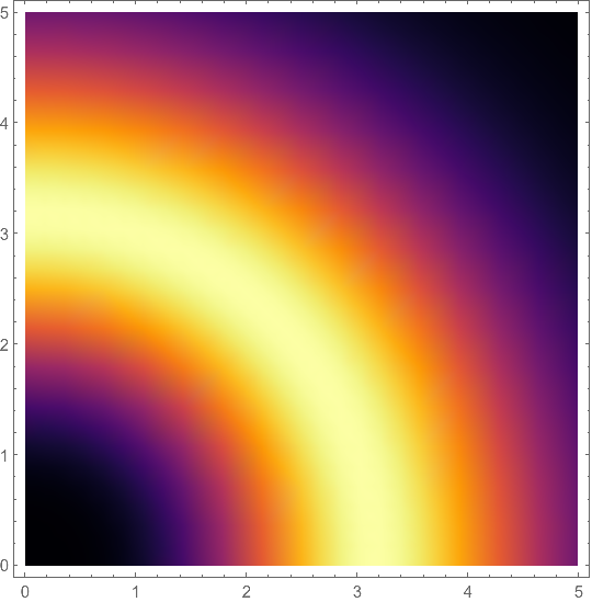
Colormaps for linear visual perception AND grayscale printing shows various ways to get Matplotlib's color schemes. Here's "inferno":

(*https://mathematica.stackexchange.com/a/127332/4999*)
ClearAll[MPLColorMap]
<< "http://pastebin.com/raw/pFsb4ZBS";

MPLColorMap["Inferno"]

DensityPlot[(x^2 + y^2)^2 Exp[-((x^2 + y^2)/5)], {x, 0, 5}, {y, 0, 5},
  ColorFunction -> MPLColorMap["Inferno"]]

enter image description here

Is there an easy way to use Matteo Niccoli's perceptual color maps for 2D plots in Mathematica? also presents some color schemes

$\endgroup$

Your Answer

By clicking “Post Your Answer”, you agree to our terms of service and acknowledge you have read our privacy policy.

Not the answer you're looking for? Browse other questions tagged or ask your own question.