3
$\begingroup$

Consider the following list

list = {{1,1,1},{1,2,1},{1,3,2},{1,4,2},
        {2,1,1},{2,2,2},{2,3,2},{2,4,2},
        {3,1,1},{3,2,2},{3,3,3},{3,4,3},
        {4,1,2},{4,2,3},{4,3,3},{4,4,3}};

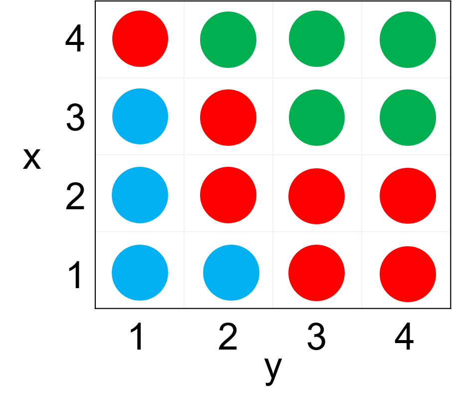
The list is composed of sublists in the form of {x,y,value}, where the first and second element are the coordinates, and the third element is a value which should be assigned in the phase diagram.

In the example above, I would a different color to be assigned to a different number (say 1 - blue, 2 - red, 3 - green).

The result should look like the following

enter image description here

This is a simplified example of a much larger data set, with very small spacings between the {x,y} values, which should eventually produce several colors that represent phases.

$\endgroup$
2
  • 2
    $\begingroup$ Why do you call this a "phase plot"? $\endgroup$ Commented Mar 26, 2019 at 20:10
  • $\begingroup$ @Stork, changed to phase diagram, if u know a better terminology please edit. $\endgroup$
    – jarhead
    Commented Mar 27, 2019 at 7:13

3 Answers 3

9
$\begingroup$

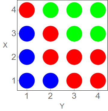
E.g.

Graphics[{{Blue, Red, Green}[[#3]], Disk[{#2, #}, 1/3]} & @@@ list,
 AxesOrigin -> {1, 1}/2, FrameStyle -> FontSize -> 28,
 FrameTicks -> {Range[4], Range[4], None, None}, Frame -> True,
 FrameLabel -> {Style["Y", 24], Rotate[Style["X", 24], -90 °]}]

$\endgroup$
1
  • 2
    $\begingroup$ Perhaps it is personal preference, but would it be better practice to use the option RotateLabel -> False rather than rotate the "X" label manually? $\endgroup$
    – user40265
    Commented Mar 27, 2019 at 2:23
3
$\begingroup$

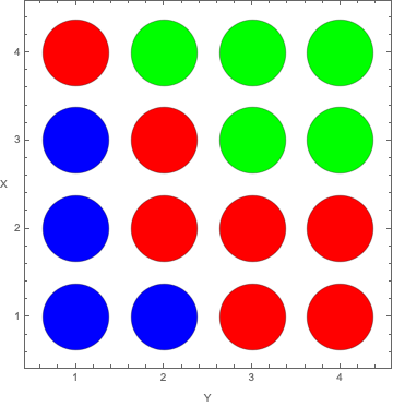
This approach might appeal

BubbleChart[list /. {x_, y_, z_} -> {y, x, z}, 
 BubbleSizes -> {0.25, 0.25}, 
 ColorFunction -> 
  Function[{x, y, r}, 
   Switch[{x, y, r}, {_, _, 1}, Blue, {_, _, 2}, Red, {_, _, 3}, 
    Green]], ColorFunctionScaling -> False, 
 FrameTicks -> {Range[4], Range[4], None, None}, Frame -> True, 
 FrameLabel -> {"Y", "X"}, RotateLabel -> False]

enter image description here

You can adjust the space between bubbles by changing the BubbleSizes.

$\endgroup$
3
$\begingroup$

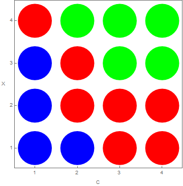
Using MapThread:

list = {{1, 1, 1}, {1, 2, 1}, {1, 3, 2}, {1, 4, 2}, {2, 1, 1}, {2, 2, 
    2}, {2, 3, 2}, {2, 4, 2}, {3, 1, 1}, {3, 2, 2}, {3, 3, 3}, {3, 4, 
    3}, {4, 1, 2}, {4, 2, 3}, {4, 3, 3}, {4, 4, 3}};

cols = {1 -> Blue, 2 -> Red, 3 -> Green};

t = MapThread[{Lookup[cols, #3, Black]
     , Disk[{#2, #1}, 0.4]} &
   , list // Transpose];

Graphics[t
 , Frame -> True
 , FrameTicks -> {{Range[4], None}
   , {Range[4], None}
   }
 , FrameLabel -> {{Rotate["X", -π/2], None}
   , {"C", None}}
 ] 

Another way could be to use Epilog in an otherwise empty ListPlot.

newList = 
 list /. {x_, y_, z_} :> {Lookup[cols, z, Black], Point@{y, x}} // 
  Flatten

ListPlot[{}
 , PlotRange -> {{0.5, 4.5}, {0.5, 4.5}}
 , Frame -> True
 , FrameTicks -> {{Range[4], None}
   , {Range[4], None}
   }
 , FrameLabel -> {{Rotate["X", -\[Pi]/2], None}
   , {"C", None}}
 , AspectRatio -> Automatic
 , Epilog -> {AbsolutePointSize[70]
   , newList
   }
 ]

Or rearrange the data further to plot it using ListPlot while incorporating PlotMarkers.

t2 = Transpose[{list[[All, 2]], list[[All, 1]]}]
t3 = Lookup[cols, list[[All, 3]], Black]
ListPlot[List /@ t2
 , PlotMarkers -> {Graphics[Disk[{0, 0}, 0.4]
    , ImageSize -> 80]}
 , PlotStyle -> t3
 , AspectRatio -> Automatic
 , PlotRange -> {{0.5, 4.5}, {0.5, 4.5}}
 , Frame -> True
 , FrameTicks -> {{Range[4], None}
   , {Range[4], None}
   }
 , FrameLabel -> {{Rotate["X", -\[Pi]/2], None}
   , {"C", None}}
 
 ]

Result:

enter image description here

$\endgroup$

Your Answer

By clicking “Post Your Answer”, you agree to our terms of service and acknowledge you have read our privacy policy.

Not the answer you're looking for? Browse other questions tagged or ask your own question.