Here's a few ways to visualize the data:
I've imported your data as a 524 by 3 matrix:
Dimensions[data]
{524, 3}
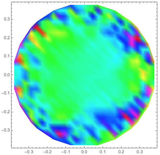
The easiest way is with ListDensityPlot:
ListDensityPlot[data, ColorFunction -> Hue]
For the other methods, I rescale the function values to run from 0 to 1:
data[[All, 3]] = Rescale[data[[All, 3]]];
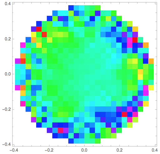
A different approach is to use Graphics:
Graphics[
 {Hue[#3], {Hue[#3], Cuboid[{#1, #2} - 0.015, {#1, #2} + 0.015]}} & @@@ data,
 Frame -> True
]
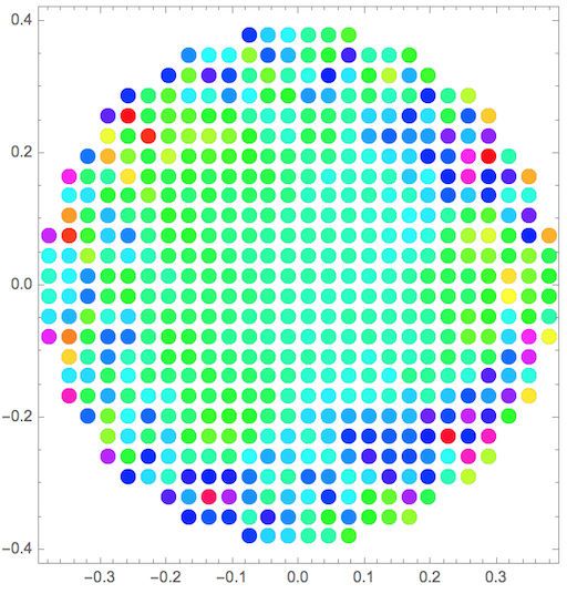
Another is with ListPlot:
ListPlot[
 Style[{#1, #2}, Hue[#3]] & @@@ data,
 PlotStyle -> PointSize[0.03],
 AspectRatio -> Automatic,
 Axes -> False,
 Frame -> True
]
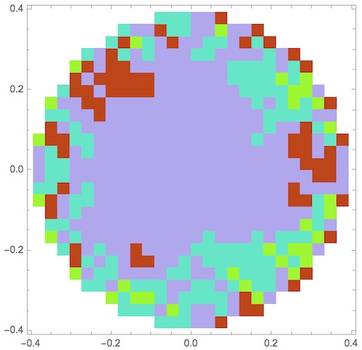
As for marking similar values, you can use ClusterClassify. Here I partition into 4 groups:
c = ClusterClassify[data, 4];

Do[color[j] = RandomColor[], {j, 1, 4}]

Graphics[{color[#3], Cuboid[{#1, #2} - 0.015, {#1, #2} + 0.015]} & @@@
  Map[Append[Most[#], c[#]] &, data], Frame -> True]


ListDensityPlot. $\endgroup$