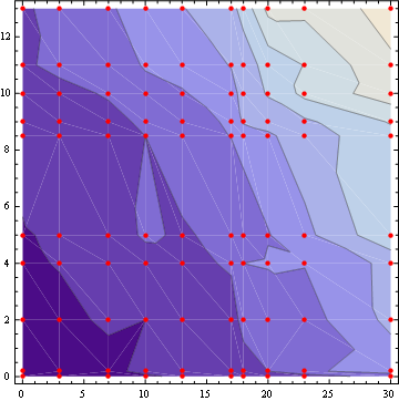
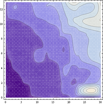
I've a large data make matrix 100*100 and and other two sets of data represent the x and y axis. Each value in the matrix is a related to one value in x and one value of y. I ask about a way to plot these data list contour plot and about how to combine this figure with list log plot and I don't want to write the the data manually
mat = {{22, 36, 44, 44, 48, 59, 67, 87, 89, 83}, {44, 32, 39, 52, 54,
   72, 63, 78, 118, 139}, {41, 36, 56, 63, 77, 84, 78, 107, 112,
   141}, {41, 64, 50, 82, 106, 100, 113, 127, 156, 183}, {61, 60, 57,
   85, 95, 122, 134, 145, 172, 197}, {50, 61, 78, 106, 113, 151, 155,
   185, 202, 238}, {61, 78, 116, 150, 122, 164, 207, 215, 227,
   265}, {95, 100, 108, 155, 147, 192, 217, 255, 267, 364}, {71, 144,
   128, 152, 187, 227, 241, 314, 302, 363}, {126, 166, 213, 214, 290,
   284, 304, 378, 392, 420}} ;
x = {0.01, 3, 7, 10, 13, 17, 18, 20, 23, 30} ;
y = {0.01, 0.19, 2, 4, 5, 8.5, 9, 10, 11, 13};


ListContourPlotaccepts matrix data, and addingDataRange -> {{xmin, xmax}, {ymin, ymax}}will ensure the ticks are displayed correctly. I do not know what you mean by combining this withListLogPlot, though. Would you clarify, please. $\endgroup$