I know this question came up so many times, but after browsing through many of the threads, I'm still not sure, if I'm doing it correctly with my dataset, so I'll give it a try.
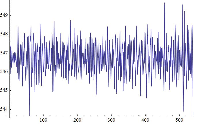
If have some sample data I know not much about. You can download it here

Now I want to look for possible dominant frequencies and it tried it like this:
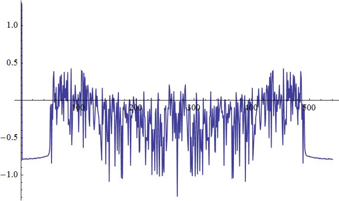
ListLinePlot[Log[10, Abs[Fourier[data]]], PlotRange -> Automatic]
and I get this:

Correct me if I'm wrong, but I don't see any dominant frequencies in here. Do you guys come to the same conclusion? Honestly, I think I'm doing it all wrong because I'm really not sure which of the many functions of mathematica to use.
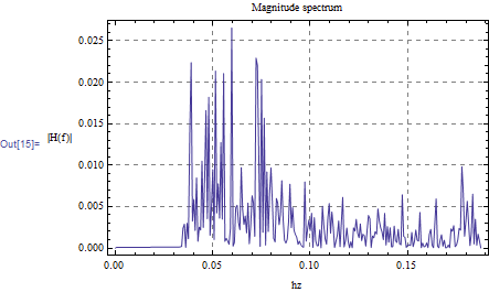
EDIT: Now I'm totally confused. I just looked again in some of my books and what they did there was drawing the frequencies on the x-Axes and the Power on the y-Axes. Then they normalised it to the total power. How to do this?


fsbelow to 2800. $\endgroup$