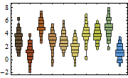
I don't quite remember what this type of plot is called, but here is the idea: I have some data which is indexed by time, and I want to look at the evolution of the distribution of that data as time progresses.
To accomplish this, I want a discrete plot with times 1,2,...,n, and instead of a point at each time, I want a histogram or approximate bell curve aligned around the mean for that time.
For example, if my data was
{{1,2,2,3},{2,3,3,4},{3,4,4,5}}
then above the t=1 point, I would want a small sideways histogram centered around 2, at t=2 I would want a small sideways histogram centered around 3, and at time 4 I would want a small sideways histogram centered around 4.
I am sure that this is not an exotic type of graph, as I remember seeing a whole section about them in my stats book (from oh so long ago).
Could anyone tell me what the name of this type of graph is, and how to make one in mathematica?

