5
$\begingroup$

I'm looking to show students a lesson on sensory perception, more specifically on masking. I know a little Mathematica but sound processing has evaded me.

  1. I would like to create a white noise and play it, show characteristics etc

    noise = RandomReal[1,{5000}];
    ListPlay[noise];
    Spectrogram[noise];
    Histogram[noise];
    
  2. Bandpass the white noise to produce different bandwidth sounds. This didn't work. Bandpassing the noise produces an amplitude constrained sound, but I was looking to constrain the sound to a specific frequency spectrum. How is this possible?

  3. Also looking to play two sounds at the same time. Sound[{sound1,sound2}] plays sounds in sequence. How can I get them to overlap? The idea would be to show how one sound can mask other sounds.

$\endgroup$
1
  • $\begingroup$ Check BandpassFilter, consider Rescaleing your lists to go from -1 to 1. Add the lists to get 2 sounds at the same time (or use ListPlay[{snd1, snd2},...] for stereo. Periodogram might be useful too. Check the option SampleRate, common to many of your functions of interest $\endgroup$
    – Rojo
    Commented Oct 2, 2013 at 20:05

1 Answer 1

5
$\begingroup$

This should get you started:

noise = RandomReal[1, {50000}];
snd1 = SampledSoundList[noise, 22050];
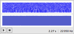
Sound[snd1]

enter image description here

This plays about 2 seconds of noise when you press the button. You can add sounds before turning them into the SampledSoundList. So for instance:

noise1 = RandomReal[1, {50000}];
noise2 = RandomReal[1, {50000}];
noise = noise1 + noise2;

does the addition, just like in lists. For filtering,

bpf = BandpassFilter[noise, {0.9, 1.2}];
snd2 = SampledSoundList[bpf, 22050];
Sound[snd2]

is a bandpass filtered version. You choose the range (in frequency) of the filter with the two parameters. Note how {0.3, 0.4} sounds quite different from {0.9, 1.0} the frequencies are normalized with respect to the Nyquist rate (11025 in this case). The spectrogram function is also simple.

Spectrogram[bpf]

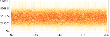
In the spectrogram, the horizontal axis is time and the vertical axis is frequency. So this picture is louder in the middle frequencies and softer in the higher and lower frequencies. The input appears to be scaled by Pi, so that a normalized frequency of Pi is the Nyquist rate (half the sampling rate). Listening to several different pairs such as {0.1,0.2} vs {0.3,0.4} you can clearly hear the differences (and see them in the corresponding spectrograms).

enter image description here

which looks quite different from the spectrogram of the noise (which is uniform over all frequencies).

$\endgroup$
0

Your Answer

By clicking “Post Your Answer”, you agree to our terms of service and acknowledge you have read our privacy policy.

Not the answer you're looking for? Browse other questions tagged or ask your own question.