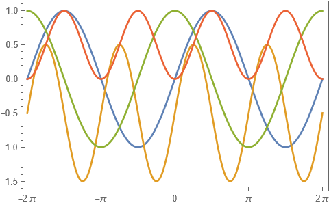
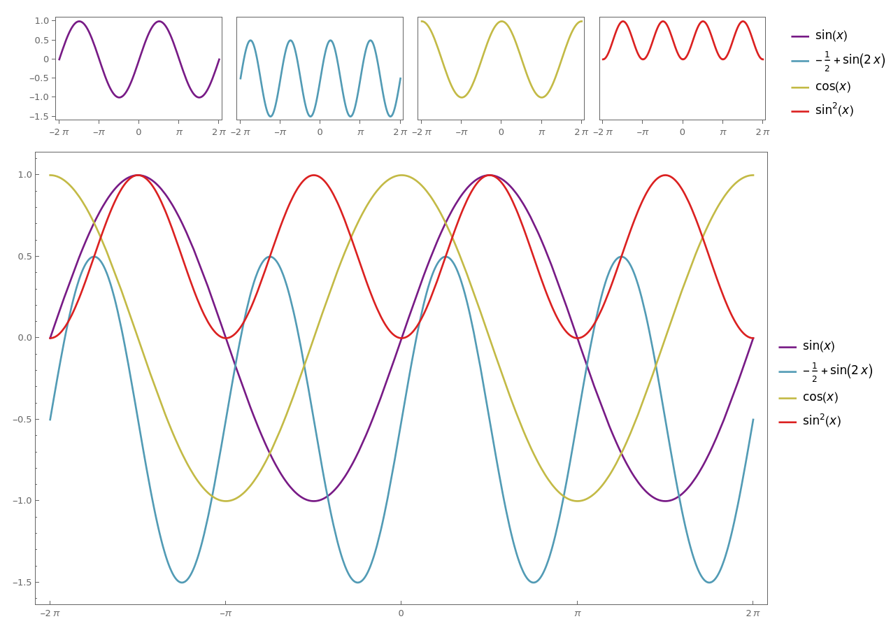
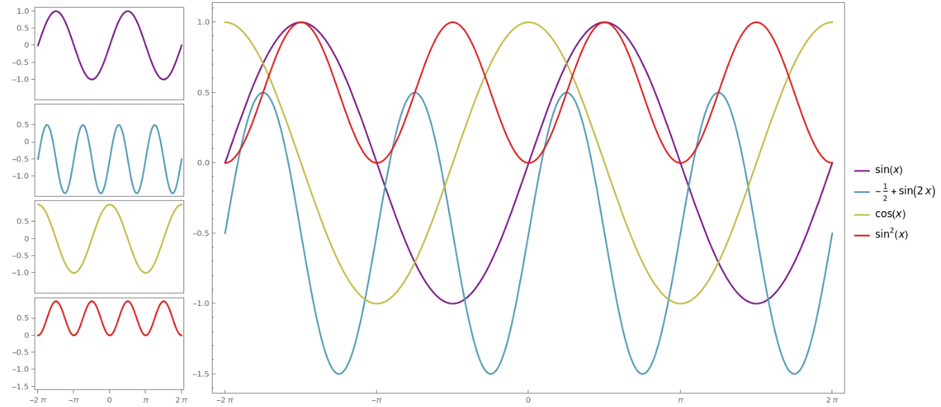
I finally installed 13.3 coming from 12.3 and I was giving some new features a test. I was excited by the new PlotLayout feature of Plot that generates grids of plots sharing axes. However, I ran into trouble trying to control the appearance of the frame ticks when compared to the standard overlaid presentation:
f = Plot[
      {Sin[x], Sin[2 x] - 1/2, Cos[x], Sin[x]^2}, {x, -2 Pi, 2 Pi},
      Frame -> True, Axes -> False,
      FrameTicks -> {{Automatic, None}, {Range[-2 Pi, 2 Pi, Pi], None}}
      PlotLayout -> #
    ] &;

f /@ {"Row", Automatic}
The bottom is what I would have expected: the horizontal frame ticks are symbolic multiples of $\pi$, and no ticks are produced at the bottom and on the right of the plot.
The top figure, stemming from the "Row" arrangement, was surprising to me: I didn't get the symbolic ticks at the bottom, there are unexpected ticks at the top that are partially clipped, there are clipped ticks on the right as well... In short, a rather poor presentation.
- How do I get symbolic ticks in a multipanel plot?
- How do I achieve control of which ticks are shown on which axes?
- I understand the choice of making all plots the same color in the Row presentation but, if needed, could I have the grid of plots automatically styled in the default colors, as used in the standard overlaid presentation?


PlotLayoutfunctionality offers very limited (if any) per-panel control over the various settings (although this is rather a case of not even a common setting working). If you really want the extra level of control, I'd suggest you to take a look atResourceFunction["PlotGrid"]- while less automatic, you can simply style each panel as you want before combining them (with many options for fine-tuning the result) $\endgroup$