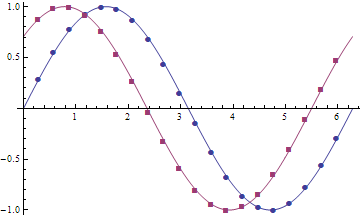
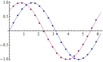
Bug introduced in 9.0 or earlier and persisting through 11.0
I have a set of data and several function operating on the same data, that I wish to plot together in a ListPlot. I need different PlotMarkers for each function to visualise the data. Because the data is quite closely spaced, I specified the number of markers using Mesh in the way I found here: Custom Intervals of Markers
So I have the following:
a = Table[ii, {ii, 0, 2 \[Pi], 0.01}];
b = Sin[a];
c = Sin[a + \[Pi]/4 ];

ListPlot[
  {Transpose[{a, b}],
   Transpose[{a, c}]
  },
 PlotMarkers -> Automatic,
 Joined -> True,
 Mesh -> 20]
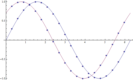
However, the Mesh command suddenly makes all markers the same shape and colour, so this is what I get out:

How can I make sure that the PlotMarkers' colour and shape remain unchanged while being able to specify the number of markers in the plot?
I'm using Mathematica 9.


ListPlotjoin the dots ... unless told to do so? Orrrr ... are you actually usingListLinePlotrather thanListPlot? $\endgroup$SetOptions[ListPlot, Joined -> True];earlier in the Notebook, sorry for that. It also seems like that is exactly what makes the difference. Without theJoined->Trueit works, with it, the markers change. Seems like a bug to me. $\endgroup$a) is randomly sampled, rather than evenly distributed like in this example? $\endgroup$