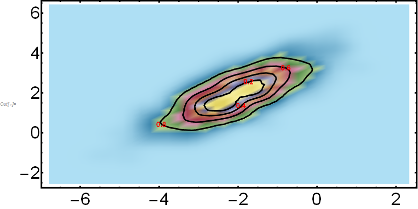
I would like to make a SmoothDensityHistogram of a data set where I can also visualize the probability level inside certain (concentric) regions. Here is the code:
somePoints =
  RandomReal[BinormalDistribution[{-2, 2}, {1, 1}, .8], 1000];

SmoothDensityHistogram[somePoints,
 Automatic, "PDF",
 ColorFunction -> "DarkBands",
 BaseStyle -> {FontSize -> 34, FontFamily -> "Arial"},
 FrameStyle -> Directive[Black, AbsoluteThickness[3]],
 ImageSize -> 800,
 AspectRatio -> 0.5,
 PlotRange -> All,
 MeshStyle -> Black,
 Mesh -> 5]
The issue that I have is to indicate the probability encircled by each mesh-line directly with a label on the plot (similar to what ContourPlot does). I am looking into MeshFunction but I cannot arrive to the results that I am looking for.
Ideally, I am also able to decide the mesh-lines that are plotted (eg corresponding to probabilities of 60% and 80%).
EDIT
I also tried the approach described here:
Contour lines over SmoothDensityHistogram
it works well in identifying the mesh-lines. However, I still cannot figure out how to label them according to the probability that they encircle (20, 40, 60 and 80% in the example):
  RandomReal[BinormalDistribution[{-2, 2}, {1, 1}, .8], 1000];
d = SmoothKernelDistribution[somePoints];

Show[SmoothDensityHistogram[somePoints,
  Automatic, "PDF",
  ColorFunction -> "DarkBands",
  BaseStyle -> {FontSize -> 34, FontFamily -> "Arial"},
  FrameStyle -> Directive[Black, AbsoluteThickness[3]],
  ImageSize -> 800,
  AspectRatio -> 0.5,
  PlotRange -> All,
  MeshStyle -> Black,
  Mesh -> 0],

 ContourPlot[PDF[d, {x, y}], {x, -4, 4}, {y, -5, 5},
  PlotRange -> All,
  Contours ->
   Function[{min, max},
    Rescale[{0.2, 0.4, 0.6, 0.8}, {0, 1}, {min, max}]],
  ContourShading -> None,
  ContourStyle -> {{Black, AbsoluteThickness[3]}}]]

