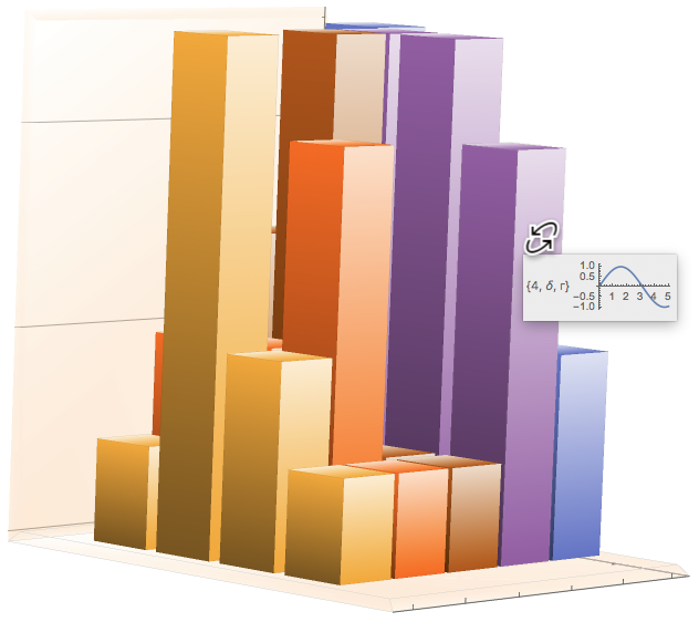
I have a large set of spectral data that requires comparison to training data. I need to provide a simple color difference for each piece of data, Spectral Plots of both the training data and RMSE Data for each color as well as one more set of ID info for each part of the plot. The plots are all BarChart3D and I am attempting to get all of this information as a ToolTip for each bar. Here's what I have so far:
data1 = Table[RandomInteger[{1, 5}], {i, 1, 4}, {j, 1, 5}];
dataLabels = Table[{#[[i, j]], Alphabet["Greek"][[#[[i, j]]]],
  Alphabet[Entity["Language", "Russian"]][[#[[i, j]]]]} &@
data1, {i, 1, 4}, {j, 1, 5}];
dataplots =Table[Tooltip[i^2,
ListLinePlot[Table[{x, Sin[x]}, {x, 0, i, .1}]]], {i, 1, 4}, {j,
1, 5}];
TooltipLabel[value_, {row_, column_}, {{rowLabel_}, {columnLabel_}}] := Placed[Row[dataLabels[[row, column]], " "], Tooltip];
BarChart3D[data1, ChartLayout -> "Grid", BoxRatios -> {4, 5, 5},LabelingFunction -> TooltipLabel]
As you can see The datalables are working fine and I can also make tooltips with the dataplots using something similar to this code provided by @Pavel Perikov:
BarChart3D@Table[Tooltip[i^2,ListLinePlot[Table[{x, Sin[x]}, {x, 0, i, .1}]]], {i, 1, 5}]
The issue is getting the two to play nicely in a tooltip format with all of the numerical information along with the spectral graphs and RMSE stuff.
How can both the numerical data and graph data be composited into a Tooltip format?
Thanks!

