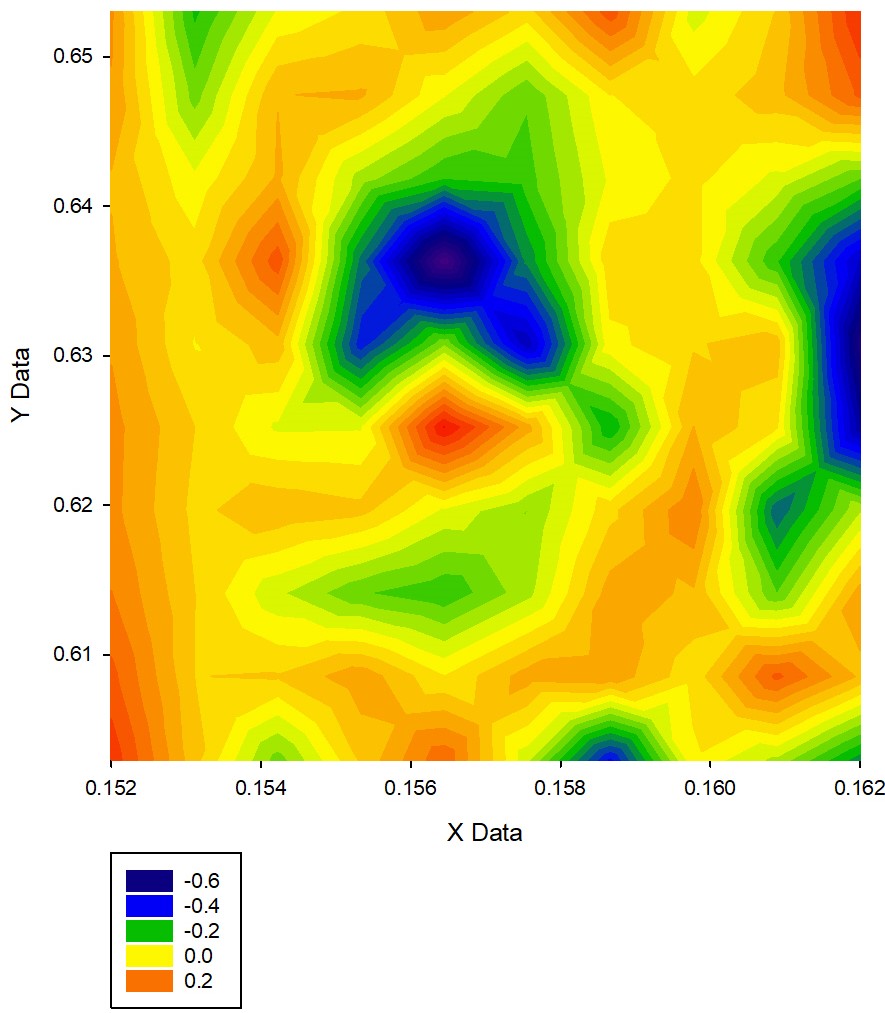
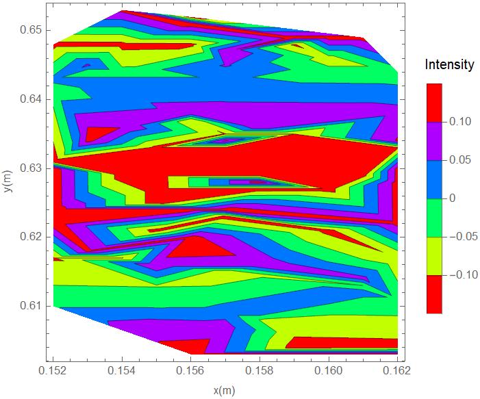
I am trying to produce a correlation map for some NMR experiment with this data. I tried to plot the data with Mathematica but the result was not close to my expectation. Hence, I tried plotting the data with SigmaPlot (version 14) and I got something close to what I expect. What should I do to my code to get a plot close or better than the plot obtained with SigmaPlot? The plots are as follows:
and
My code is:
data = Import["correlationdata.csv"];
ListContourPlot[data, ColorFunction -> Hue, PlotRange -> All, FrameLabel -> {"x(m)", "y(m)"},
PlotLegends ->  Placed[BarLegend[Automatic, LegendMargins -> {{0, 0}, {10, 5}}, LegendLabel ->
"Intensity"], Right]]


