I have the following code:
Show[LogLinearPlot[fpN, {t, 0.01, 10000}],
 LogLinearPlot[fpS, {t, 0.01, 10000}],
 ListLogLinearPlot[Table[dataa[[i]], {i, 1, 8}],
  PlotMarkers -> {Automatic, 13}, AspectRatio -> 1 ,
  PlotLegends ->
   Placed[{87, 85, 80, 75, 70, 65, 60, 55}, {0.14, 0.66}]],
 Frame -> True, PlotRange -> All, Axes -> False, AspectRatio -> 1,
 FrameStyle -> Directive[Black, 13],
 FrameLabel -> {Style["x axis", 16],
   Style["y axis", 16]}]
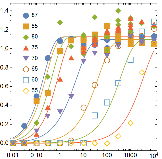
which gives me the following Figure:
How can I put the markers and the curve figures of the same color in this code?. As an example in the figure the 55 data is a yellow rhombus but the line is red. The data at 60 is a blue square but its line is green. Similar for the other data.
Edit: Just for clarification purposes fpN plots the data from 87 to 75, fpS plots the data from 70 to 55 abd dataa[[i]] contains the data that I am plotting as markers
Thank you?

