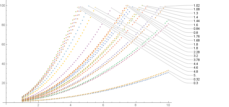
I recently updated to Mathematica 11.2, and I very much like the automatic PlotLabels feature that I discovered. However, it picks a somewhat silly ordering when the data I'm plotting cuts off at different x-locations. Say I have data that looks something like this:
slopes = Table[i Round[Abs[Sin[i]], 0.1], {i, 1, 5, 0.2}];
mydata = Table[Select[Table[{x, 1 + slope * x^2}, {x, 1, 10, 0.1}], #1[[2]] < 100 &],
   {slope, slopes}];
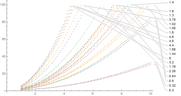
If I just ListPlot it, Mathematica does something smart about plot label vertical positioning which I haven't managed to recreate manually:
ListPlot[mydata, PlotLabels -> slopes, ImageSize -> Large]
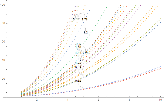
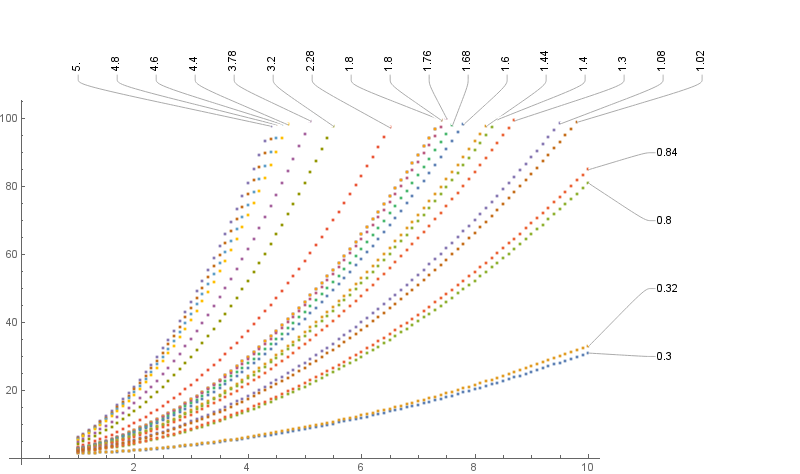
However, the ordering is all off; I want to order them by the slope, not by the y-value at the location where my data happened to cut off. So I tried using Callout instead, with a manually specified anchor position:
ListPlot[Map[Callout[#1[[1]], #1[[2]], Automatic, 5] &,
    Transpose[{mydata, slopes}]], ImageSize -> Large]
This gives the horrendous-looking
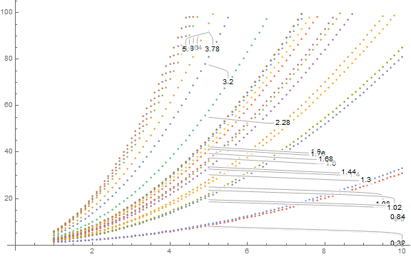
Okay, fine, I can give it a position manually. But 10 and {10, After} both give identical, very bad results:
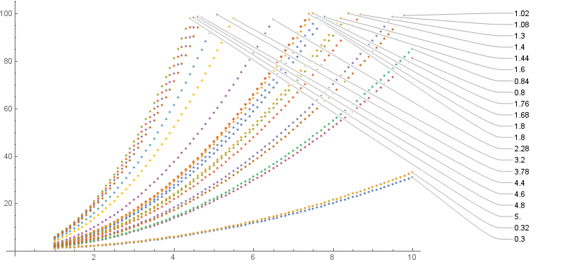
What I want, from most important to least important (but preferably all of them):
- the labels should not overlap and should not be cut off
- the labels should have a pointer to some point on the curve
- the labels should be in slope-order, or, more precisely, the order that the data has at a particular x-position that I specify
- the labels should all be along the right side of the plot, the axis should not extend past the end of the data
How can I accomplish this?

